
Infographics with Excel
Infographics have been around a while but only now am I starting to see them everywhere. There are very little great visualizations online. There are very little resources which have ready made infographics and I intend to change that in the coming months.
What are infographics or Visualizations? Infographics are graphic visual representations of information, which is intended to present data quickly and clearly. They can improve a message if presented well and some of the more striking images online these days are infographics. Infographics have evolved in recent years to be for mass communication, strategy and marketing, and thus are designed with fewer assumptions about the readers knowledge base than other types of visualizations.
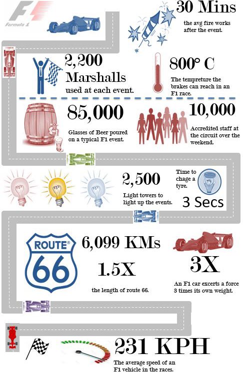
As with the dashboard page this will be the page I use to list the Excel infographics. Each Excel infographic will come with a fully functioning and updatable model. Like the dashboards I plan for all of the infographics to be eye catching. I put the following F1 Excel infographic together today. I displays some key metrics from the F1 sport.
The following is a link to the F1 Infographics page.
Africa Infographic in Excel
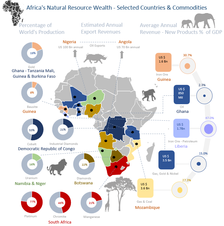
The following infographic visualization I saw online somewhere and thought it looked pretty cool and easily transferable to Excel. I like the doughnut charts and the colour coding of the African nations with the charts.
The following a link to the infographic and Excel file for the above image.
Business Infographic in Excel
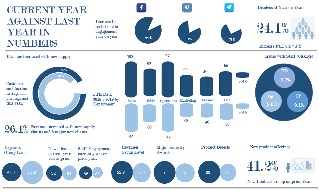
This infographic visualization displays business metrics year on year. It is an Excel spreadsheet which houses the data and the information can be changed to suit a range of situations.
The following a link to the infographic and Excel file for the above image.
Ageing Infographic in Excel
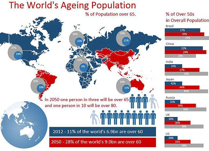
The following infographic visualization displays data about our globe, where people are ageing and when it will all come to a head.
The following a link to the infographic and Excel file for the above image.
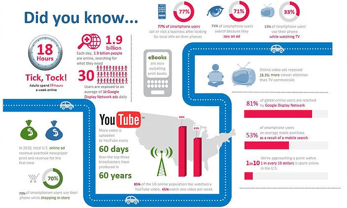
Hours On-Line Infographic in Excel
The following infographic visualization displays data about our time spent by people online. The Excel infographic is fully interactive and all elements can be changed and updated by changing an Excel file. I got the idea from an image I saw online.
The following a link to the infographic and Excel file for the above image.
Sales by Region Infographic in Excel
The following infographic visualization displays data about sales for an organisation by region. The Excel infographic is fully interactive and all elements can be changed and updated by changing an Excel file. I got the idea from an image I saw online. It is more of a business infographic.
The following a link to the infographic and Excel file for the above image.
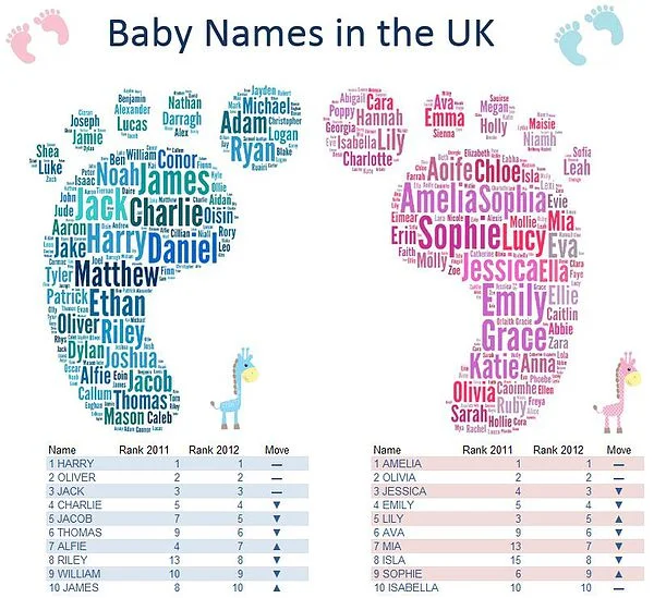
Baby Names in the UK Infographic in Excel
The following infographic visualization displays popular baby names in the UK. My sister has just had her first child so maybe this is a bit of a suggestion board for her. At any rate baby names are on my mind at the minute and thought this made a nice infographic.
The following a link to the infographic and Excel file for the above image.
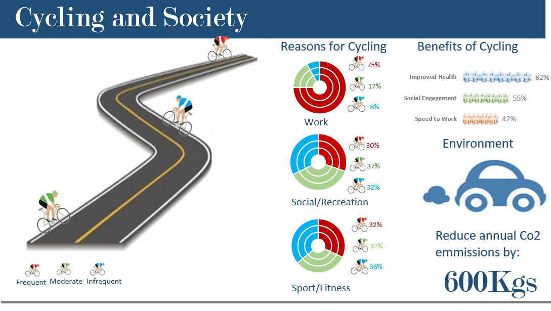
Cycling Infographic in Excel
A cycling infographic visualization in Excel - displays some generic data about the befefits of cycling on mind, body and the planet.
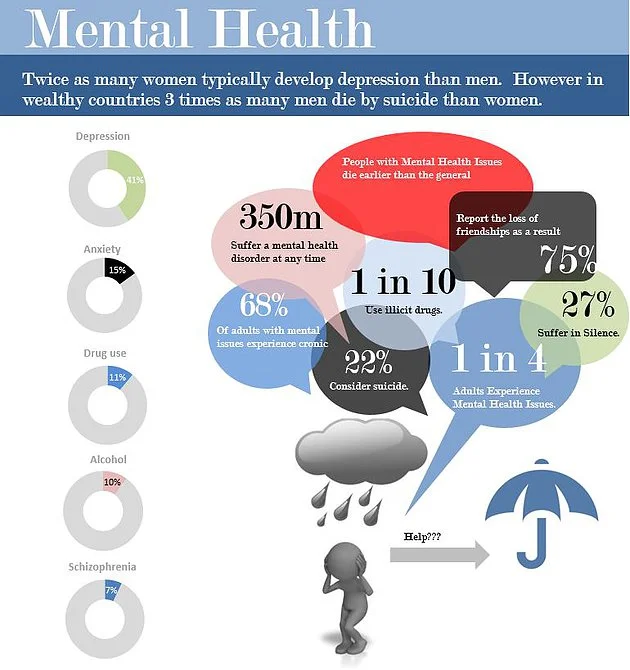
Mental Health Infographic in Excel
Mental Health issues have taken on increasing importance in the media in recent years. It has changed a lot since I was young with much research going into the causes and effects of mental health issues. It is a big problem in society and hopefully with greater awareness society is bridging the gap and becoming more understanding. This visualization attempts to address some of the issues.
The following a link to the infographic and Excel file for the above image.
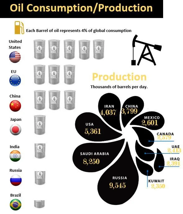
Oil Consumption Infographic in Excel
The following infographic visualization is a look at oil consumption and production globally. Listing the major players it shows some interesting statistics. I did not think that Russia was the largest oil producing nation.
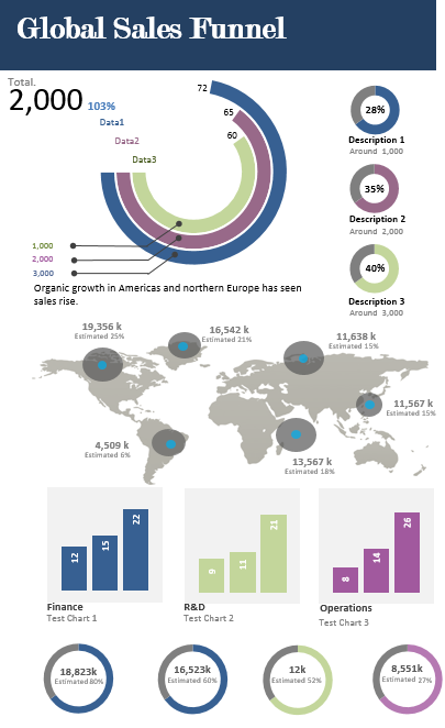
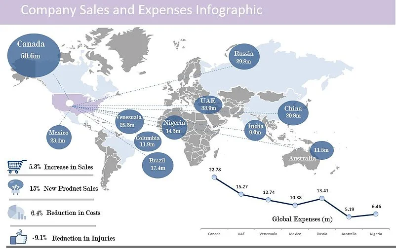
Global Sales Infographic in Excel
The following infographic visualization is a look at global sales by country. It is sales which emanates from America. The sales data is static and can by updated in the attached Excel file. Visually it works quite well with few colours.
The following a link to the infographic and Excel file for the above image.
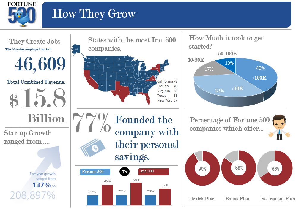
Fortune 500 Infographic visualization in Excel
The following infographic is a look at some data around the fortune 500 group of companies. These companies are the largest in the world. Their progress and success is important for society.
The following a link to the infographic and Excel file for the above image.
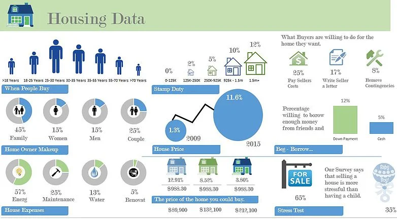
Housing Infographic in Excel
The following infographic visualization in Excel is a look at housing related information. The topic of housing is always on peoples minds. When I was young housing was considered expensive. Now housing is considered expensive. Is there ever a time when housing and the costs associated with housing is considered reasonable?
The following a link to the infographic and Excel file for the above image.
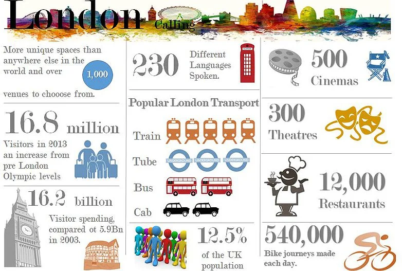
London Infographic in Excel
The following infographic is a look at London my home for a large part of my working life. I still miss London!!!
The following a link to the infographic and Excel file for the above image.
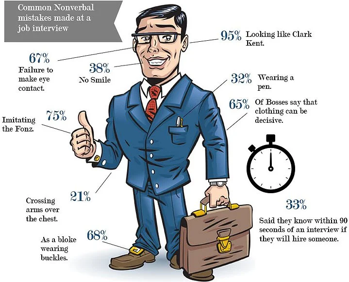
The Interview Infographic in Excel
The following infographic is a look at common problems at interview when you look like Clark Kent.
The following a link to the Excel infographic for the above image.
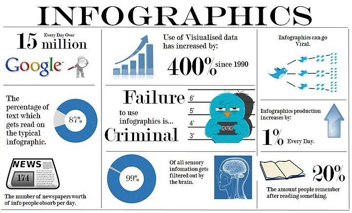
The Infographic in Excel
The following infographic is a look at the rise of infographics on the net. These tools for visual representation have taken off in a big way. Now a valid and growing way to present Excel data.
The following a link to the infographic page and Excel file for the above image.
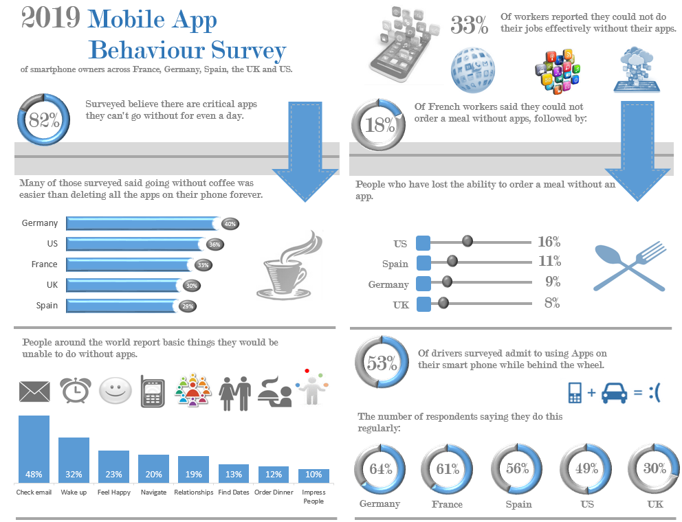
App Data Infographic in Excel
The following infographic visualization is a look at the state of App data. It is an example of what a survey and a little effort can do. The survey was the use of app data in Europe but makes a nice infographic.
The following a link to the infographic page and Excel file for the above image.
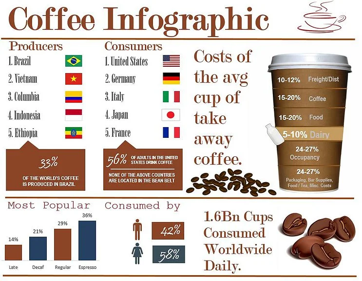
Coffee Infographic in Excel
The following infographic visualization is a look at key coffee production and consumption statistics. It is displayed in an Excel file with changeable cells for manipulation.
The following a link to the infographic page and Excel file for the above image.
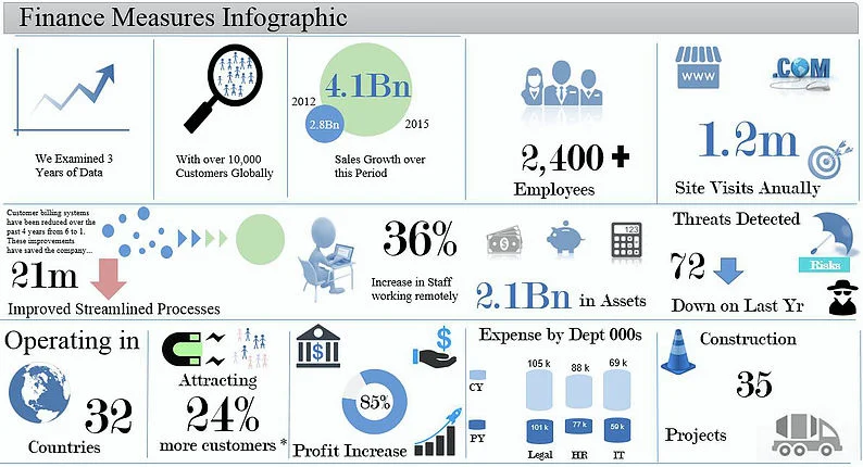
Finance Infographic in Excel
The following Finance infographic is a look at KPIs for a particular company. It is displayed in an Excel file with changeable cells for manipulation.
The following a link to the finance infographic page and where you will find the Excel file for the above image.
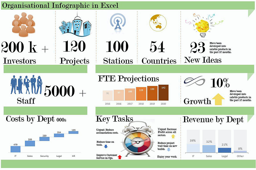
Organisation Infographic in Excel
The following whole of organisation infographic is a look at important information presented in an Excel file. It is displayed in an Excel with changeable cells for manipulation.
The following a link to the organisation infographic page and where you will find the Excel file for the above image.
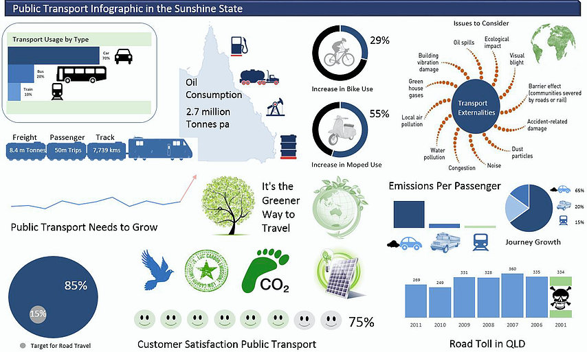
Transport Infographic in Excel
The following whole of transport infographic visualization is a look at some key issues affecting the way we live. There are pictures and charts and a number of statistics surrounding both public transport and the planet. It is displayed in an Excel with changeable cells for manipulation.
The following a link to the public transport infographic page and where you will find the Excel file for the above image.
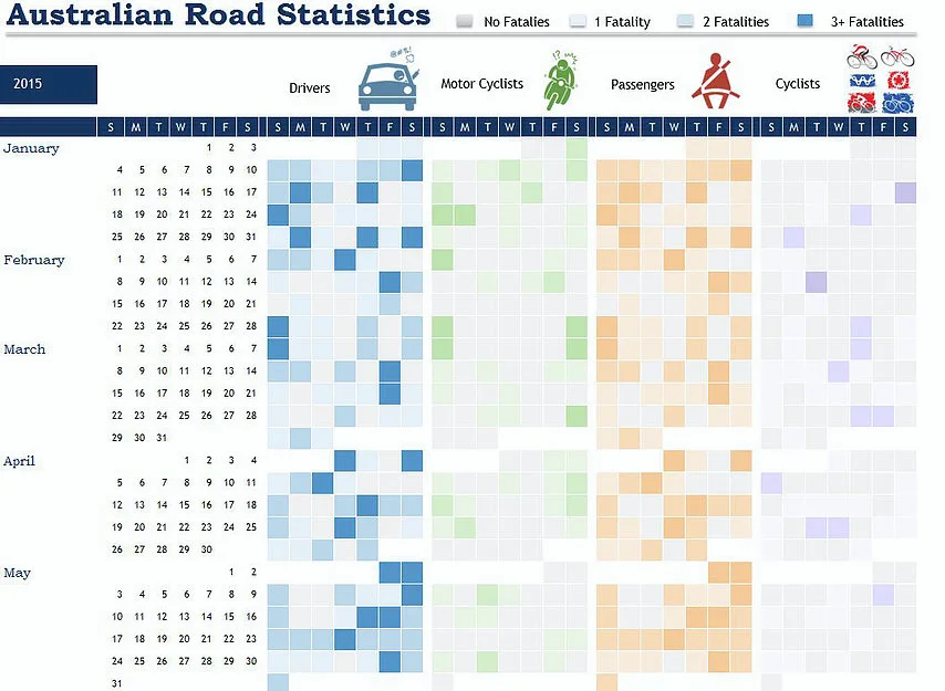
Road Traffic Statistics Infographic in Excel
The following Excel infographic is a morbid look into the road traffic statistics in Australia. The infographic was too large to include a picture of all of the months so just the first 5 years are shown. There are 3 years of data, with the toggle being the blue cell at the top left depicting the year, which is a data validation list. The darker colours in each of the segments depicts a higher death toll. This Excel technique is achieved mostly through conditional formatting.
The following a link to the public traffic fatalities infographic page and where you will find the Excel file for the above image.
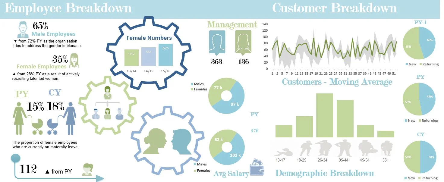
Male, Female, Customer Infographic in Excel
The following Excel infographic is a look at some demographic metrics inside an organisation. It is a breakdown by age, gender and have some information about the percentage of male and female employees and management breakdown.
The following a link to the male, female, customer infographic page and where you will find the Excel file for the above image. The Excel file can be found in the blog and may take some finding.
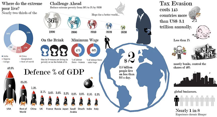
Excel Infographic Change
The following Excel infographic is a look at some of the more startling issues facing our planet right now. It outlines extreme poverty and interestingly some government defence spending which might best be spent on tackling humanity and the human condition.
The following a link to the Excel change infographic page and where you will find the Excel file for the above image. The Excel file can be found in the blog and may take some finding.
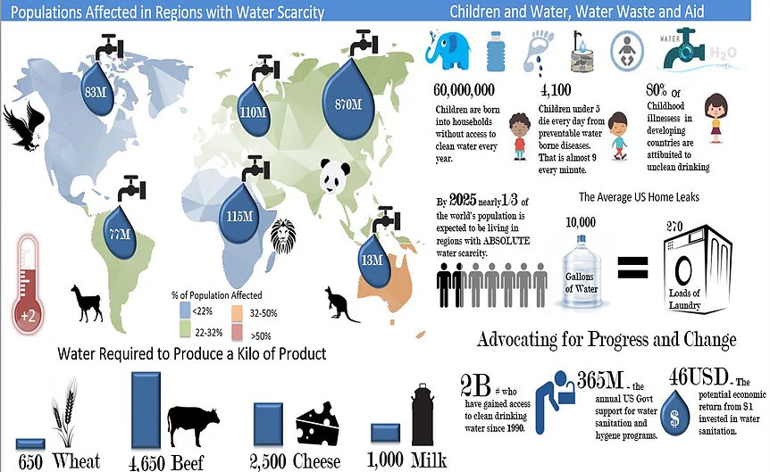
Excel Infographic Water
The following Excel infographic is a look at how we use water and what might happen if the world heats up as expected with man made climate change.
The following a link to the Excel water infographic page and where you will find the Excel file for the above image. The Excel file can be found in the blog and may take some finding.
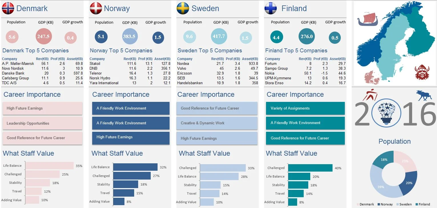
Excel Infographic on Scandinavia
The following Excel infographic is a one of my favourites of all time and is on the front page of my site. It is a look at some demographic information about 4 of the countries in Scandinavia. Apologies to Iceland. There are population, GDP, GDP Growth which has been quite low ever since the GFC. It was posted on 30 May in my blog so you may need to scroll a bit to find it.
Excel Infographic on Climate Change
There is a stack of information online about climate change. Excel is a wonderful tool to display and change this sort of data. I have made an infographic based on our changing climate with statistics from the web showing the current state of affairs, all things climate change.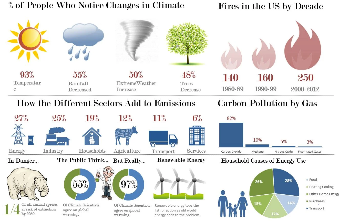
The following is the link to the blog post which has the Excel Infographic.
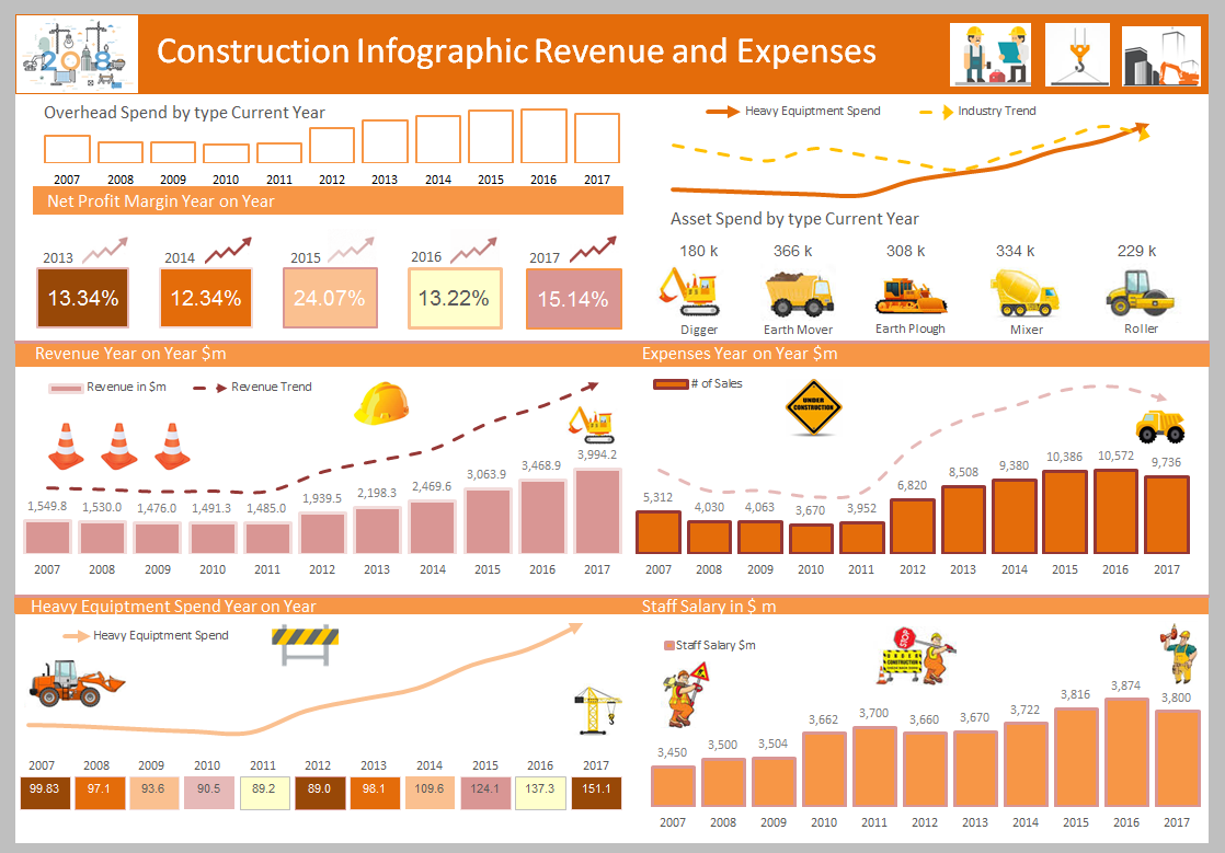
This graphic displays revenue and expenses with some relevant pictures and charts for a construction company. You should be able to modify it to your industry.