

Excel Dashboard Examples and Template Files
On this dashboard web page you may download and utilise loads of Excel dashboard templates from TheSmallman's Excel dashboard region and contain your very own information. The website's goal is to set up a step-through-step-manual Excel dashboard introduction that consists of loads of dashboard types, financial, organisational, and KPI dashboards. The article's first phase covers the philosophy of Excel dashboard layout and consists of numerous pix of Excel dashboards I've made for CPA Australia. Subsequently, there are hyperlinks to pages with loads of Excel dashboard templates that you may download.

What is an Excel Dashboard
A dashboard is a one-web page assessment of important information that allows you to take a look at your subject matter quickly and easily. The capacity to layout visually attractive Excel dashboards is a difficult ability to acquire. I actually have made a healthy proportion of mistakes while developing Excel dashboards, these errors helped improve my own technique and the learnings from those blunders are contained on this page today. This site has a plethora of Excel workbook examples that have been carefully curated throughout time to save you the trouble. Simply insert your very own information into the data entry pages, alter the calculation pages to mirror your requirements, and your information can be displayed in the output pages (dashboard). I hope you find the Excel dashboard example you are looking for and assists you on your journey to data mastery.
FREE Excel Dashboard
The above Microsoft Excel Dashboard is free of charge to a good home. Enjoy gently.
Need Help with Your Reports?
Smallman.com provides customized reporting solutions for your business. Get fantastic custom designed reports in Excel or Power BI. Contact the experts.Sound Excel Design
Creating a Dashboard in Excel: The following outlines some key Microsoft Excel dashboard creation rules. Simple use of colours, clean design which is easily read. There are some key things to consider when creating an Excel workbook. Excel dashboards should ideally be;
Readable and easily understood. The meaning of each statistic/metric need to be clear to all with Excel formula calculations separate from the output.
Interactive Excel workbook, meaning that it can be modified to represent various organisational divisions.
Able to show the primary measurements. Determine what matters, then make advantage of the dashboard's essential elements.
Generous with the “white space”. The portions of a dashboard that are not in use are referred to as "white space," and they have equal visual significance as the areas that are filled with data.
Every chart and table on the dashboard must have a clear message displayed and be named.
Aim to arrange the sections of your dashboard into symmetrical grids that correspond to data blocks. When it comes to visual display, symmetry matters.
Create stunning Excel dashboards like the ones above either in a course or buy my favourite Dashboards which make up my courses.
Charting For Excel Dashboards
The next step is to decide which visuals and design best represent your data. For example, you should pay attention to other Excel graphs as follows.
Column chart a vertical chart that lays data out by time period very well.
Bar chart: a horizontal chart that stacks lines of data.
Waterfall chart: view how an initial value increases and decreases through a series of alterations to reach an end value
Heat Map chart: represent data in a dial. Also known as a speedo chart
Pie Chart and Doughnut charts: highlight % and proportional data
Line Chart in Excel: These charts are great for 2 part comparisons.
Dynamic Chart in Excel: Charts that auto update, these dynamic charts can be helped with an Excel table.
Pay attention to the dynamism of the charts so that each data point is updatable.
Additionally adding Slicers to your data sets allows the charts to update easily.
Whether you have complex data or it is simple, interactive Excel dashboards are the ideal goal when it comes to the creation and charting process.
Excel Dashboard Example
The following YouTube video is a look at what is possible using an Excel dashboard. The video shows the key functionality and how things can move and change just by changing a single metric.
A Variety of Different Dashboard Examples
Excel dashboards are a very valuable corporate tool when created with forethought. An organisation can see all of the key information in one place and see how it is tracking against the key criteria. The following are some examples of Excel dashboards which I have put together. The information in these Excel dashboards is not real, it is for demonstration purposes only. After going through the exercise of creating all of these Excel dashboards I can say one thing with complete certainty, making Excel dashboards is a lot of work but very worthwhile when you see the final working result.
One of the issues with developing the following Excel dashboards is obtaining the data. I would scratch my head as I started creating the raw data from scratch early on. Later I got a bit smarter and found that wiki and some government websites had ready made tables which were Excel compatible. I then just needed to sketch out a final output dashboard and work backwards to make the data fit that vision. Many of the techniques spoken about in the site which I have incorporated on TheSmallman.com are built into these Excel dashboards. On the whole these Excel Dashboards do not need VBA at all. There are a couple of exceptions when you get down to the Heat Map section but mostly native Excel run these dashboards.
Many of the current dashboards I have created have been for clients or for accounting bodies. I have to be pushed in order to create something that I am proud enough to share here. The one to the left is for a course I have ran several times over the years. It has evolved and grown over time and is one of my favourite creations. It is available in one of my face to face courses.
The dashboard on the right is also for a course I have for an accounting body. I have just recently completed it and the Excel dashboard runs on Power Pivot exclusively. The course focused on how to manage large datasets and create and refresh rereports that can be updated seamlessly. The purpose of a dashboard such as this one is to provide a quick way for managers and other key stakeholders to track progress, identify trends, and make informed decisions based on real-time data.
There is a complimentary post on Excel dashboards in my blog.
Free Excel Dashboard Tutorial (90 mins)
I have made a quick dashboard tutorial which is posted on YouTube. This outlines how to extract data from the internet and format it in a way that allows you to generate an informative one page Excel dashboard. There are step by step guidelines to follow which will allow you to build the dashboard from scratch.
Excel Dashboard Templates
The next section starts with a 90 minute tutorial on how to create an Excel dashboard from scratch. It also contains a large selection of the Excel dashboards on this site which are free to download. All have an associated Excel dashboard template which is fully functional and has a complete data set inside it. The dashboards are all a little different, some spin on combo boxes, option buttons, slicers and there is a few that changed based on the mouse rolling over a cell or two.
Enjoy.
Dashboard Courses and Models
Generate highly visual and insightful insights, drive change through clarity which allows immediate action. Easily generate dashboards to help your organisation make timely decisions based on the right data, much faster. To learn how to put really these type of Dashboards together why not sit my Excel dashboard course.
Or maybe a starting point you are looking for - a professional model which can be populated with your data - then perhaps look at some of the premium model available on the site.
Thanks for visiting my site.
Excel Dashboards in Practice
Here is an example of how the dashboards work in practice. This short YouTube video shows how all of the metrics change as the levers are pulled inside the dashboard. A lot of work inside Excel needs to happen for this sort of thing to become possible. When an Excel spreadsheet is laid out correctly the dashboard can change and update in the way that you want it to. The example presented is one of my favorites Excel dashboards to build and showcase.
The Following 35 Excel Dashboards are Free to Download
The following are the sites current Excel dashboards to download. I will be creating more and more Excel dashboards and these dashboards will be free to download. Click on the link or picture to visit the specific Excel dashboard page. An Excel file is on every page with a brief description of the Dashboard. Click on the picture or link. At the bottom of the corresponding page there will be a link to the dashboard where you can download the Excel file associated with the dashboard.
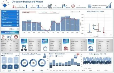
Corporate Dashboard Report
This dashboard appears to be the most popular Excel dashboard template on thesmallman.com. It is a simple dashboard to create that uses very few colours.
The EBIT Excel Dashboard report is an update of another of the original dashboards on the site. I have used some relevant infographic elements to spice the dashboard up a bit. It is functional and tells the Excel story of a company based in the update of two combo boxes. Splits the dashboard by reporting metric and group. The following is a link to the dashboard template. (Free Excel Dashboard - Updated April 2020).

Department Dashboard in Excel
The department store Excel dashboard is a mixture of financial and non financial metrics all presented in a single page. It has a map feature which displays the region in focus. The following is a link to a page which contains the dashboard template.
The following is the link to this free dashboard template. (Free Excel Dashboard - Updated April 2020).
Operational Dashboard Report
This Excel dashboard uses a mix of 3 colours (blue, red and green) it is not overly busy and tells a story in a small space. Excel dashboards can be as simple or complex as need be, this is an Excel example of a simple data set shown clearly in a single page.
The above Excel Dashboard shows a range of metrics on a single page from an operations perspective. The underlying business is primarily banking however, the underlying data set can be adapted to fit a range of businesses. This dashboard did not take entirely long to produce relative to the other ones - perhaps I am learning... The following is a link to the dashboard template. (Free Excel Dashboard - Updated April 2020).
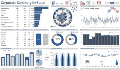
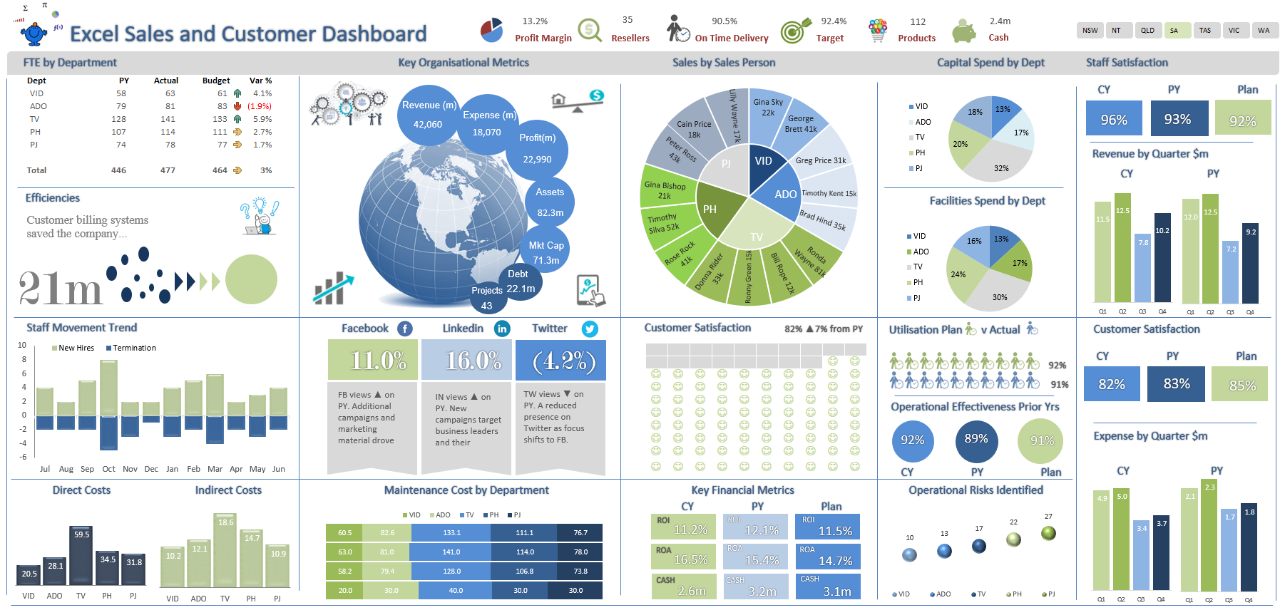
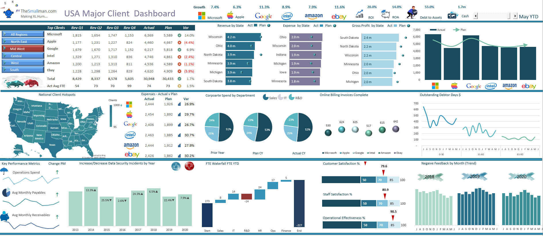
Corporate Summary Dashboard
The above Excel Dashboard displays a range of organisational metrics from revenue, expenses, FTE, Issues all against a "well thought out plan". The underlying dataset is split over several sheets and the report updates via a slicer at the top of the Dashboard which allows it to spin by State. It is highly interactive and very user friendly - enjoy. This link takes you to the dashboard template. (Free Excel Dashboard - Updated April 2020).
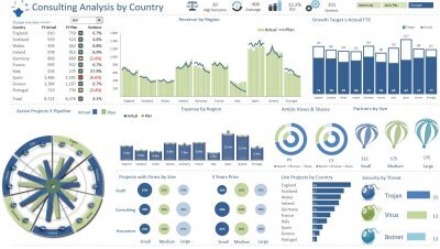
Consulting Excel Dashboard
The above Excel Dashboard is an update of one of my very first dashboards on the site. It have had some infographic elements added to it to enhance the story. It is debatable weather they work or not but I like the finished product.
The dashboard displays revenues, expenses, FTE, key projects by region and a range of other metrics.
The following is a link to the dashboard template. (Free Excel Dashboard - Updated April 2020).
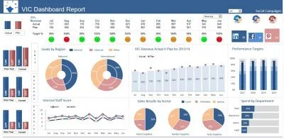
Traffic Light Excel Dashboard
While the above is an updated version of the first Excel dashboard I published on the site. It has been refreshed and updated which was long overdue. The following is a link to the traffic light Excel dashboard template.
The template uses example data to display actual V plan data and shows EBIT, revenue and expenses graphically at the side. There is a traffic light effect to indicate progress against plan for each of the areas of the organisation and a combo box to choose which areas financials you want to see. It was the very first Excel Dashboard I incorporated into thesmallman.com, so it gets centre. (Free Excel Dashboard - Updated April 2020).
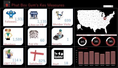
Key Measures Excel Report
This Excel dashboard has only a small amount of information - this is an example of how to fill the space with infographics - adding relevant pictures can enhance the story of your dashboard. You will notice the dashboard is still fully flexible.
The above is another original updated Excel Dashboard. The heat map on the right with some key metrics has been added along with an EBIT chart which shows a trend over time. The following is a link to the excel dashboard template displayed above. (Free Excel Dashboard - Updated April 2020).

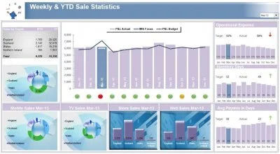
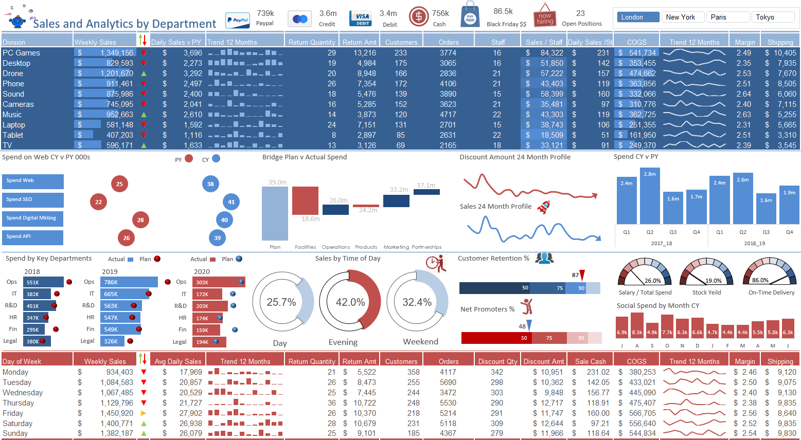
Excel Revenue, Expense and Staffing KPI Report
This KPI Report is an update to one of the original dashboards on the site. I have reworked the dashboard and added additional features to fit inside a single page. The toggle at the top right of the report allows the user to spin the information by year which will change all of the data within the display. It is a functional report which displays a lot of information about various groups within an organisation in a small amount of space. The following is a link to the Excel dashboard template. (Free Excel Dashboard - Updated April 2020).

Human Resources Dashboard
The Human Resources - HR Dashboard is a mixture of employee related information, from salary, hires, employee satisfaction, age demographics and much more. All split by department and sub department. It makes a very nice template for a human resources department to track a range of key performance metrics. To get to the dashboard template either click the picture above or the link below. (Free Excel Dashboard - Updated April 2020).
Sales Dashboard
The Sales Excel dashboard highlights the month in focus with a light blue bar depending on the month shown in the drop down. You can see from the chart that September is in focus so the bar shifts to light blue in September and all of the other Charts change to reflect that month. The dashboard also has a traffic light setup. (Free Excel Dashboard - Updated April 2020).
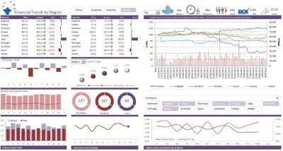
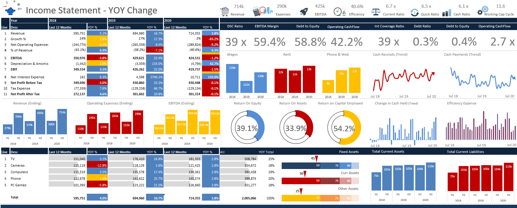
Financial Trends Excel Dashboard
The Financial Trends Excel Dashboard features price and turnover by region. The dashboard uses an Excel slicer on the main page to isolate countries in the chart. It also has the ability to slice by region and has a combo box for top or bottom 5 by country.
The months which appear in the dashboard is controlled by a combo box which allows year to date data to be shown without too much fuss. (Free Excel Dashboard - Updated April 2020).
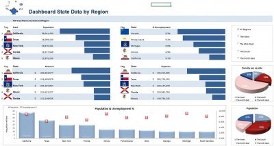
US States Dashboard
This US Excel dashboard is a sneak peak at population data obtained from Wiki. At the right of the dashboard there is some radio buttons which enables the selection by region. The States are grouped into their regions and as the grouping is selected the State Flags and charts change in accordance with the radio button.(Free Excel Dashboard - Updated April 2020).
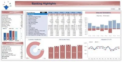
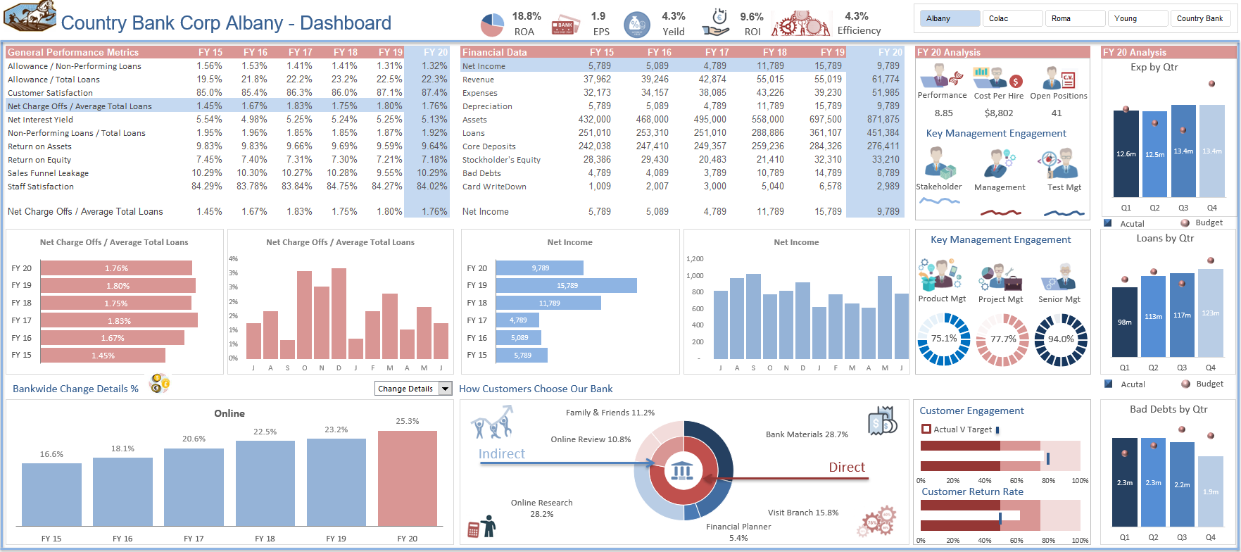
Banking Excel Dashboard
The following Excel dashboard has been used in the financial modelling document. It is an Excel dashboard which outlines Banking highlights. It uses a spinner button to generate projections which are highlighted in blue on the right to indicate that these figures are budget. (Free Excel Dashboard - Updated April 2020).
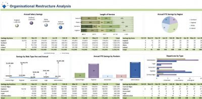
Restructure Excel Dashboard
The Restructure Excel Dashboard is predominant designed around workforce planning and trapping the savings from changing the size, shape and nature of the organisation. It is clean and clear, it has no spinner controls on the dashboard which means the dashboard is updated with new raw data. (Free Excel Dashboard - Updated April 2020).
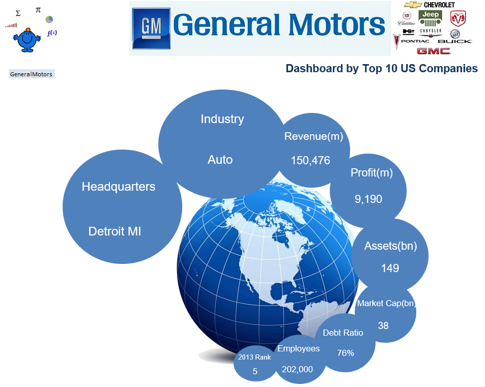
The Top 10 Excel Dashboard
Top 10 Excel dashboard depicts the top 10 US corporate, highlighting some key common metrics. The design of the body of the Excel dashboard (world) stays the same while the logo changes as each company is filtered with the drop down on the left hand side.
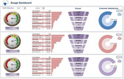
Gauge Excel Dashboard
The Gauge Excel dashboard features a gauge. I once read that the gauge on a dashboard was like the fast food for Excel Dashboards. They take up too much space for the information they provide. However, when you only have a small amount of information to show on your dashboard and that information is important, then there is no reason why they can not be added to a dashboard.
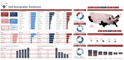
Demographic Dashboard
The Demographic Excel dashboard shows demographic information for the USA. It introduces a heat map which shows high concentrations of particular demographics, such as race.

Prior Year Excel dashboard Prior Year
Excel dashboard tracks a firms key spending items, plan v actual for EBIT, revenue and expenses. I tried adding just two colours to the Full time equivalents chart but it did not look right so I kept the multi coloured look and in this dashboard I think it works.
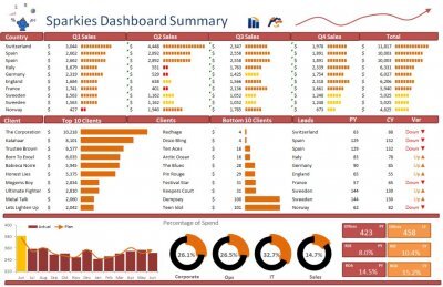
Sparklines Excel Dashboard
The Sparklines Excel dashboard is an interesting one as it has many sparklines and the sparklines are conditional formatting not charts. The file works well as a visual display of each of the metrics being displayed. If you go to the link you can download this dashboard free of charge. It gets you started in and shows how well put togther models are designed.
World Cup Excel
The World Cup Excel dashboard is a tribute to the upcoming world cup in Brazil. This sort of dashboard is known as a Wall Chart. So it's a world cup wall chart in Excel. You can predict the matches and see who may meet up in the knock out stages of the tournament. This sort of dashboard can be used with any tounament based competition if the methodology which I have used is followed. Enjoy!

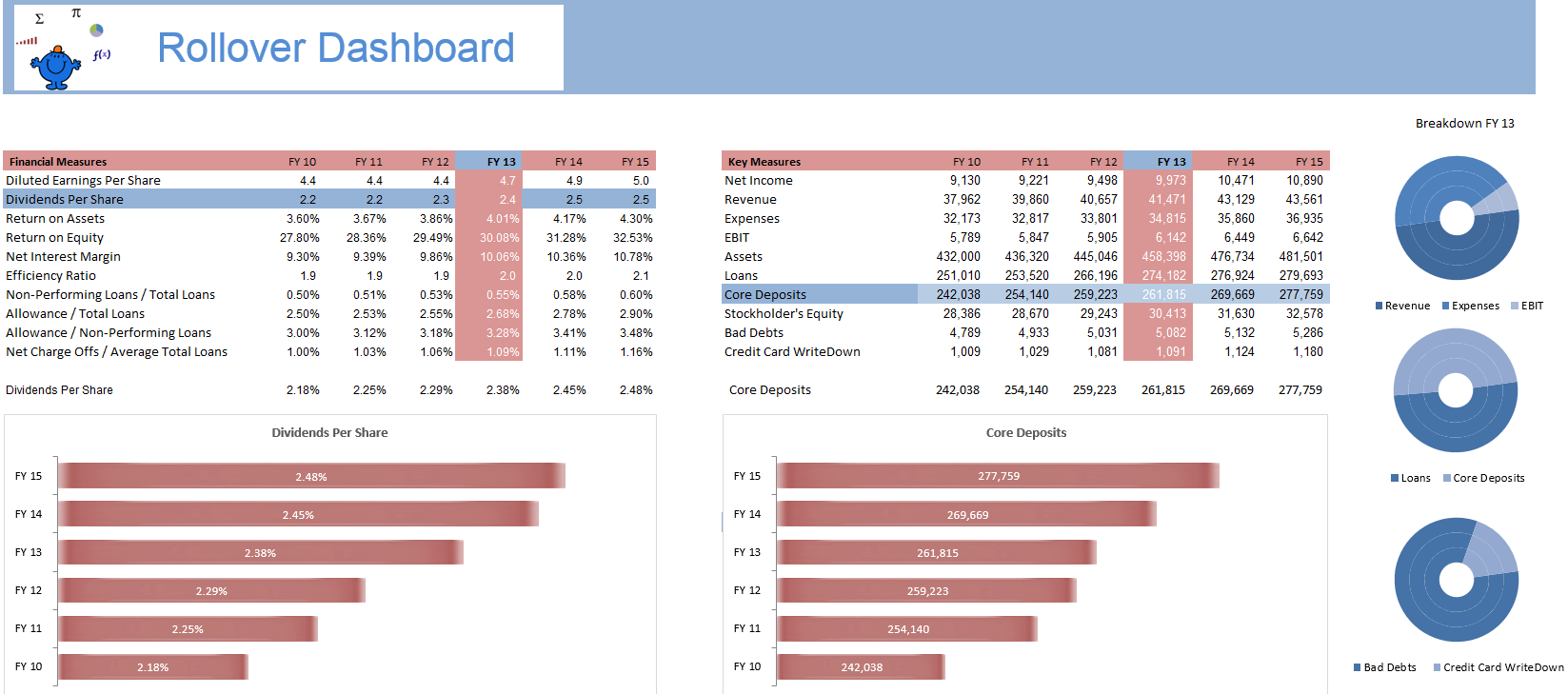
Rollover Dashboard
The Rollover Excel Dashboard draws on the article on Chart Hyperlinks which details how to change a chart by rolling over a particular cell. It is a really cool technique which has far reaching implications especially in the creation of Excel dashboards. I have shown a couple of concepts for a dashboard however there will be many many more.
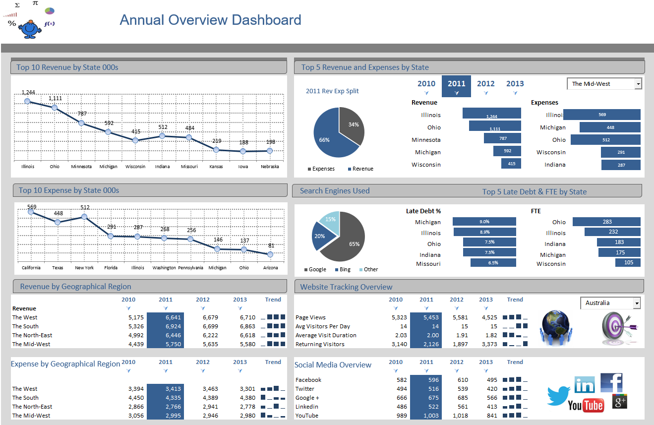
Overview Dashboard
The Overview Dashboard below once more has a rollover feature in the same manner as the above dashboard. The years in the top right panel of the dashboard are what change the charts in the dashboard add in the flexibility in the model. Just roll the mouse over a year to see the metrics associated with that year in the dashboard. The article on Chart Hyperlinks might provide some more insight in how to set one of these Excel dashboards up.
Heat Map Dashboard in Excel
The Heatmap Dashboard is a breakdown of salary and unemployment information in the USA. The charts on the right of the dashboard are spark lines and will change colour with the change in the combo box on the top left. The heat map of the USA will change colours based on the selection of the drop down above the map of the USA. The dashboard displays top and bottom 10 metrics by state by region.

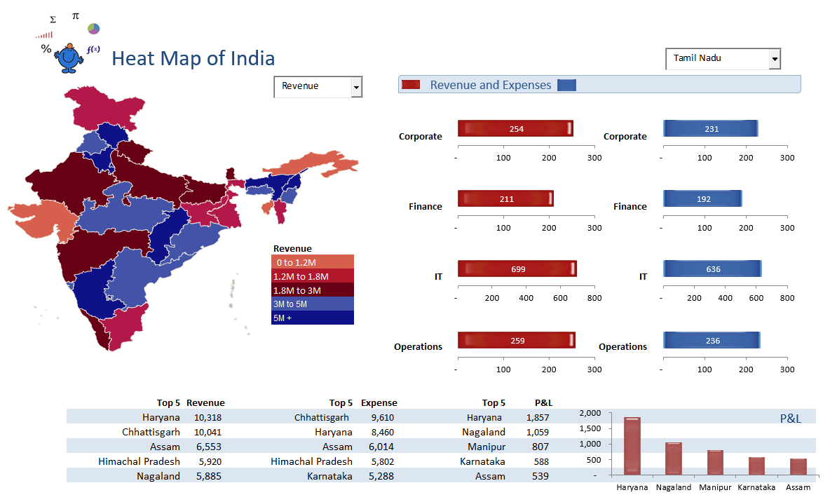
Heat Map of India Dashboard
India Heat Map Dashboard is an Excel dashboard which displays a heat map of the states of India. The dashboard displays revenue and expenses by type and by State. The dashboard also has a break down of the top 5 revenue, expenses and profit by State. It is quite a simple Excel dashboard and should be easy to follow.
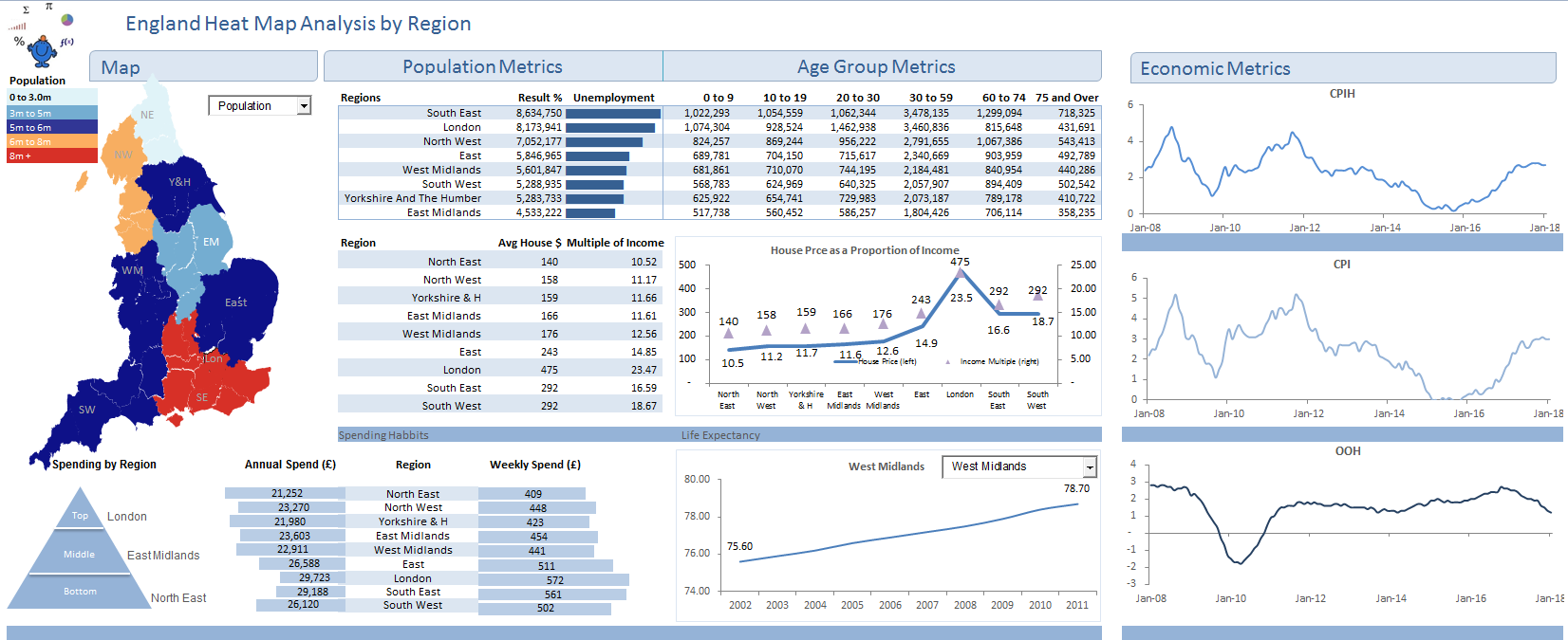
UK Heatmap Dashboard in Excel
The England Heat Map Dashboard is an Excel dashboard which displays a heat map of the regions in England. The dashboard displays age group metrics, house price, income and life expectancy data. The dashboards spins on a combo box beside the map of England. The colours in the heat map part of the dashboard change with the combo box.
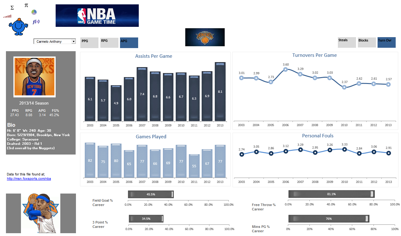
NBA Dashboard
The NBA Player Excel Dashboard is a dashboard which shows some of the current batch of NBA starts and their statistics. It is an Excel 2010 workbook with a couple of macros to show change the colour of each of the active tabs. These tabs control the charts on the dashboard which display stats like points per game, rebounds per game and steals per game. I enjoy the NBA so this dashboard was a bit of fun.

National Excel Dashboard
National Excel Dashboard The following Excel dashboard has a heat map of Australia which changes according to the selection made in the drop down. The flags next to the slicer will change based on the selection. The technique for this can be found on the Toggle Chart page. This Excel dashboard will work on Excel 2010 and later.
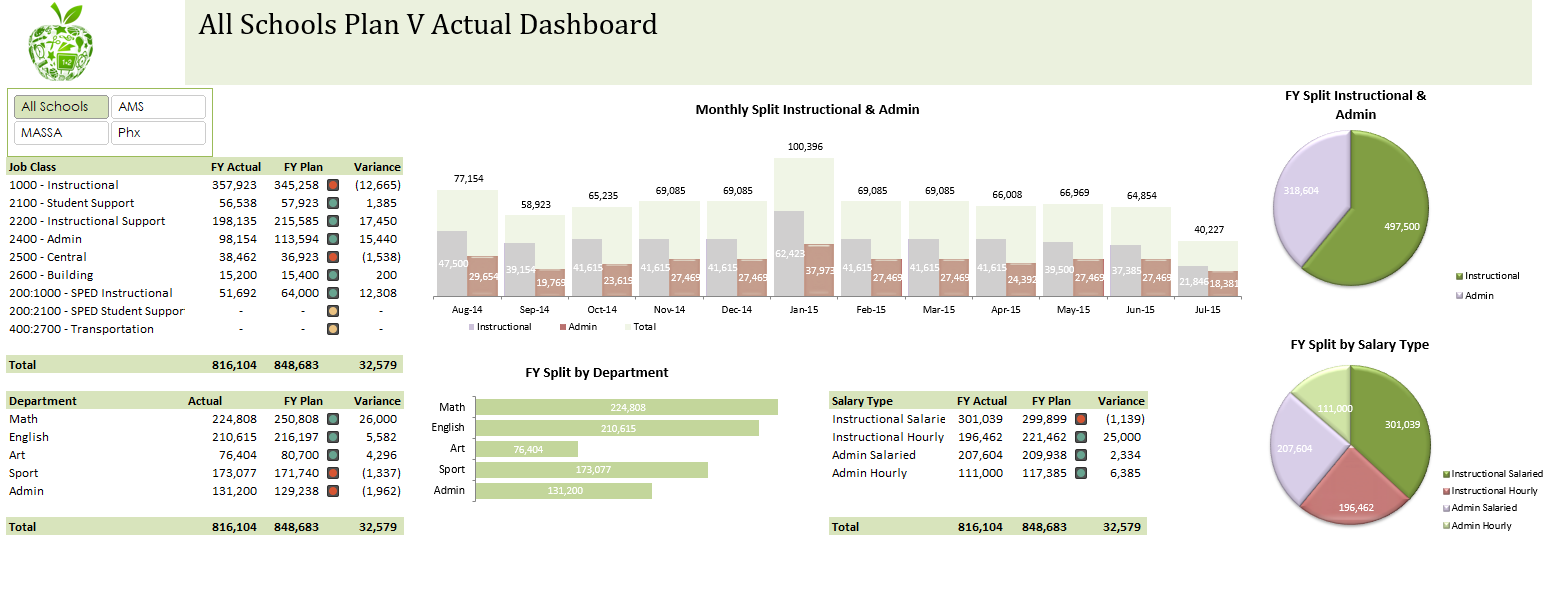
School Dashboard
The School Excel Dashboard is a dashboard which shows plan v actual for a number of schools across disciplines. It is an Excel 2010 workbook which uses a slicer to flick the dashboard between schools to show performance. The dashboard shows data by discipline and shows the trends on spend over a one year period. You can see the peaks and troughs. There is some coding behind the sheet but this is only to speed up the data input. I will leave the coding in the worksheet in case people find this useful. People are added to schools on the staff sheet. The input sheet acts as the control tab where data is entered into the back end database.
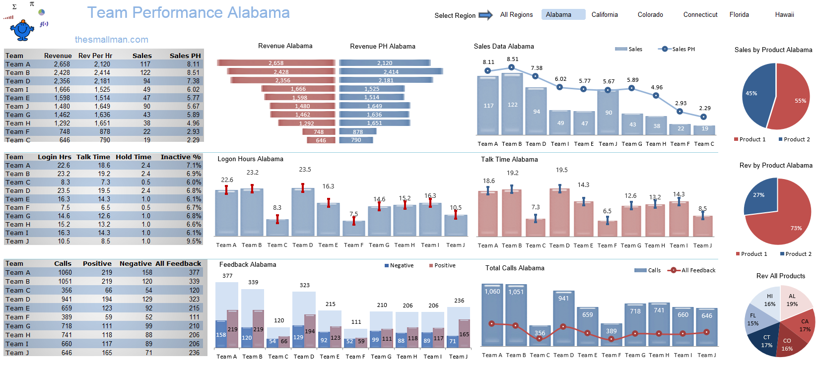
Team Performance Dashboard
The Team Performance Dashboard is a dashboard I created as a submission to the Excel Forum Dashboard competition in November 2014. The competition was open to all with a first prize of an iphone 6. There were 119 entries in the dashboard competition. It was enjoyable putting together this Excel dashboard, I did not win but I did get a page dedicated to this dashboard on ExcelTip.com
I have recently updated this dashboard to include a few new elements, an additional chart and I have streamlined the colour scheme.
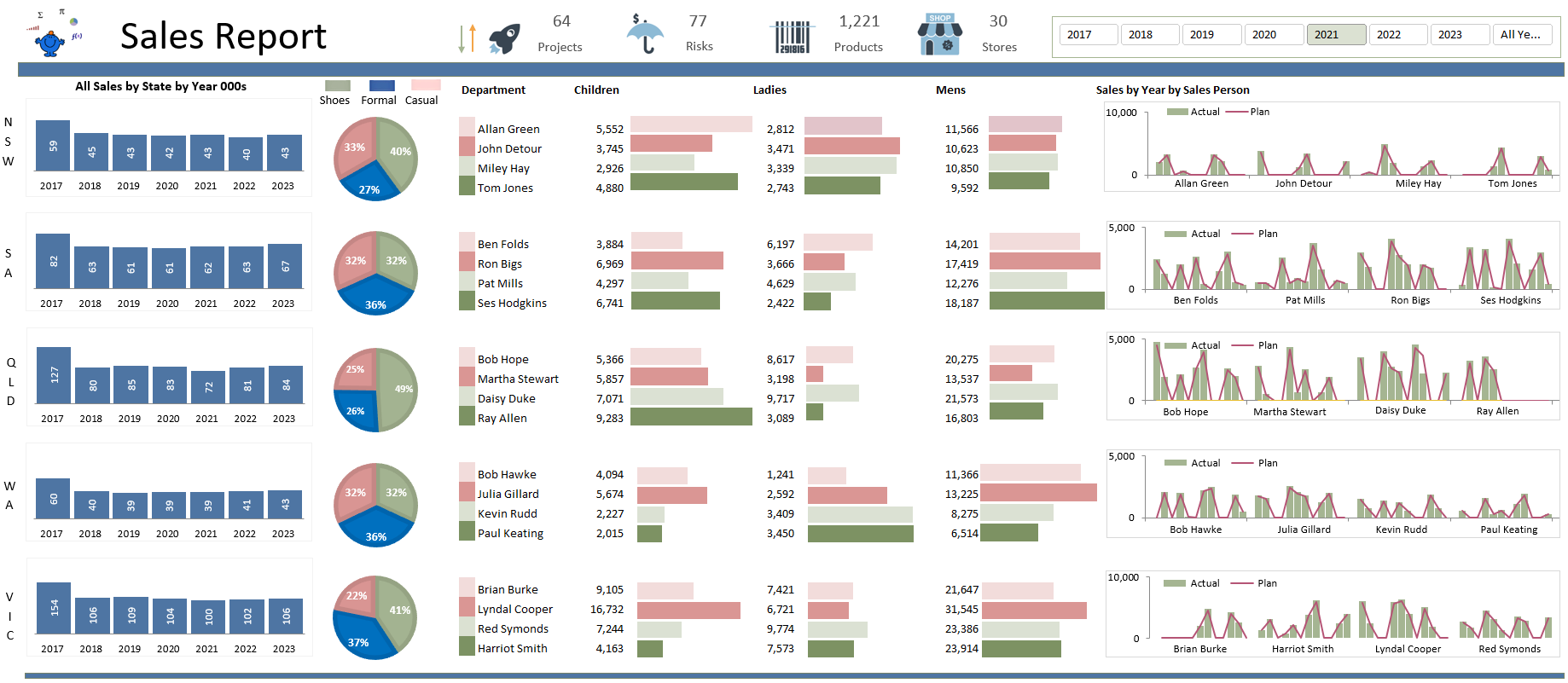
Sales Person Excel Dashboard
The Sales Person Excel Dashboard is a dashboard which traps sales person data by State based on Australian States. There is quite a bit of information on the Excel dashboard. The dashboard has 5 static charts to show the overall sales position and 20 dynamic charts which are based on the slicer at the top of the dashboard which spins on year. Apologies to Tasmania and the territories for the no show on this dashboard.
Road Traffic Dashboard
The Road Traffic Statistics Dashboard is a dashboard which captures traffic statistics in Australia over a long period. The raw data came from the Australian Bureau of Statistics.
www.abs.gov.au
It is the government body here in Australia which looks after the collation of society demographic and other data related to life in Australia.

The dashboard presents an all too real picture of the age, sex and vehicle type of all fatal accidents recorded over a 7 year period. One of the positives is that traffic fatalities seem to be falling. A slicer at the top of the dashboard allows you to generate a report by State or by year. There are high level charts, charts showing speed statistics, vehicle involved in fatality, month and time. The data is not complete on the ABS site however I have tried where possible to keep the data as close as possible to actual figures.
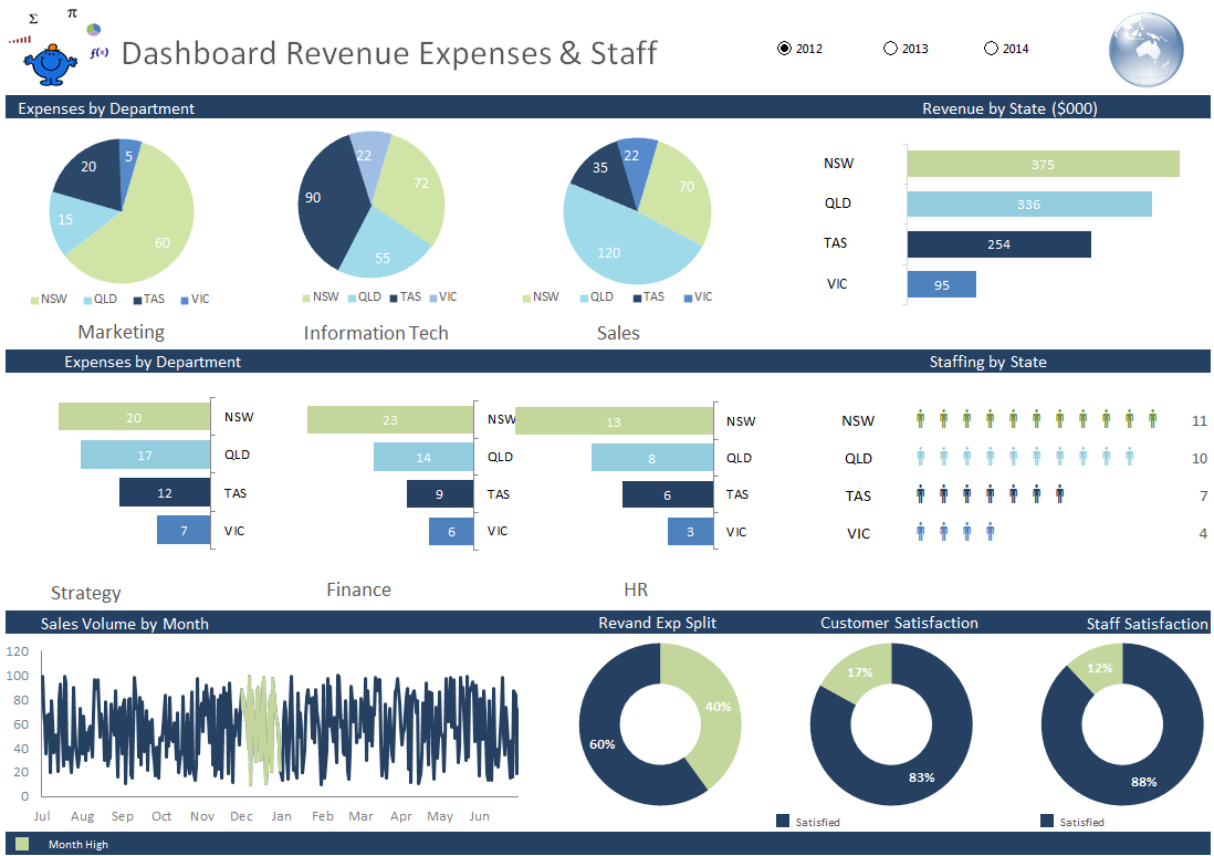
Revenue Expense Dashboard
The Rev Exp Staff Dashboard is an Excel dashboard which captures expenses by State and department, revenue and national staffing levels. The dashboard spins on year and has 3 years as an example. It has a very nice staffing chart and a consistent colour throughout.
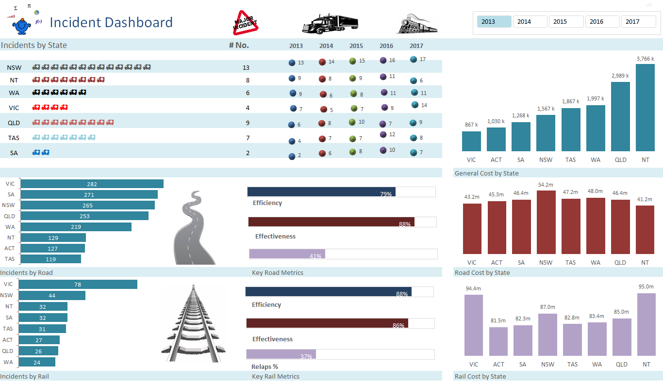
The Incident Dashboard
The Incident Dashboard is an Excel dashboard which is quite small but captures some important metrics. The dashboard uses the same in cell technique for charting incidents as the prior dashboard. In the blog post I will give some examples of in cell charting using the REPT formula. It would be nice if the picture library were enhanced a little more but it is what it is at this stage.
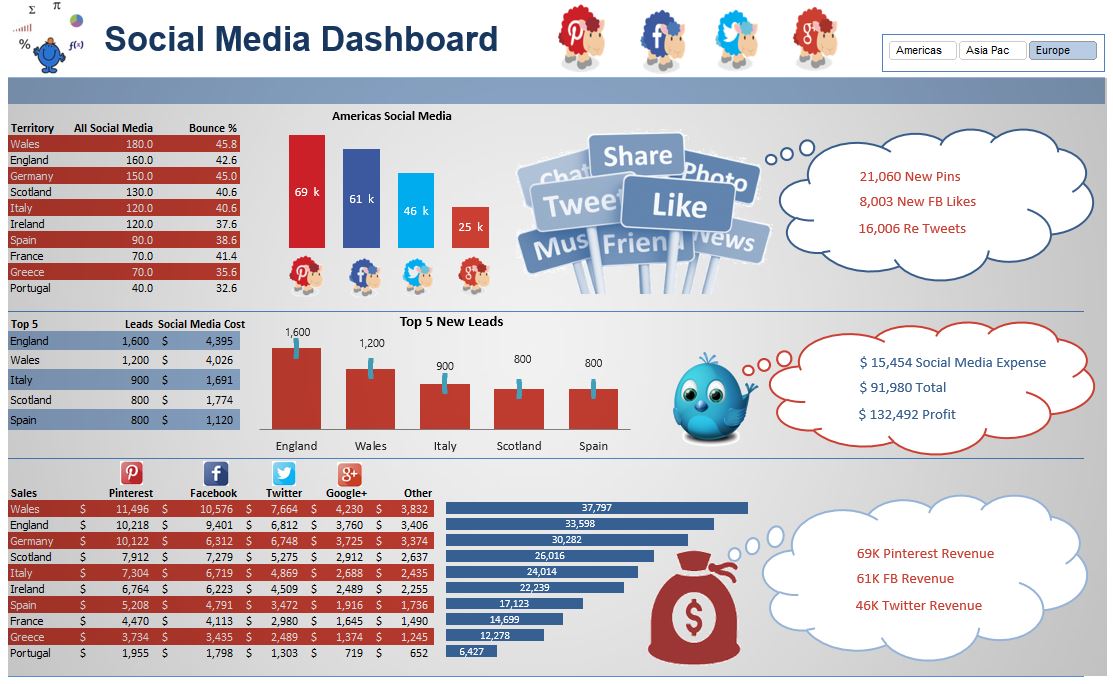
Social Media Dashboard
The Social Media Dashboard is an Excel dashboard outlining social media activity for a company. It focuses primarily on Pinterest, Facebook, Twitter and Google Plus. Apologies to other social media outlets.
Premium Excel Dashboards
The following files are from my premium dashboard selection, dashboard menu Shop Dashboard at top of page. They tend to be my Excel Dashboard courses, so are available for a fixed price. These Excel dashboards are a lot larger in size than the free Excel dashboards above. All the inputs and calculations sheets are included in all models in these sections. The dashboards can be used to add your own data saving you time and effort. The short video in this section is an idea of how one of the premium dashboards operates.
KPI Dashboard
This Excel dashboard has a combo box which give the dashboard the capacity to spin on month and has a range or organisational and operational metrics that change as the month changes. The dashboard is mostly a trending dashboard and does not have the variety of detail as some of the other dashboards on the site. There is a great deal more information not used in the dashboard so the dashboard can be modified to suit with your own Excel data.
Global Sales Dashboard
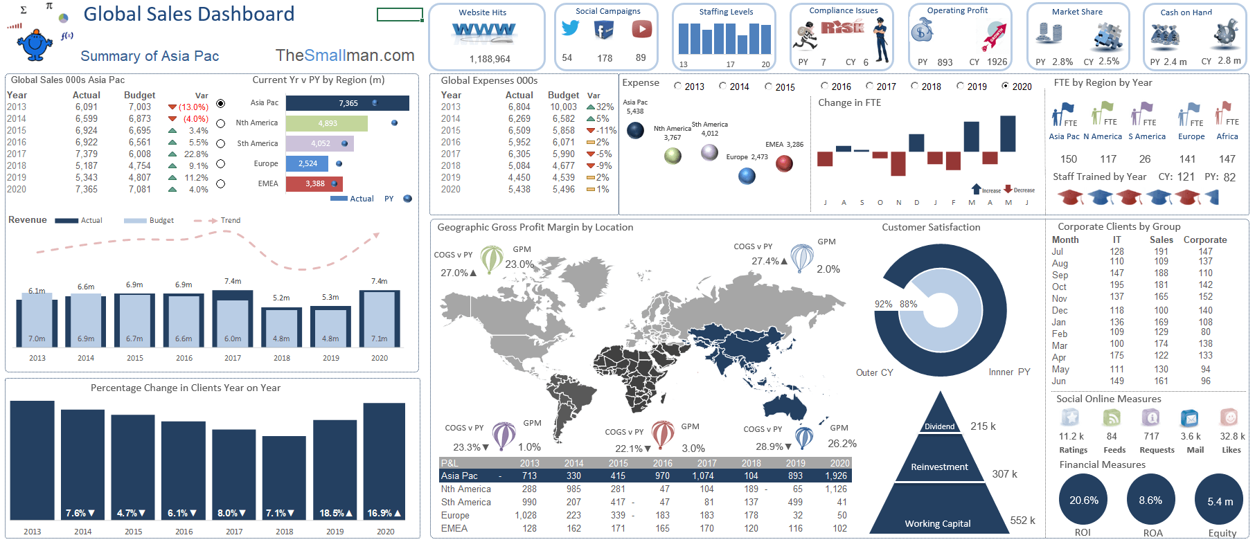
Global Sales Dashboard The Global Sales Dashboard is a dashboard which captures sales statistics for a fictional company. This Excel dashboard uses an Excel heat map to highlight each of the regions. It uses 5 colours, one for each region. There are some option buttons to show data by year at the top and option buttons on the left to set the focus of the dashboard on a specific region. The map will change colour to reflect the region in focus.
KPI Sales Dashboard
A key performance indicator (KPI) dashboard can give you the ability to consolidate all finance and operational activities and compare key projects, compare actual to plan all within a single page. These dashboards have audit, administration, staffing, data by department, by product. Check on the status of staff and customer satisfaction, cost to hire and the change between permanent and casual staff. Excel dashboards like the one beside are a great way to report key metrics clearly to management.
Key Operational Dashboard

Consolidate all finance and operational activities and compare key projects, compare actual to plan all within a single page. These dashboards have audit, administration, staffing, data by department, by product. Check on the status of staff, cost to hire and the change between permanent and casual staff. Excel dashboards like the one beside are a great way to report key metrics clearly to management.
Financial Trends Dashboard
Showing financial trends over time in a succinct manner is key. Show the big larger view of all sales activities and progress against target over time, both month and year to date.
This financial trends dashboard is part of my premium selection of Excel Dashboards. In addition this is my latest creation for one of my courses which I run for CPA Australia. I will pull this together with one of dashboard videos. Look forward to using it with my students in mind. It took quite some time to come up with the concept and get the look and feel exactly as I wanted it. There were many iterations before this final dashboard output.
Dashboard with Power Pivot
This is a full day training course I use as the output from a large data set. It takes current year and prior year sales and compares the sales against by department, industry segment, compares region and gives an idea of how the company performs against prior year. The dashboard is entirely created in Excel with a Power Pivot back end as its source.
Product Dashboard
This product dashboard is used to report on products by department or category. The dashboard tracks a range of metrics including, revenue, expense, gross profit, net margin, staffing metrics and many more. The metrics in the body of the dashboard are both month in the chart and quarter in the table. Giving the user a range of dashboard items to focus on.
BI Excel Dashboard
This is a concept business intelligence (BI) dashboard which has been adapted from the infographics section of thesmallman.com. BI dashboards can monitor metrics such as gross margin, profit or loss on sale, plan versus actuals, new customers details, market volumes, market share and plenty more. Building a dashboard from a infographic is significantly more work as there needs to be more data and the data needs to have formulas which will help the Excel Dashboard spin appropriately.
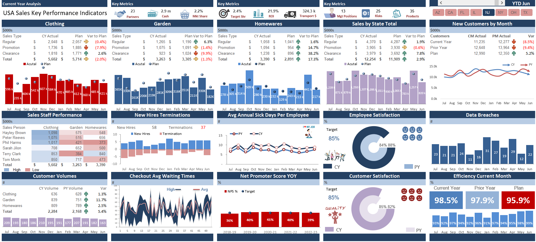
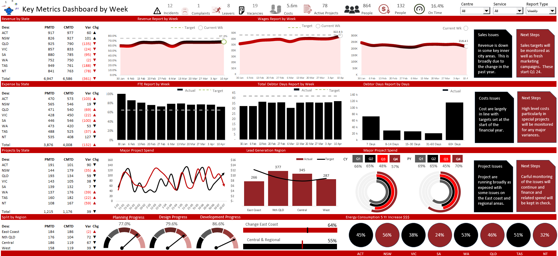
Key Metrics Dashboard
The latest dashboard for a new series of webinars for CPA Australia. This dashboard is packed full of features including a rollover function and heaps of charts, controls and conditional formatting. I adapted it from a more basic dashboard and now it has wings. Infographics, symmetry and consistent use of colour. All good in the dashboard hood.
Cost and Sales Dashboard
The following is a brand new dashboard. I was playing around with a file I had and started arranging the data in columns and it started to take shape. I added some charts for my client (changed the source data) and kaboom, completed dashboard with all the bells and whistles. It is very satisfying finishing a dashboard in Excel. Click the dashboard to see a larger version.
Storytelling with Excel Dashboards
Over this holiday season my colleague wanted to create a Power BI (PBI) prototype so I offered and with his data I made my first cut in Excel. I will be transferring the results to PBI in due course. The above would never fit into PBI but is a bit of fun with some of the results. Excel has the flexibility to generate the most visually appealing dashboards and with creativity and forethought you can create stunning results.
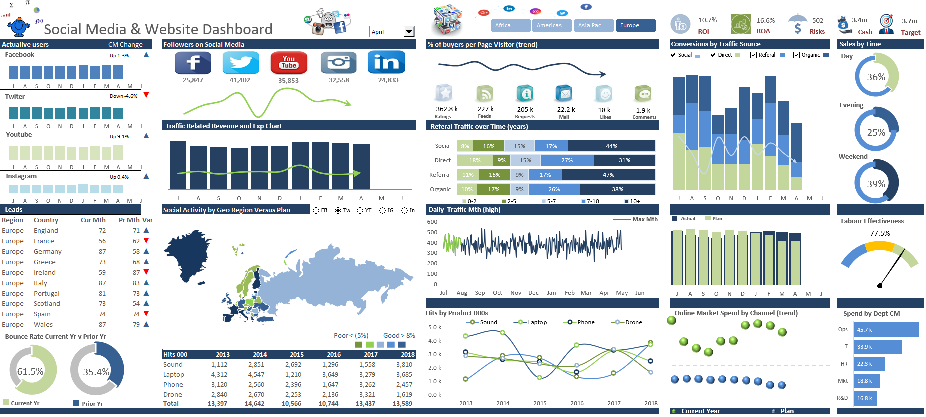
Website Traffic Excel Dashboard

This Excel Dashboard became a labour of love as the months passed and I slowly put it together. It has hundreds of data points and tells a compelling and ever changing story of website traffic and related metrics in a single page. You could take this Excel dashboard which has metrics like site visitors, site bounce rate, time people spend on site, page views per user, social media, paid traffic, organic and direct search traffic. The website tracking dashboard took longer to create than any other dashboard on the site. The term ‘the devil is in the detail’ is appropriate for this particular Excel Dashboard.
Dashboard Tutorial YouTube
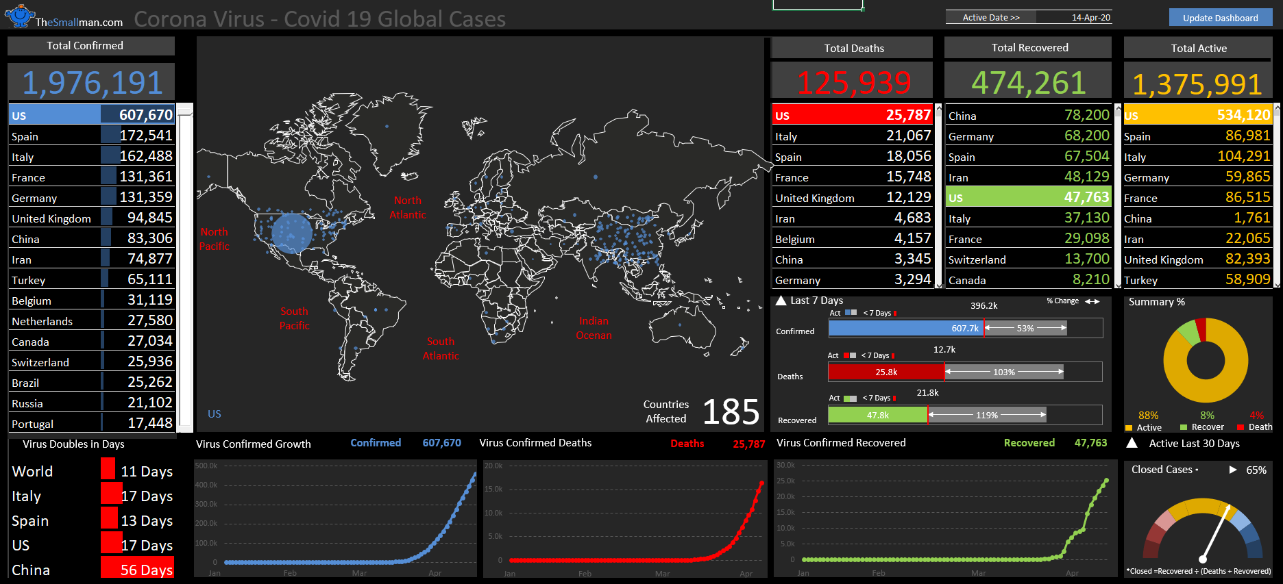
Dashboard Tutorial YouTube Since the start of the growing pandemic, the general public has become increasingly interested in numbers and statistics, so being able to quickly interpret and comprehend large quantities of information has become more important than ever. The following model outlines the crisis and tracks changes automatically. The creation of this dashboard will be run as a webinar for the Financial Modelling Meetup group. Link below to more details and registration.
Sound Charting in Excel
Recently I update my Excel charting course to include some additional charts I have been working on and some more detail in and around the calculations pages. The final output is presented in a well laid out design presented in three horizontal areas and four vertical areas, will some details and comparisons at the top. Enjoy.
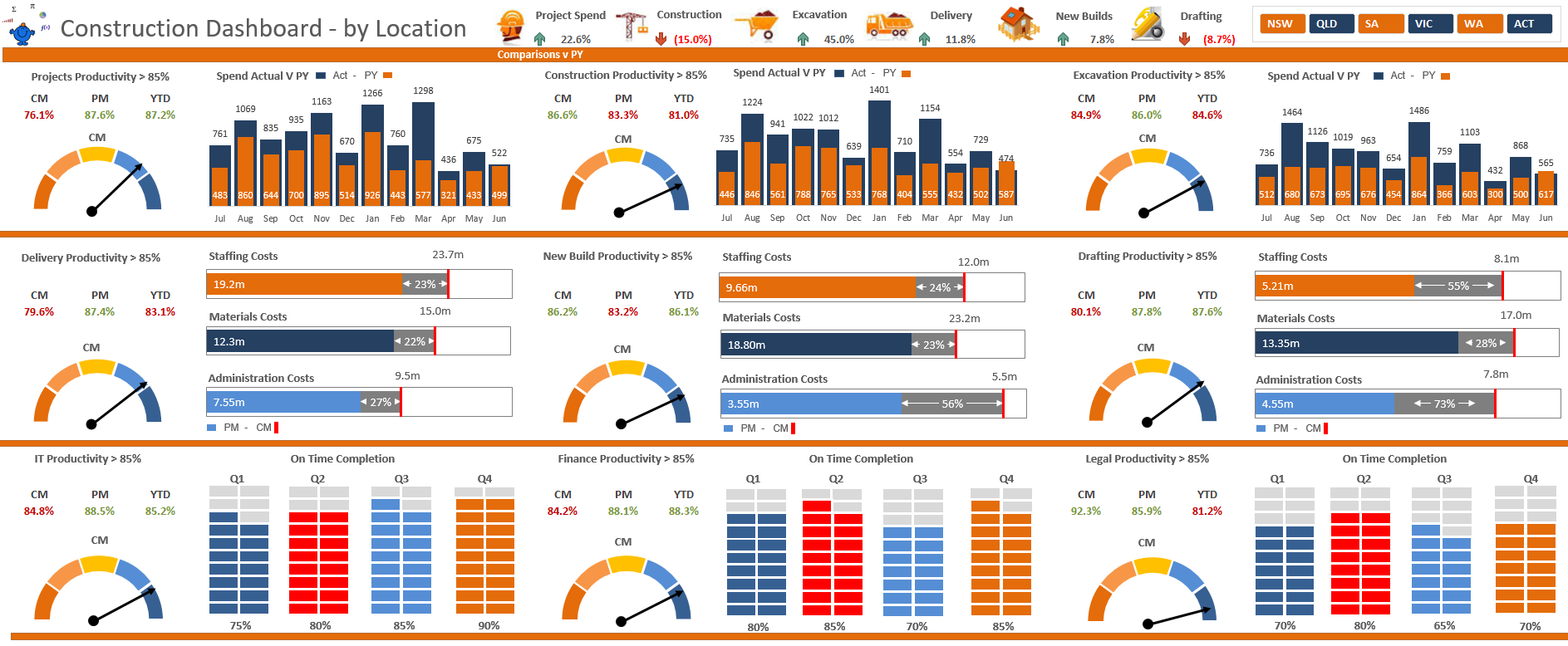
Construction Dashboard Metrics
Had a client ask to track some key metrics. Started with a neat dashboard template and build on it. Split into three levels the dashboard displays information by state and gives some of the key performance indicators for each of the business areas. I am not sure how I will use this Excel dashboard but most likely it will be the basis for a future course.
Corporate Reporting Excel Dashboard
Occasionally I have a little time on my hands and I can update one of the dashboards that i devised many years ago. The following time is such a time. I added a fresh section to the following dashboard and made it spin by regional area. It is neat and to the point providing a high level overview of key operational metrics. The smaller version is available free to download at the following link. Alternatively you can get many dashboards of this quality at my premium section.
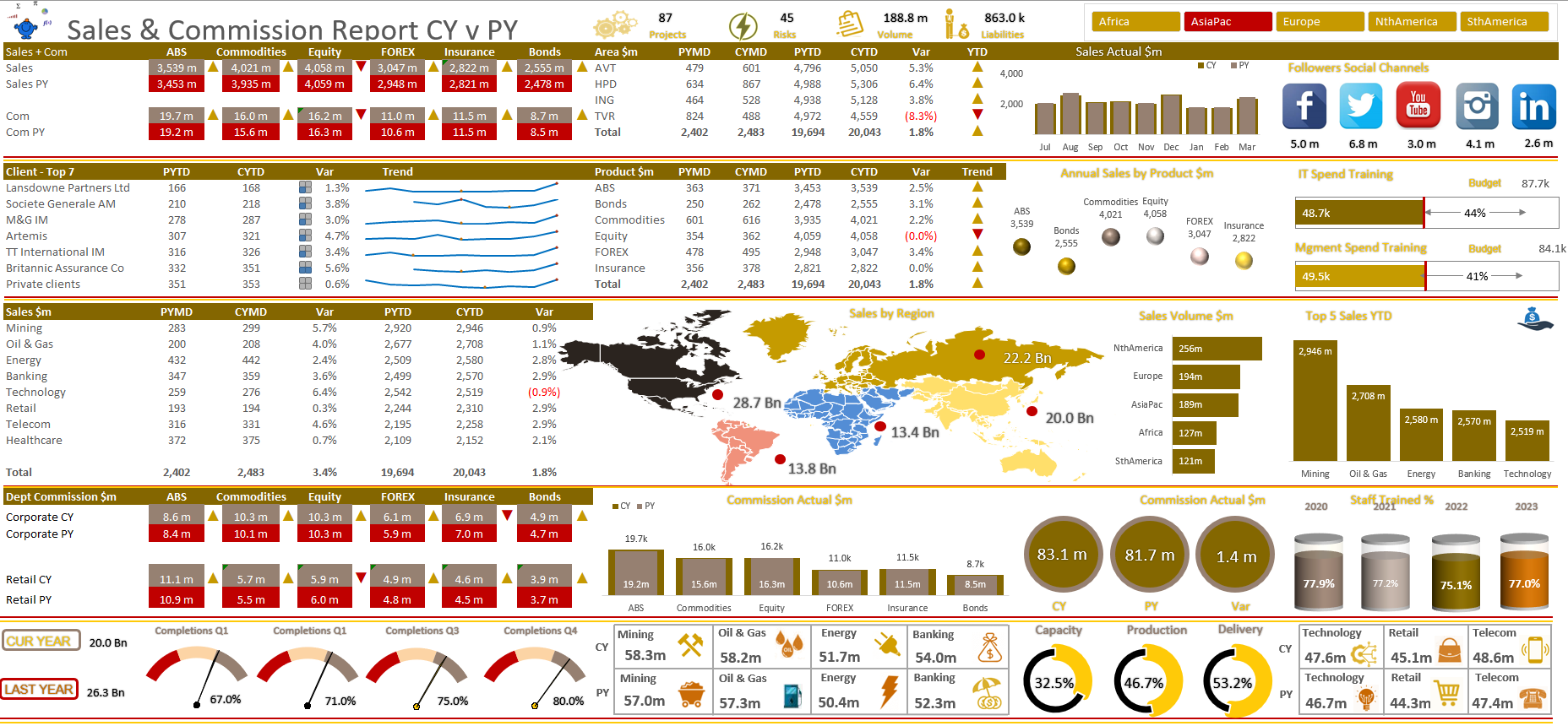
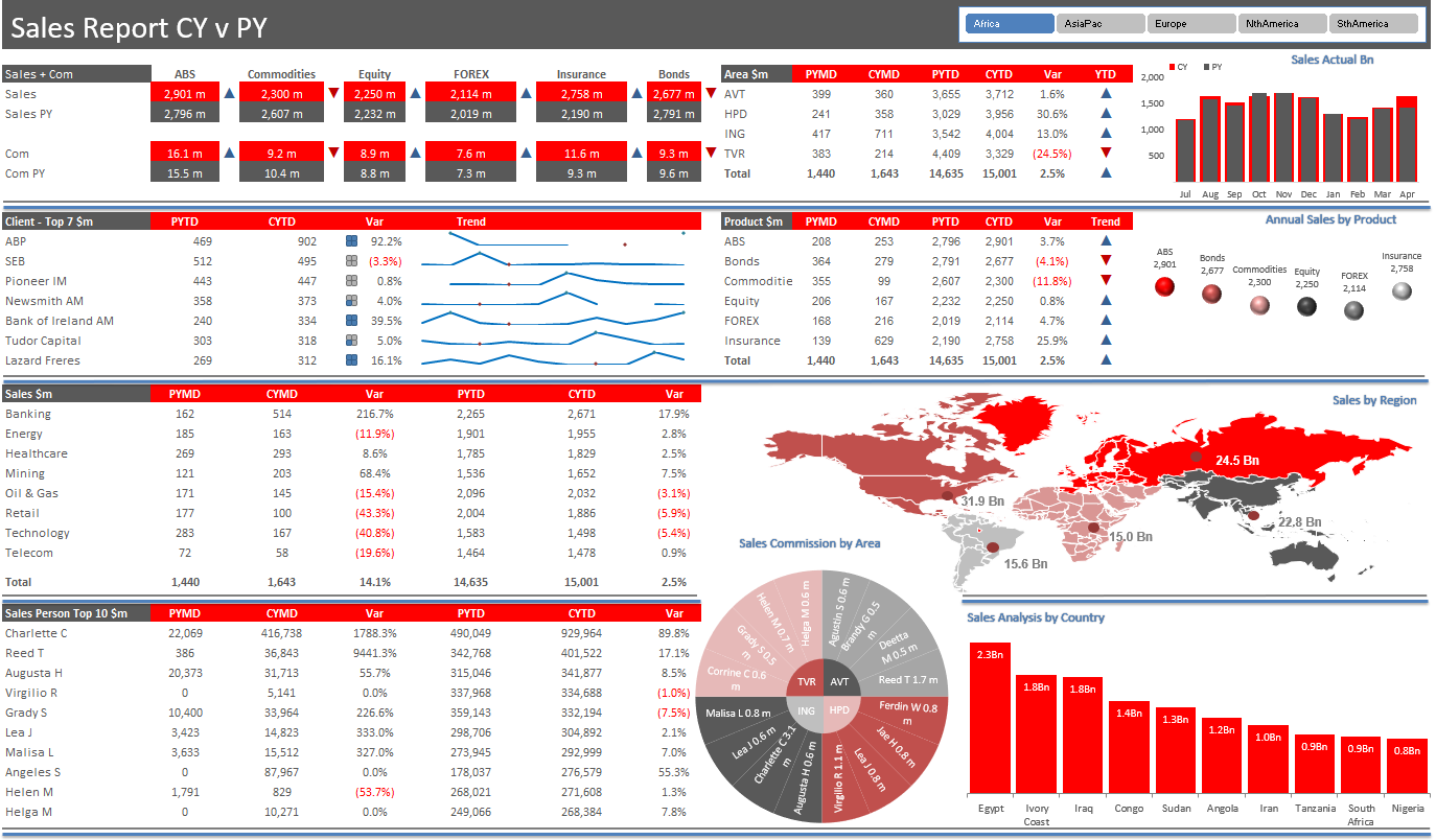
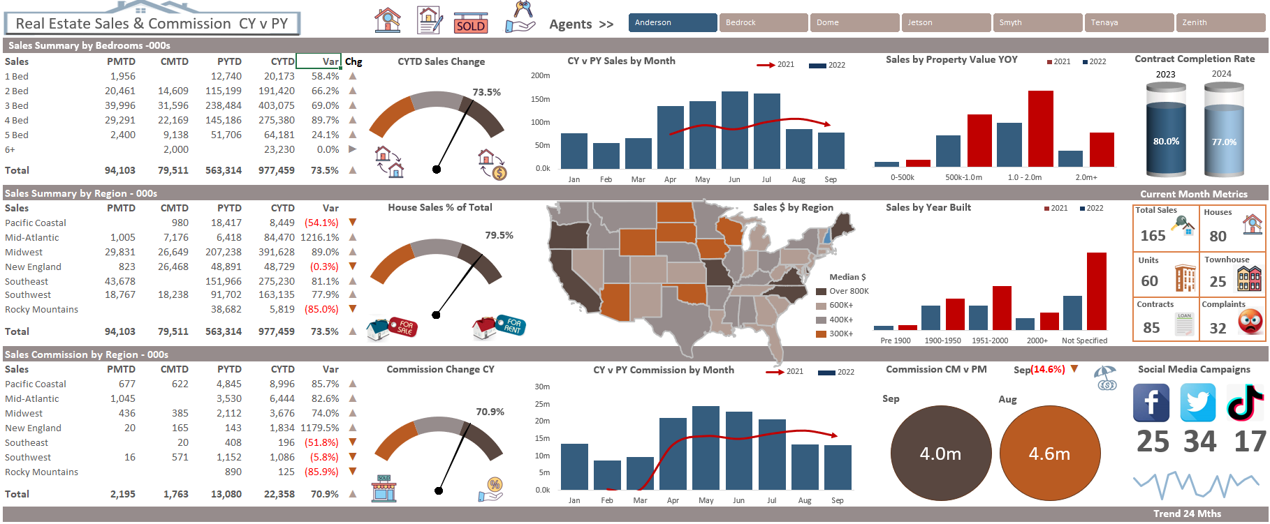
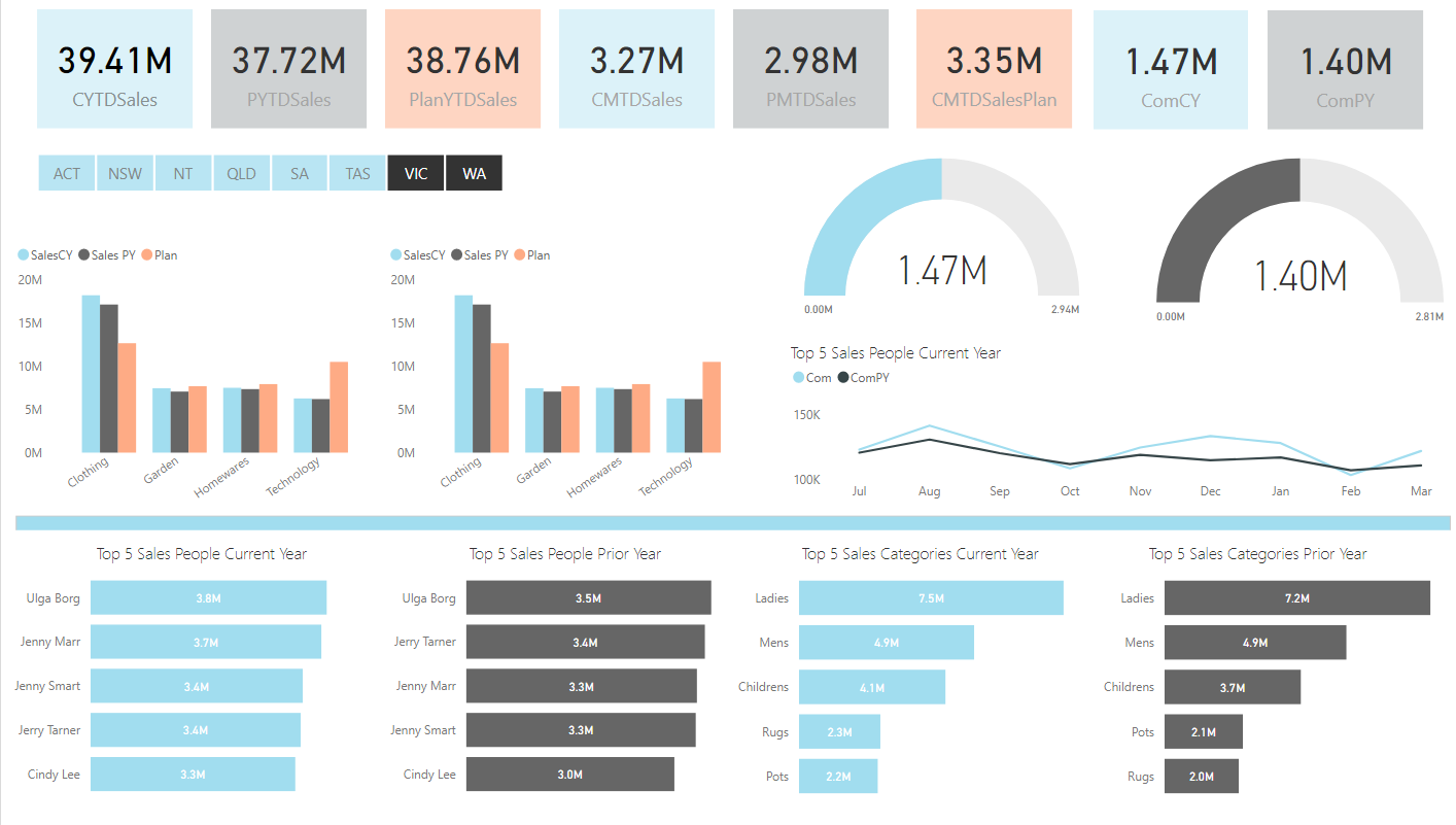
Sales & Commission Excel Dashboard
The following Excel dashboard is a summary of seven departments within a banking environment. It summaries the financial performance by region showing sales, commission, performance against plan and prior year to data and some human resources metrics by each department. It displays the data in a clear structured format providing a sound overview of key organisational metrics. A link to the blog article which has more details on this dashboard is as follows - Cool Dashboard You can get many dashboards of this quality at my premium section.
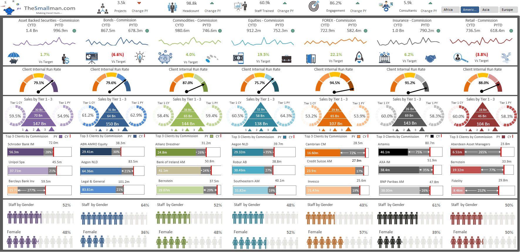
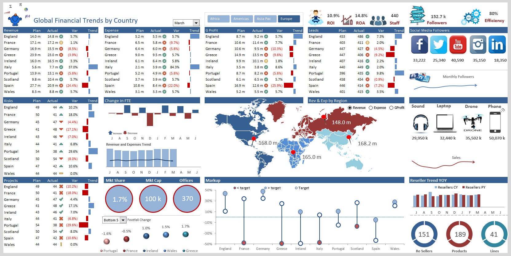
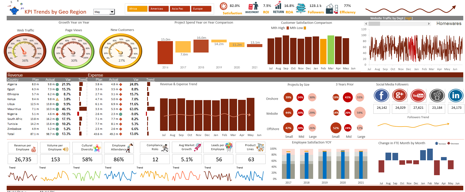
Multi-National Excel Dashboard

During the later part of the year I had some time on my hands and decided to add to the dashboard stable. The dashboard will spin on global region, Americas, Asia Pacific, Africa and Europe. It shows you month of the year, can go forwards and backwards and provides comparisons with plan and prior year data to show a meaningful comparison. I do hope you enjoy.
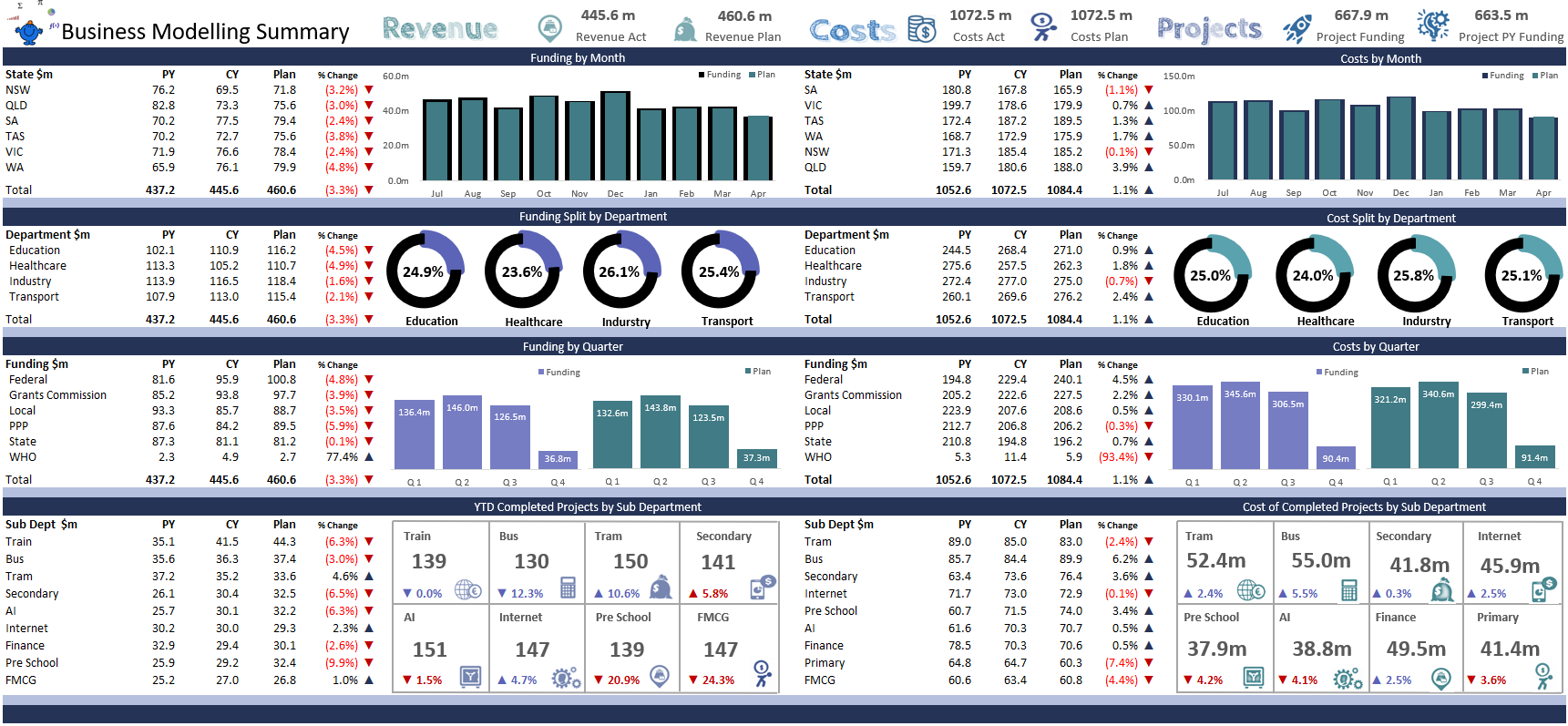
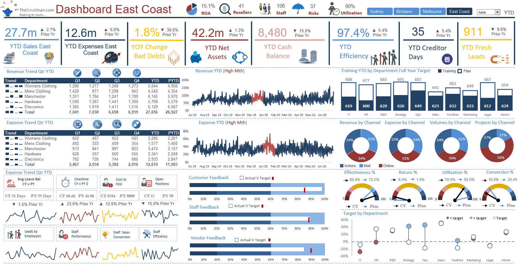
Full-Year Rolling Excel Dashboard
This dashboard was created for a client and has been modified slightly to protect the innocent. All of the images in the Excel dashboard are in fact Excel charts. It took a while to get all of the charts just right but has a striking final look and feel. The dashboard is split into 4 areas with current and prior year comparisons and data validation. You can get many dashboards of this quality at my premium section.
Annual Results Excel Dashboard
This dashboard was created in my spare time over the holiday period at the start of 22. This was the baseline for one of my early courses and I make it a little larger in size and dimension to show more results. It is a roll over dashboard that changes when you hover over the years at the top of the board. While the dashboard is over 10 years old now it sill performs well and tells a broad story about the state of the organisation. You can get many dashboards of this quality at my premium section.
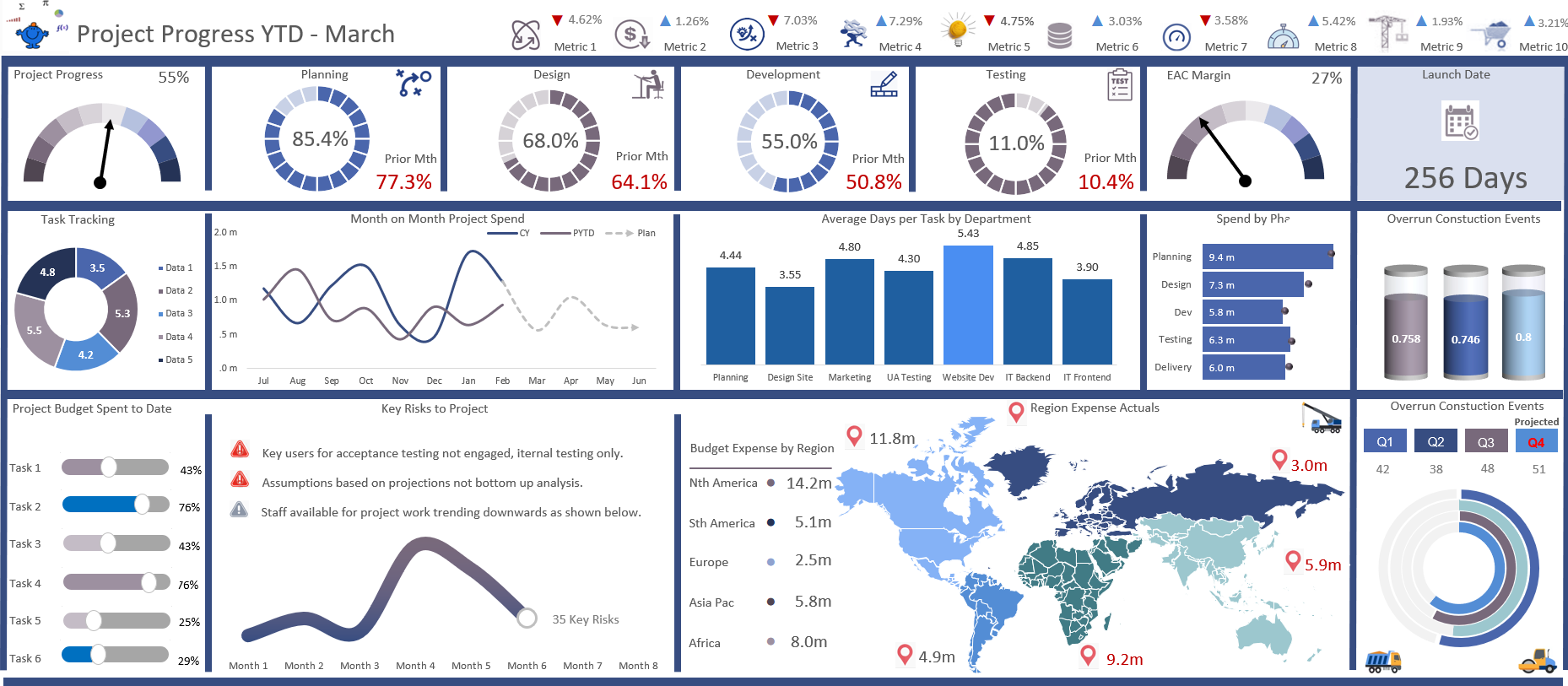
Project Tracking Dashboard
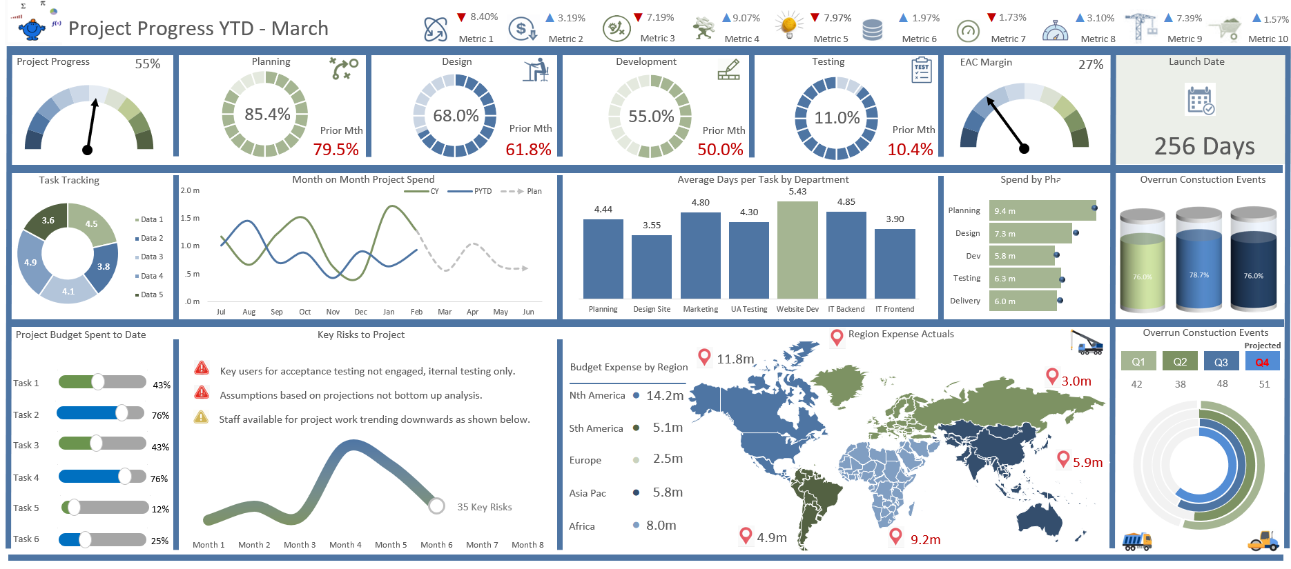
Project tracking dashboards are a way to monitor how key metrics are tracking on a dashboard over the life of a project. They can flag when parts of a project are going poorly and help with the maintenance of the project as much of the information is right there in front of you. The project dashboard helps inform and if done thoughtfully will add a great deal to any business. Try creating your very own project tracking dashboard, an example output is here to help.
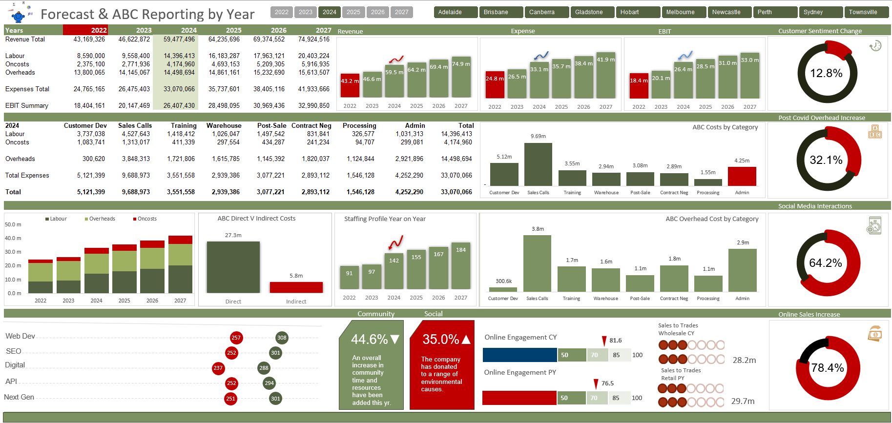
ABC Dashboard Design
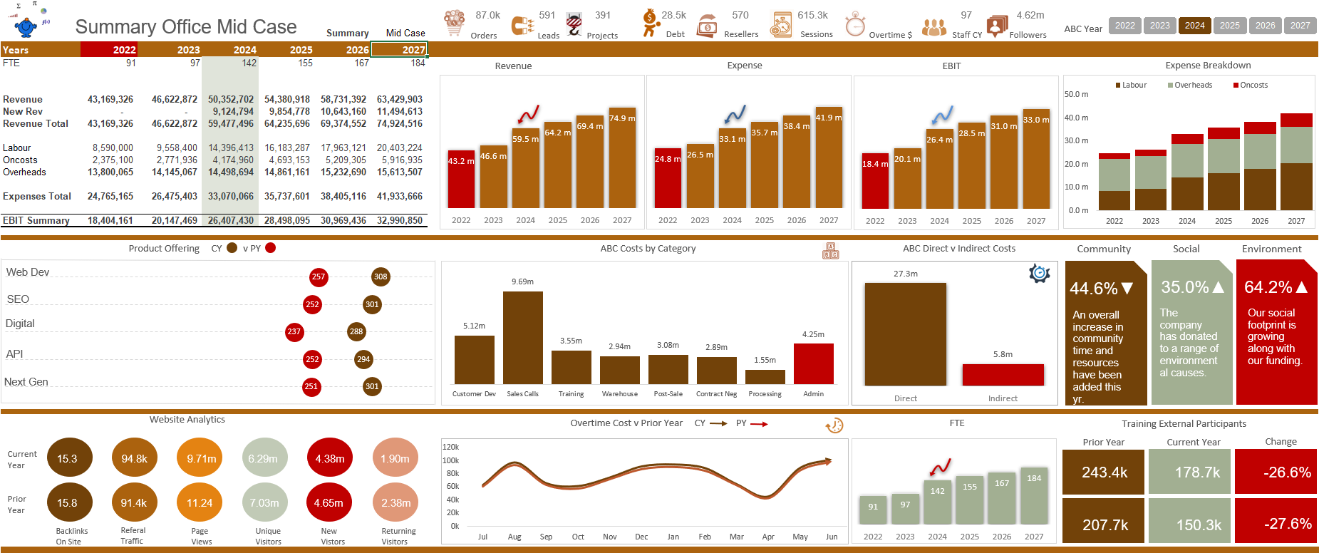
The following dashboard is the output for an activity based costing course which I conducted for CPA Australia. I thought it might be nice to have a very visual display as ABC reporting can be a little number intensive. I quite like the result and it gives you the ability to choose a year of focus for the P&L and the ABC reporting.
Reporting Dashboard

The following reporting Excel dashboard was inspired by an existing dashboard in this list of dashboards. It looks totally different but uses the same data set. It goes to show that you can use the same data to produce a number of high quality outputs that look completely different. I hope this dashboard inspires others to create works of wonder in their day to day Excel creations.
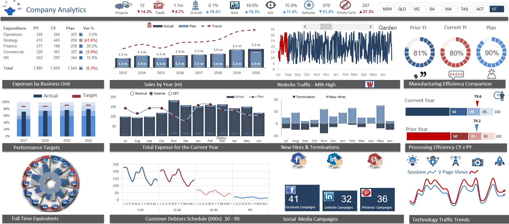
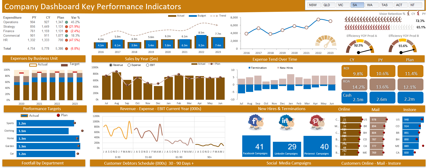
Company Key Metrics Dashboard
The financial tracking dashboard was the baseline dashboard that I created for a client. I have white labelled it to protect the innocent and some of the data is randomised for that purpose. It give a snapshot of a small component of a companies activities. The dashboard is neat and to the point. Client was very happy.
Web Data Dashboard
The website tracking dashboard is one I have had on file for a number of years. I just pulled it out to see if I could sharpen the dashboard and was reasonably happy with the result. The raw data is pulled directly from a website and the key metrics are updated on a monthly basis. Much of the report can be changed by month or by region. Dashboards in Excel are hard to beat for look and feel as you can manipulate the length and width, add pictures and the charting of Excel is extremely flexible. Hope you enjoy.
Real Estate Dashboard
I started creating a real estate dashboard with the intention of reaching out to the company who posted the raw data for a collaboration but by the time I finished I was unable to find the post and decided to post my results here for the world to enjoy. I will make this available in my premium models in the coming days so perhaps some company in the US can benefit from the raw data and work that I put in to create this Excel dashboard. Enjoy gently.
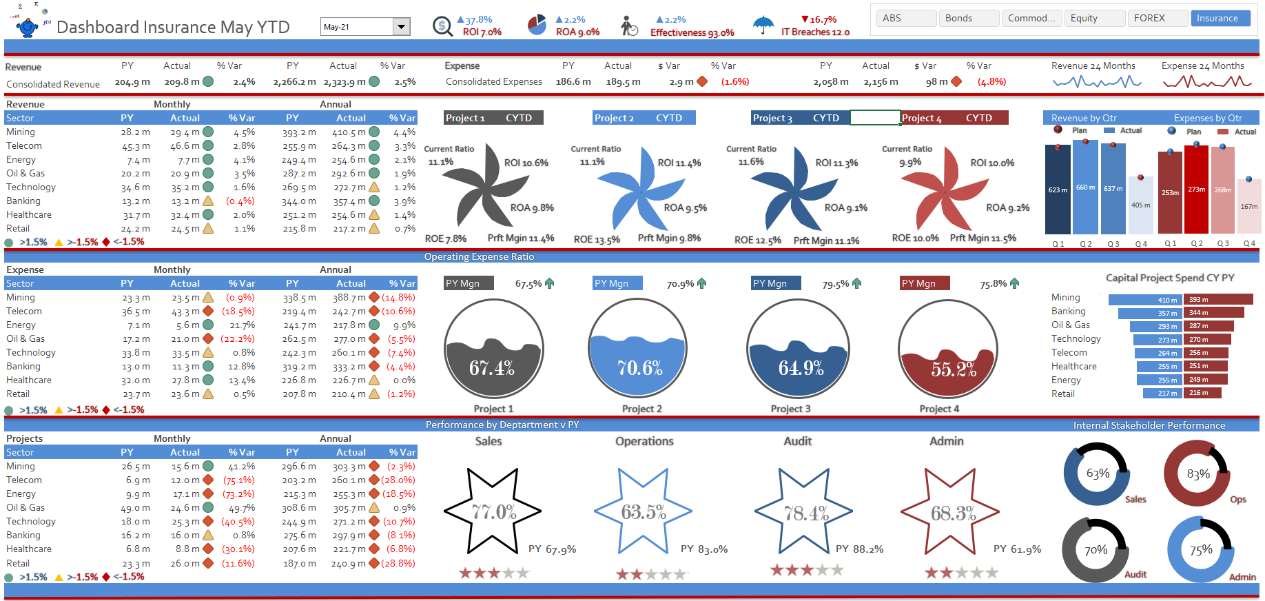
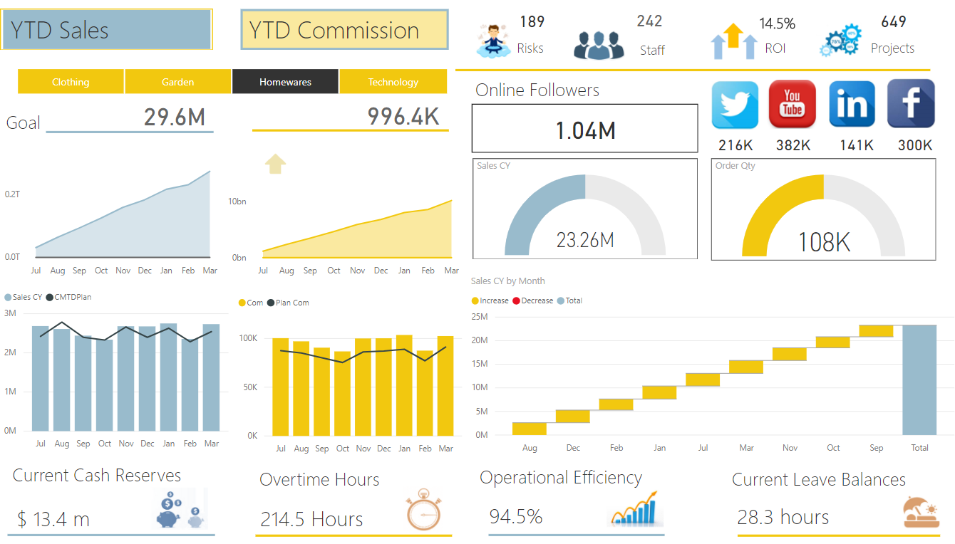
Finance & KPI Dashboard
The following is an enhanced version of the financial modelling and activity based costing training course that I run. It lets management look at traditional profit and loss reporting along side the more time consuming activity based costing report so the numbers can be expanded into activities. Any report that allows deeper analysis into the origin of the spend is going to be highly valuable in a corporate setting. The report allows the user to isolate the data by year and by multiple geographical locations at once. It is a neat dashboard that requires very little effort to maintain.
Wind Turbine Dashboard
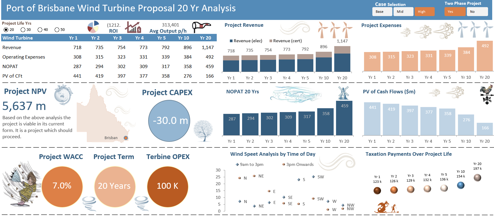
The following is an Excel dashboard that I created many years ago for a friend of mine who had 600 students in his finance class at a local university. The project was to create a wind turbine financial model with projections for 20-50 years into the future. I created a model based on the underlying data and presented the model to the class in a lecture theatre. It worked out rather well and the resulting dashboard I was quite pleased with. Enjoy gently.
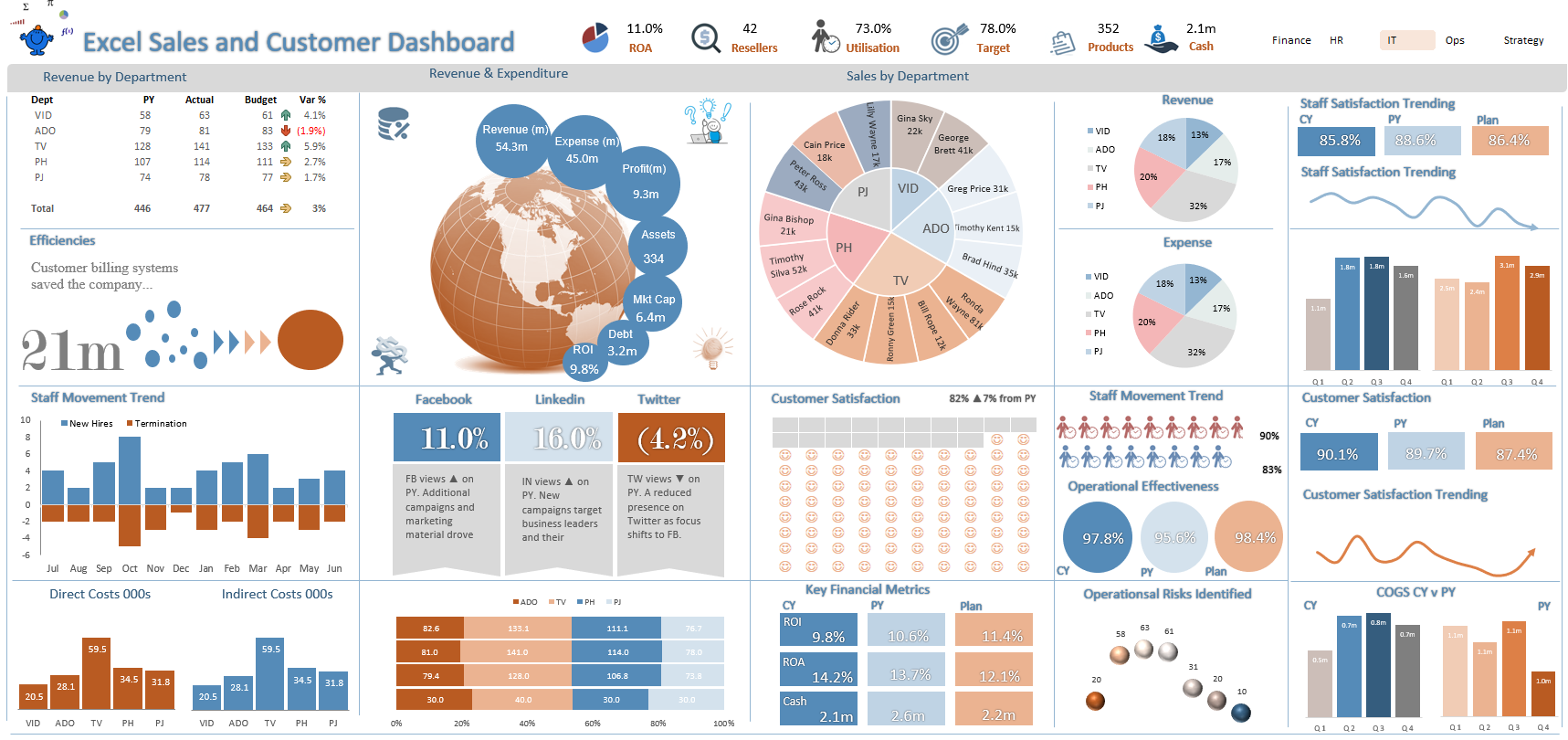
Excel Finance Dashboard
Data collection is a crucial step in understanding how your projects, finances and general metrics are progressing. Excel spreadsheets are the ideal tool for managing all that data in a single place. But data by itself is just a collection of numbers. The following dashboard corrals the data into a meaningful one page report where the month and region can be changed quite easily. The file has a number of worksheets that feed into key calculations pages and updating the dashboard is a matter of replacing the existing data.
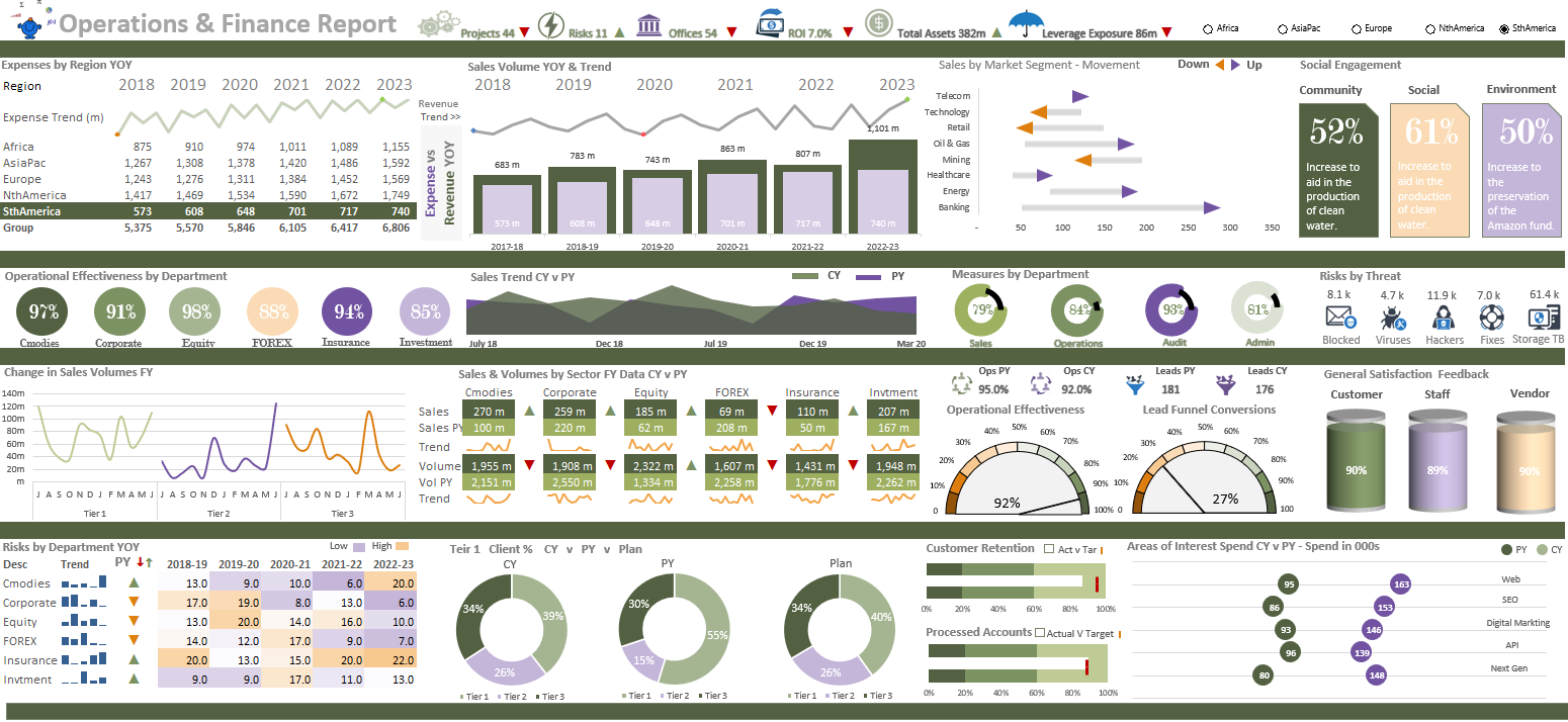
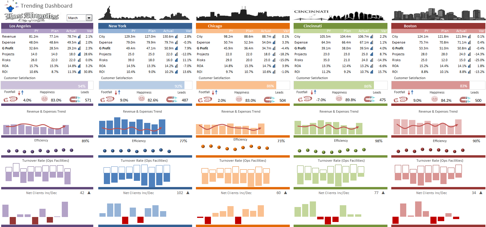
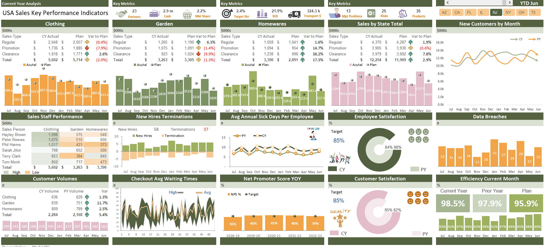
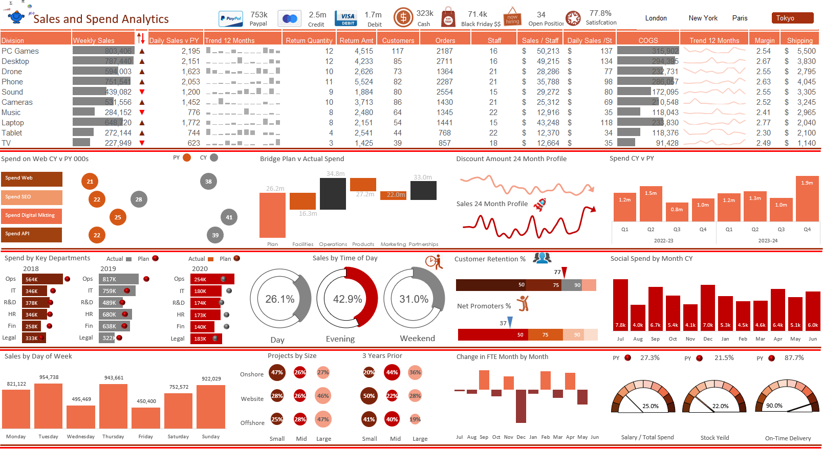
Major City Dashboard
The dashboard looks at a range of sales and expense metrics, compares actual to plan to prior year to date positions with variances. It has a bridging waterfall chart which operates over several years and a number of other charts including a modified gauge and some interesting plan v actual charting solutions . The report uses a slicer to compare each geographic region however this could be easily changed to spin the model by department or product or operational area. Additionally the report considers metrics about customer numbers, staffing, sales volumes and cost of goods sold.
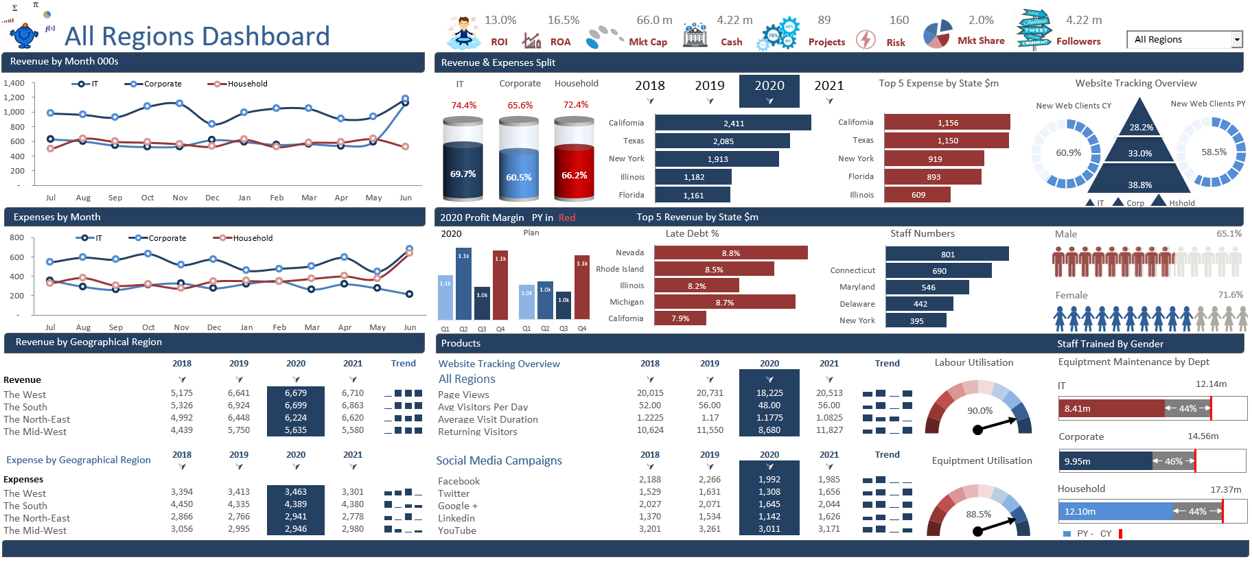
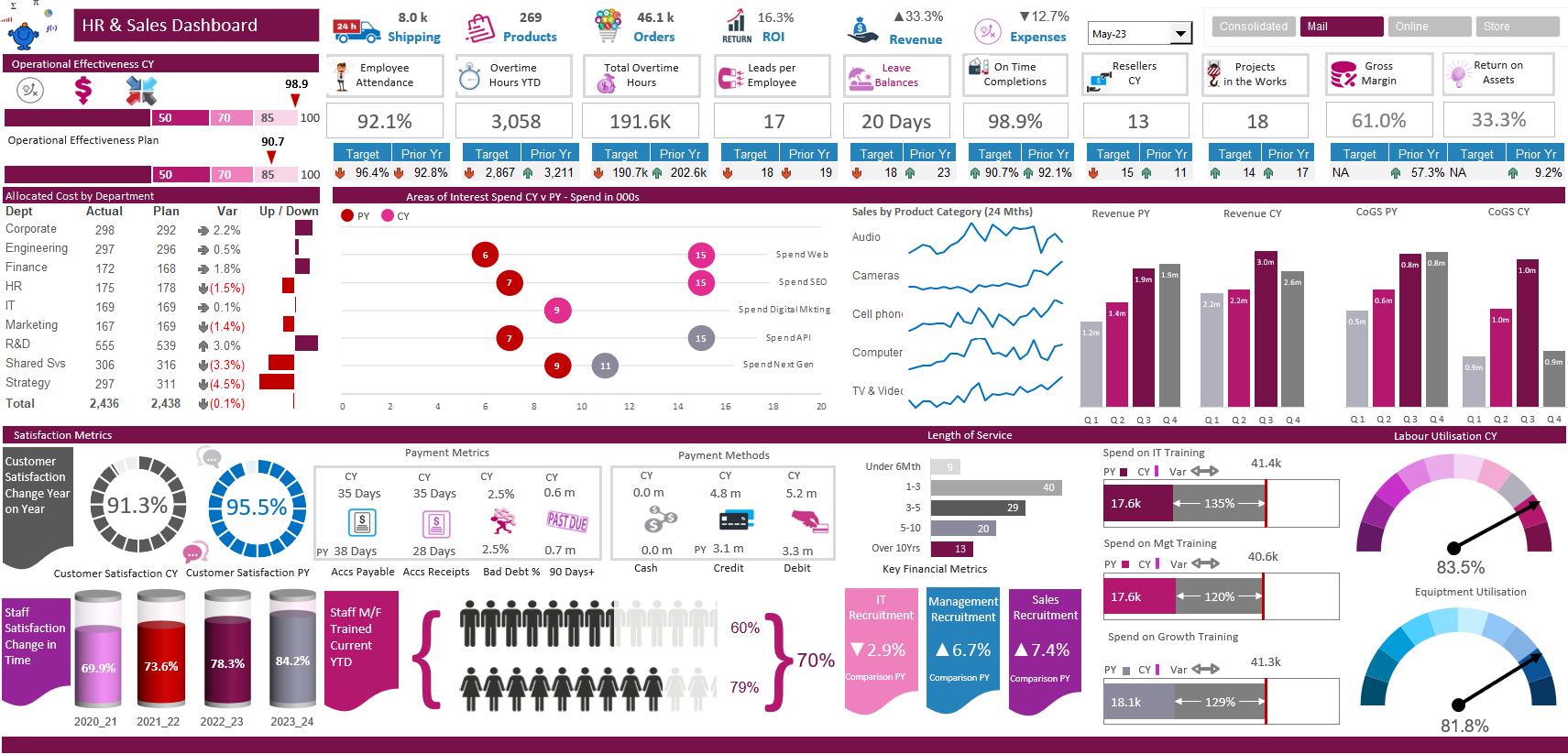
Key Geographic Trends Dashboard
The dashboard looks at a range of key metrics and charts them in a number of different ways. There are spark lines and bar charts in conditional formatting. The metrics compares actual to plan and prior year to date positions with variances in bar charts. The report compares each geographic region with a slicer at the top. Additionally the report considers key operational and staffing metrics alongside on another for comparison.
Excel Balanced Scorecard Dashboard
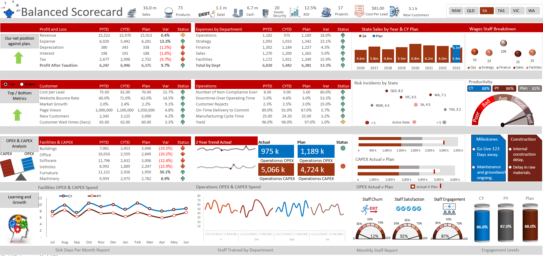
The balanced scorecard is one of my favourite dashboards. We have just given this dashboard a revamp. It tells a compelling story for each of the state regions in the one pager. It has a neat feature at the bottom of the board are three charts and the chart will change to a different chart type based on the performance of the metric. Not often in a fixed place you will see a chart change from a line to a bar chart. But here we are. It is so enjoyable creating these business metrics. I do hope you enjoy.
Key Metrics Excel DashboardDashboard
This company key metrics dashboard has been my charting course for a number of years. The course has undergone a range of iterations and new charts have been added and removed over time. The end goal is to show how to create a range of charting metrics and order them in such a way as to generate a neat Excel dashboard.
Power BI Finance Summary
Power BI dashboards provides a tool for business users to show their most important metrics in one place, updated in real time, and available on a multitude of different devices. With one click, users can explore the data behind their dashboard to help find the answers to important operational questions.
The same broad concepts that are used to create Excel dashboards can be used to create dashboards in any program. Once you learn the basics, the application is a matter or repeating those concepts. The adjacent dashboard is a Power BI model that compares Sales figures for the current year versus the prior year and plan based on the region which can be selected using a slicer.
Power BI Overview Report
The genuinely cool thing about Power BI Dashboards is how easy they are to create once the raw data has been input and manipulated. The data can be turned into charts and tables with the click of a few buttons and the interface is very user friendly.
Power BI can unify all your organisation’s data, whether in the cloud or on-premises. Using Power BI you can connect SQL Server databases, Analysis Services models, and many other data sources to your same dashboards in Power BI. If you already have reporting portals or applications, embed Power BI reports and dashboards for a unified experience.
Key Metrics Data Report
This company key metrics dashboard has many different metrics to absorb. The data has undergone a range of iterations and new charts have been added and removed over time. It presents quite a bit of information on a single page.
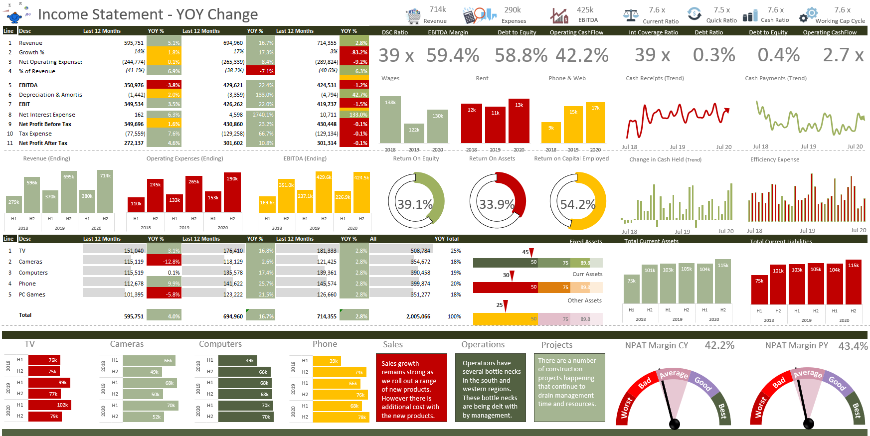
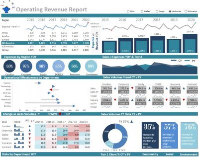
Revenue & Expense Report
The following dashboard has been adapted from its original version. The dashboard combines both revenue and expense data to generate a neat one page report outlining the key KPI data with a focus on the revenue and expenses.
Cash Flow Statement
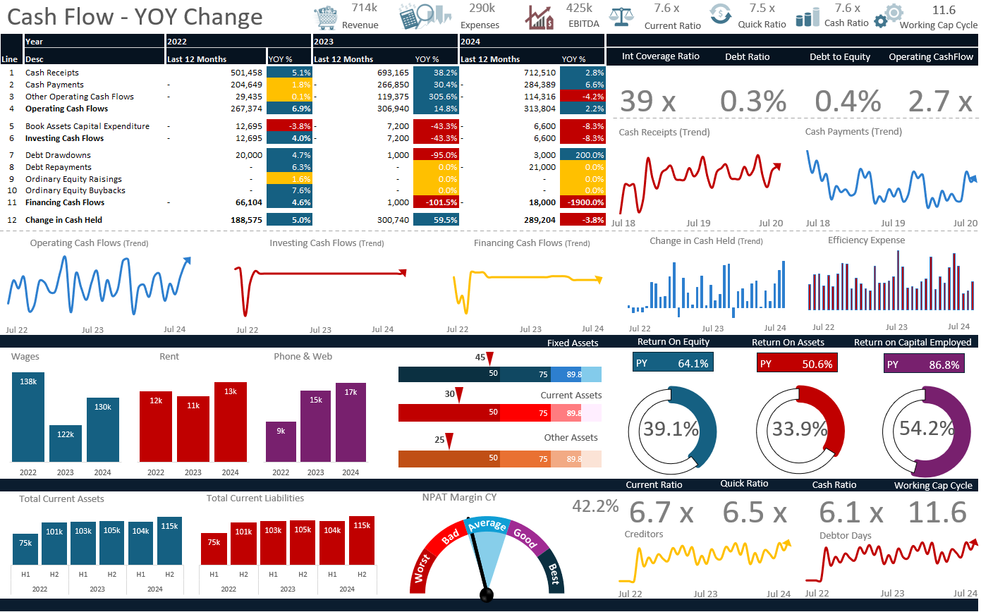
This company cash flow metrics dashboard has many different metrics to absorb. It is primarily cash flow data however there is some balance sheet information in the dashboard. The data has undergone a range of iterations and new charts have been added and removed over time. It presents quite a bit of information on a single page
HubSpot Dashboard
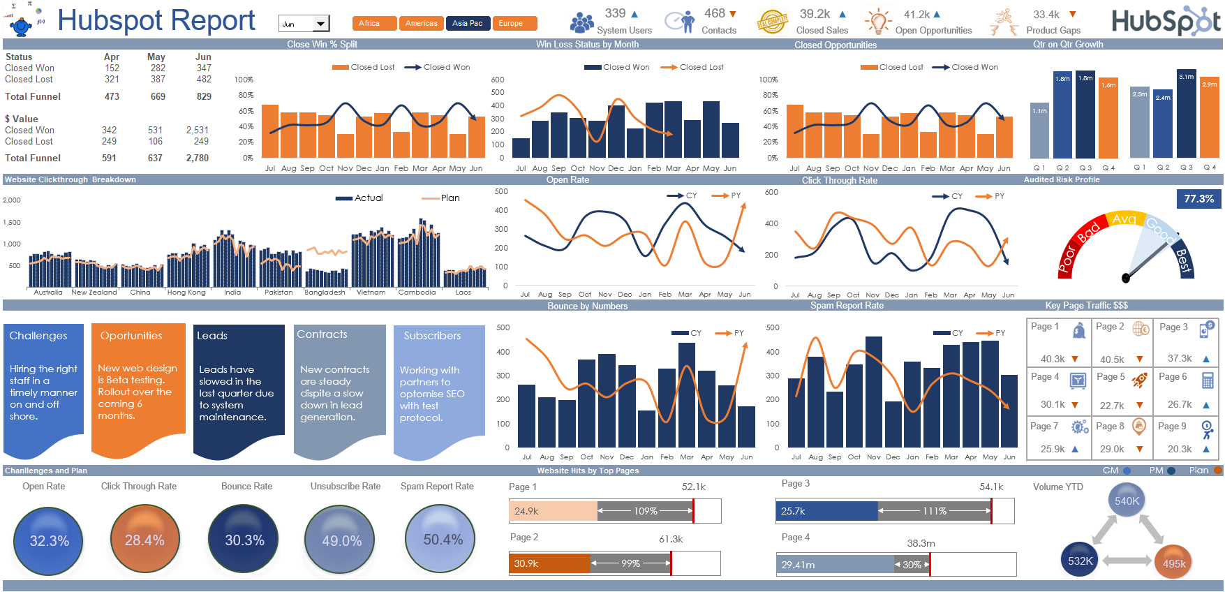
This is a hubspot dashboard that has many different metrics to absorb. It is a consolidation of hubspot data in a single page. The data has undergone a range of iterations and new charts have been added and removed over time. It presents quite a bit of information on a single page without being over busy. The dashboard has a slicer by region at the top and a drop down by month both of which allow the user to change the focus of the dashboard