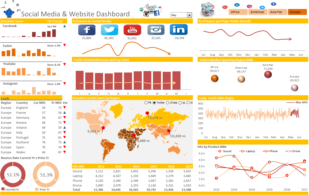
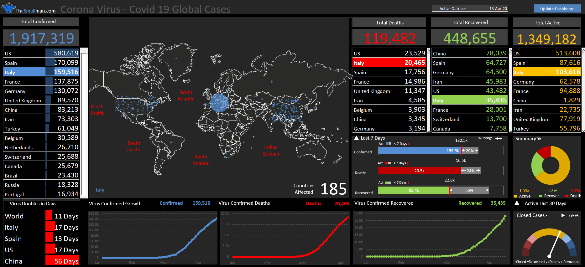
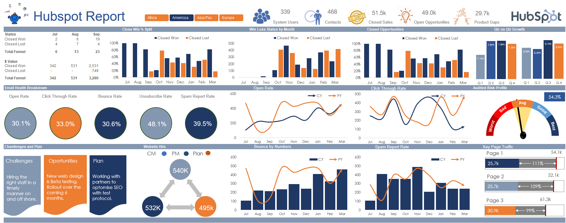
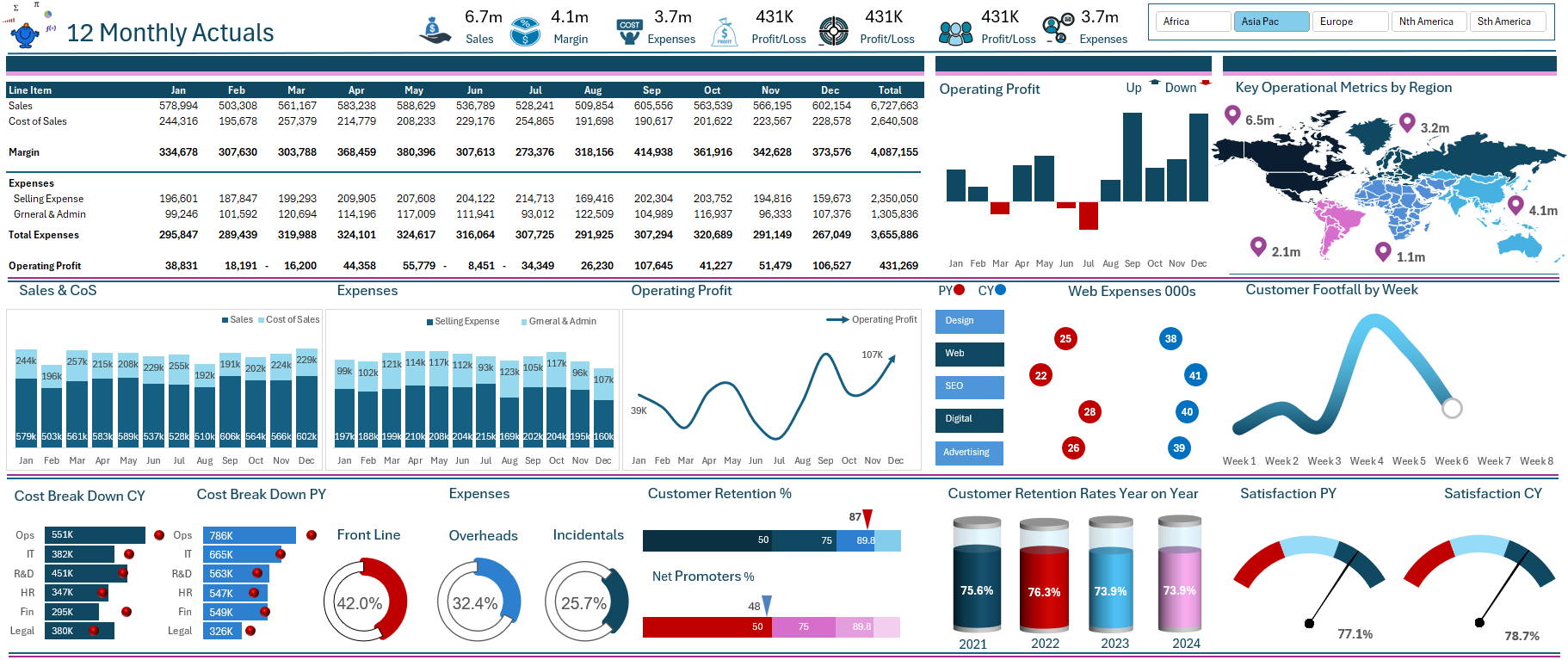
Here is another take on a social dashboard in Excel. It is a bit different from my first attempt many years ago. The data is arranged in a very different way - there is more data this time. In the world of dashboarding you are only limited by your own imagination which in my opinion is limitless.
This dashboard takes a large amount of data over a number of metrics and presents the main elements into a succinct summary. The dashboard moves via a slicer on geographic region and a combo box which restricts the viewing to the year to date depending on the month chosen. The use of the NA function is the key behind hiding data which you don't want to see. Have a good look at the workings and the file set up. If you are familiar with the files on this site you will see a common pattern.
Enjoy the journey!
