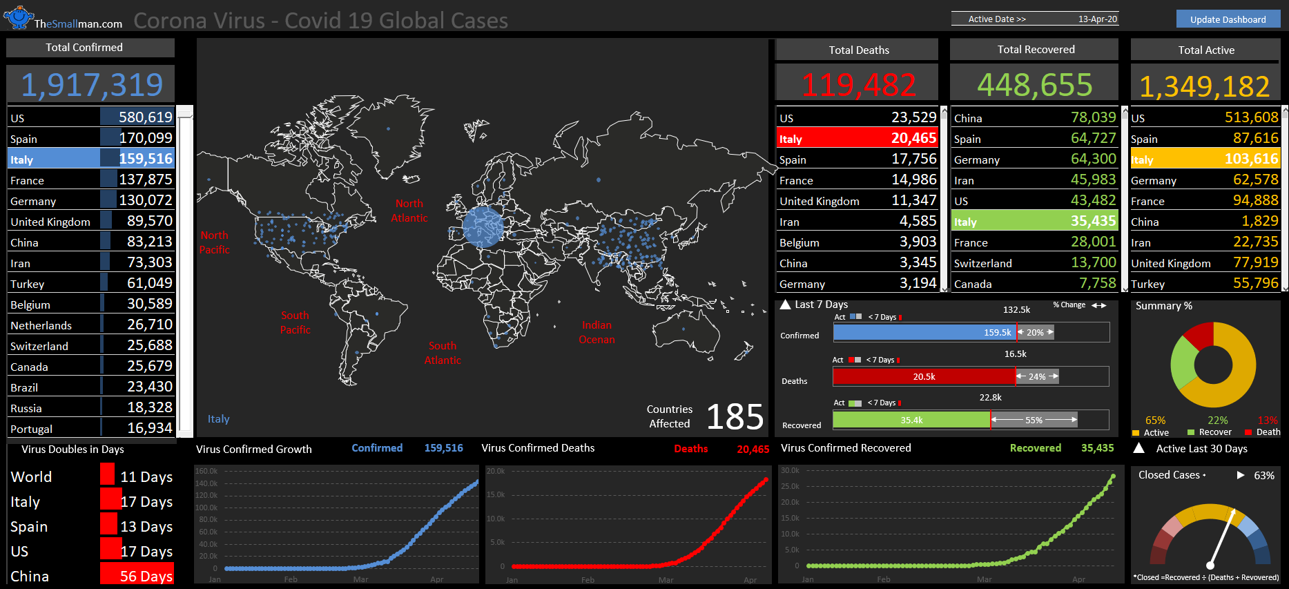
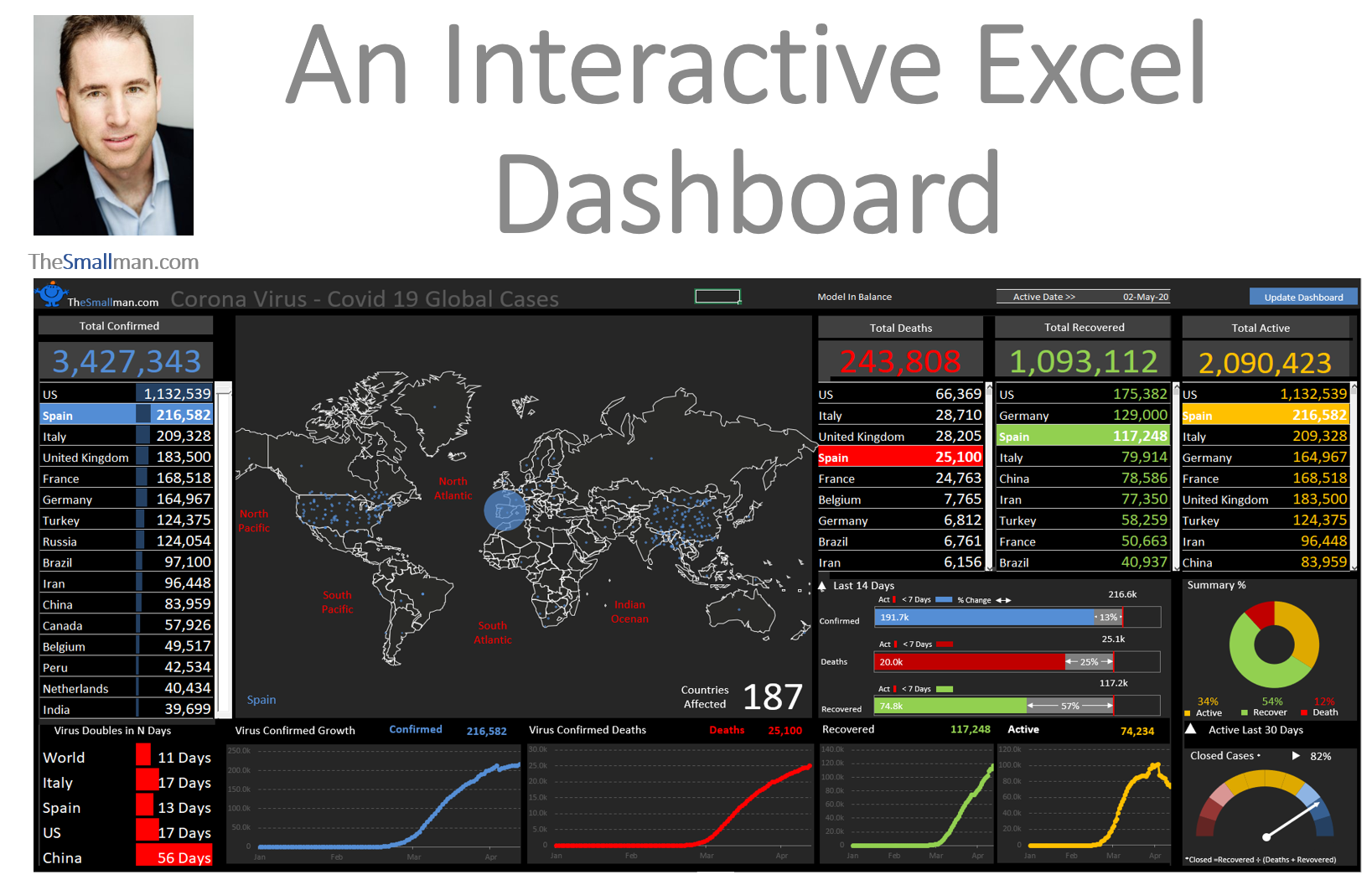
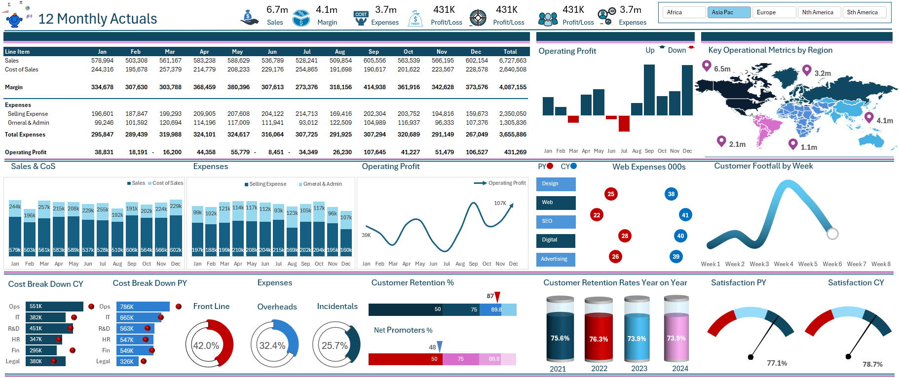
The following is the YouTube tutorial on how this dashboard was built from scratch. The Excel file you will need to follow along is below.
A YouTube tutorial that takes participants through the tracking of a crisis.
Since the start of the growing pandemic, the general public has become increasingly interested in numbers and statistics, so being able to quickly interpret and comprehend large quantities of information has become more important than ever. Join us online to hear from Excel specialist and financial modeller Marcus Small as he shows us how he built a dynamic dashboard model using standard Excel tools to track the COVID-19 outbreak based on data from the John Hopkins University C-19 website. The focus of this session will be on taking large amounts of data and turning it into understandable and easily absorbed information in Dashboard form.
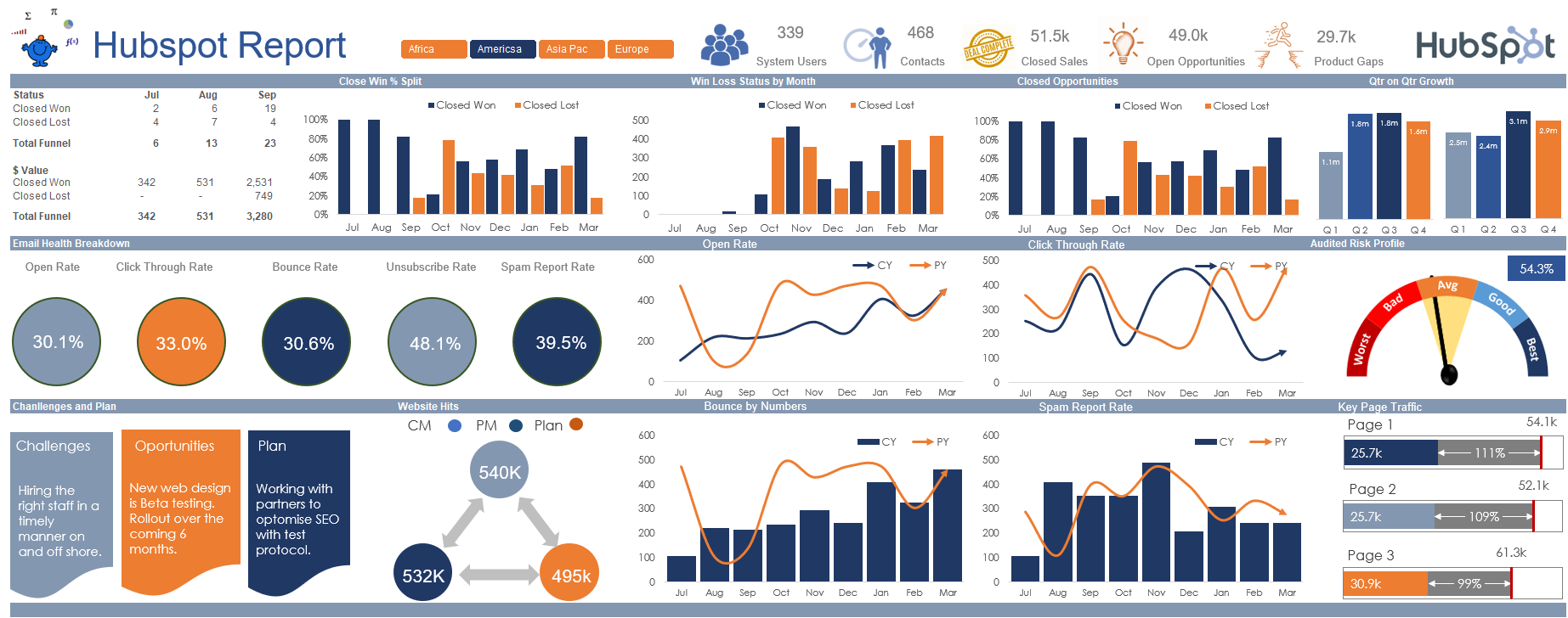
The bar charts in the report were modified from ClearlyandSimply.com Robert Mundigl is a savant and his website is a treasure trove of unique techniques which he has perfected. Check it out.
The session will cover:
The setup of a Power Query custom function to extract multiple web based flat files instantaneously.
Changing the source data into a tabular dataset so it can be tapped for information on a range of metrics.
Create customised charts XY Scatter inside stacked bar charts and heat mapping charts from scratch.
Creating custom functions in combination with conditional formatting to make the model spin using a “one cell to rule them all” methodology.
Setting up a dashboard according to your users’ requirements; key things to do and what to look out for.
General questions about the makeup of a fully automated dashboard model, how to replicate this method time and time again.
The video is 95 minutes long but it is time well spend as I cover a lot of valuable information that can be practically applied to your tasks at work.
Hope you enjoy the tutorial on YouTube.
