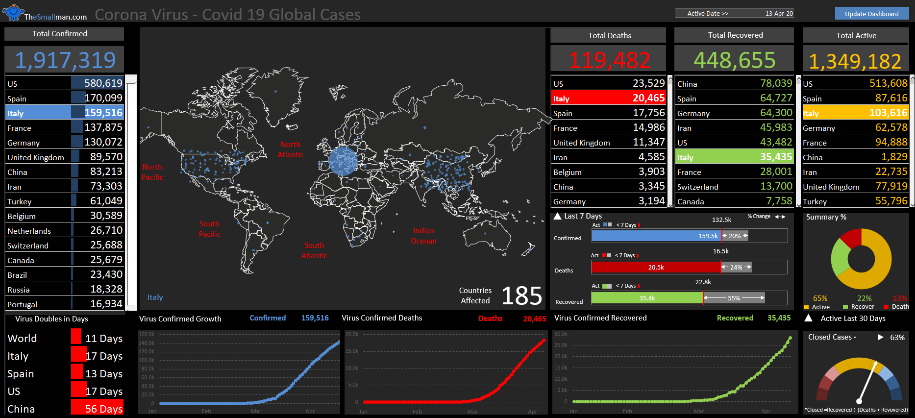
Over the past few days I have taken one of my infographics and weaponised it into a fully functional dashboard. I took a baseline and added more data, more formulas, used my one cell to rule them all methodology. The starting point is as follows and forms one part of my 3 part infographics webcast.
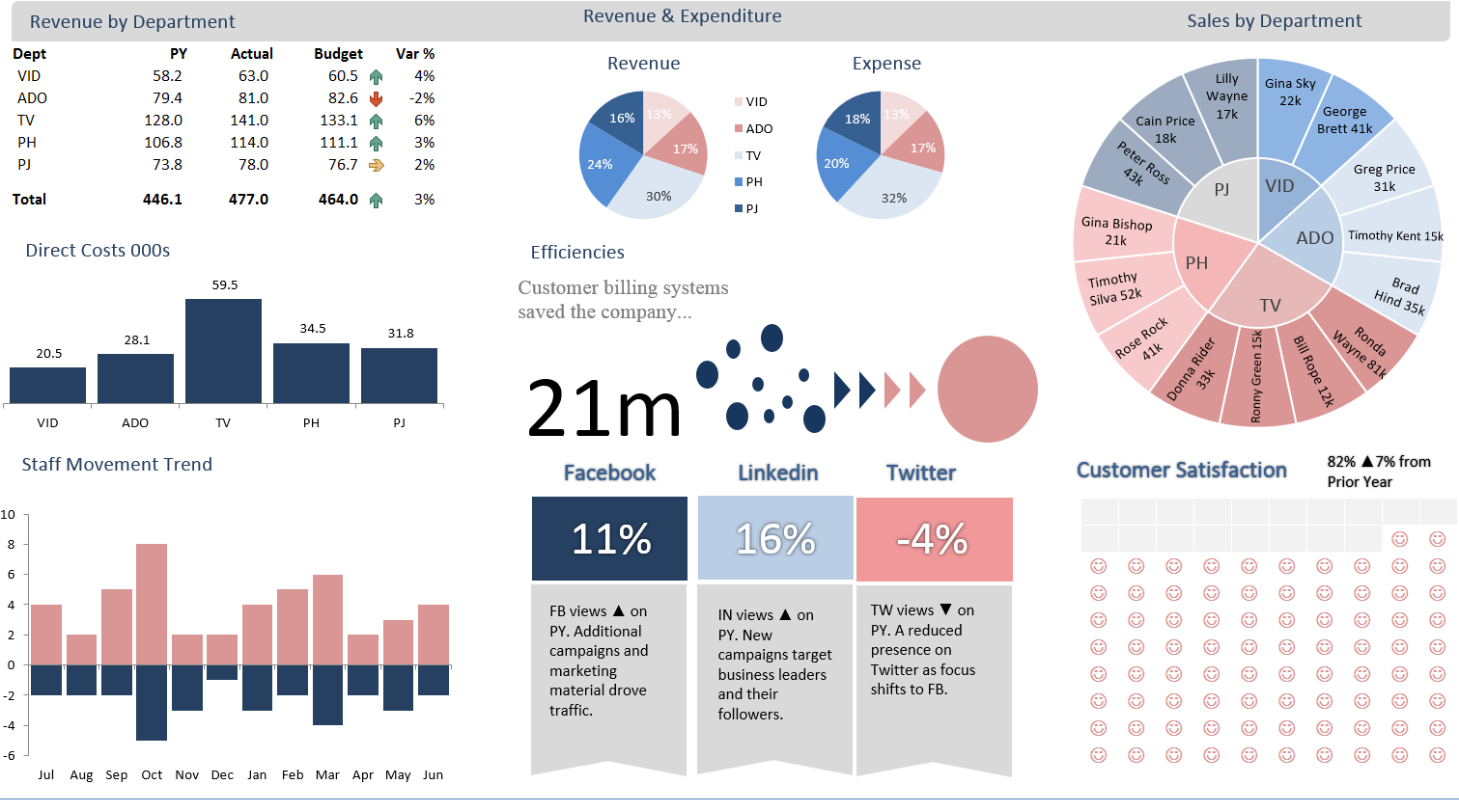
Baseline Infographic which I used to transform into a dashboard.
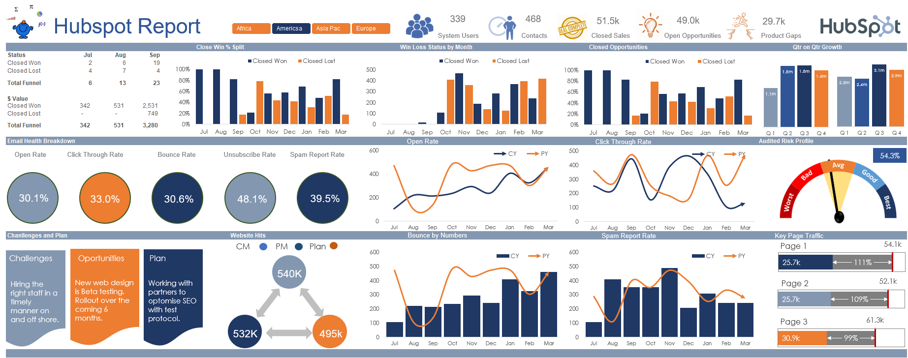
The following Excel dashboard is the change from the above.
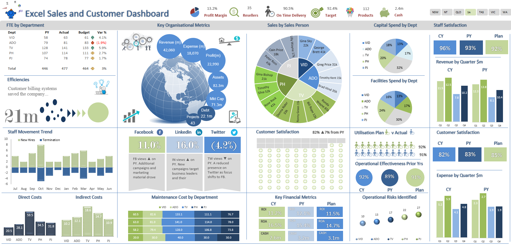
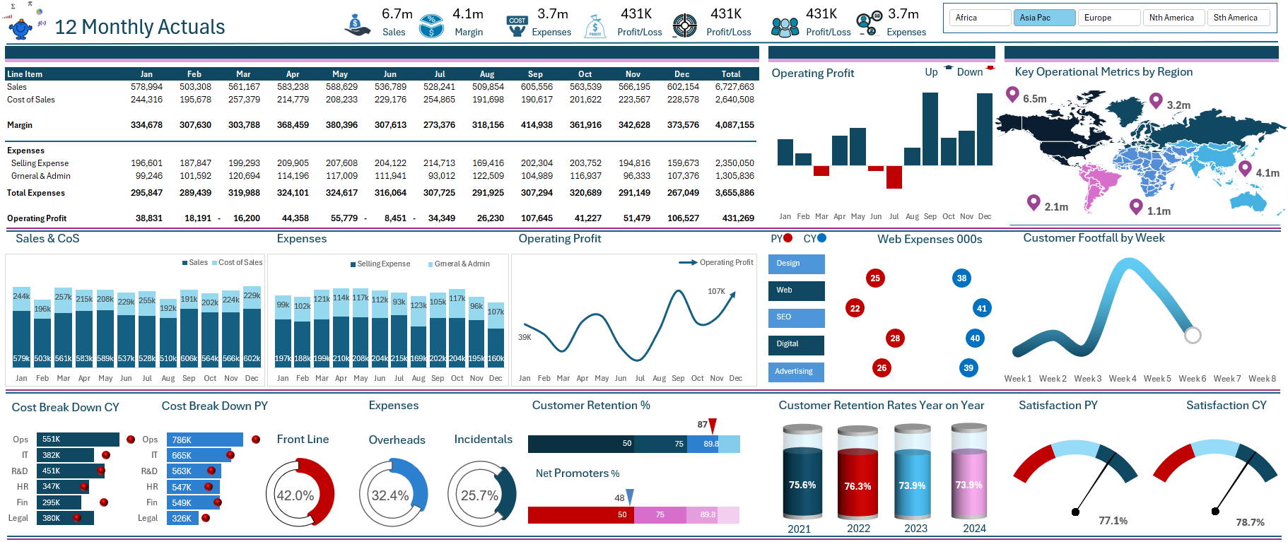
New Dashboard with changes made to create a larger space and generate more metrics on a single page.
The reason the above is a dashboard is that it is able to change given a change in the underlying source data and this change is brought about by the change in the slicer. The underlying data is a lot larger but the principles of creating a financial visual remain the same:
● The consistent Use of colour in your outputs.
● Alignment to make the eye travel from element to element seamlessly.
● Clean clear headings using the same font where ever possible.
● Liberal use of white space so none of the elements overlap.
After going through the extensive exercise of creating this Excel dashboards I can say one I was very pleased when I saw the final working result. It is very satisfying to get something up and running that tells the story I am looking for. Happy dashboarding peeps.
You can find more dashboards to download (40+) on the main body of the site: