Adding a bit of pizazz to charts can be difficult at times. I tend to stick to what I know works when comparing say budget to actual. What is nice is to add some trending data to the conversation. I think it adds value from a visual perspective. It is nothing the user cannot see when actual is against budget or forecast. It just adds an extra element to the chart. I prefer to add trend data as a Line chart rather than use Excel’s inbuilt trending tool. There is more flexibility in the formatting of a Line chart.
Take the following chart with an added Line chart:
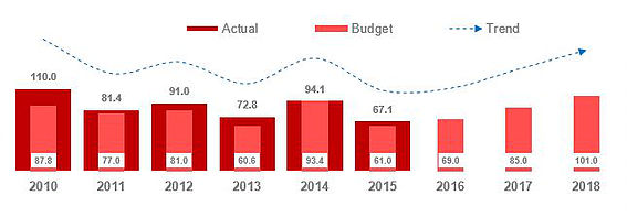
Actual is shown against Budget with the nice addition of a line chart. The line chart shows the trend for the data in the Clustered Column and the Stacked Column charts.
The way you make the above chart is to create a Clustered column chart with Actual Budget and Trend data
Now right click on the blue trend data and choose Line Chart.
Notice how the blue is selected by right clicking on the blue series (trend).
From the dialog which comes up choose Line chart from the drop down.
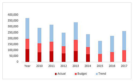
I have used Actual, Budget and Trend. For the Budget and Trend put a tick in the secondary axis and change the budget to a Stacked Column Chart.
The image above shows the newly created series types with the two secondary axis.
Now all we need to do is to add an arrow head to our data and format it a bit.
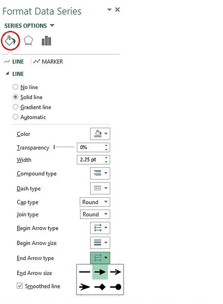
Click on the line chart and choose Fill and Line from the Format Data series menu.
Choose and end arrow size, choose an end arrow size and choose smoothed line.
With a little bit of formatting your chart should look something like this.
Both axis I will hide and you may need to fiddle with the scale of the right horizontal axis. Once I start to format the chart and add a bit more bling, the chart ends up looking as follows.
The data works nicely along with the source data. The excel file attached has the above chart and the source data. The trend above says 0 but I have hidden these values as I only want to see the trend not plot the data.
