
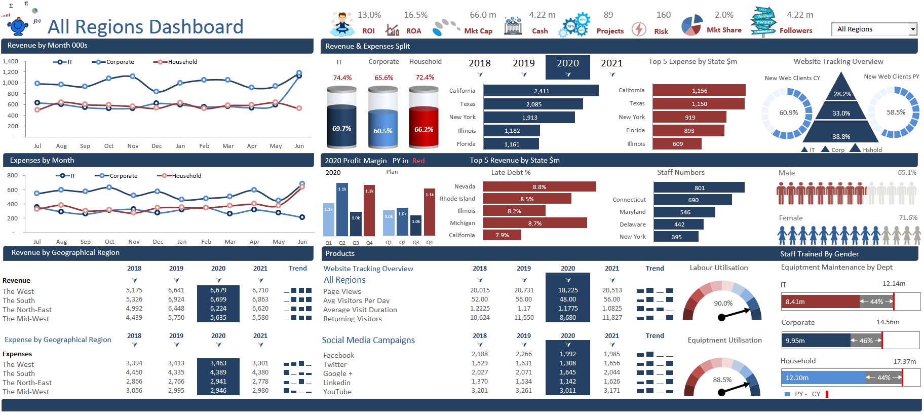
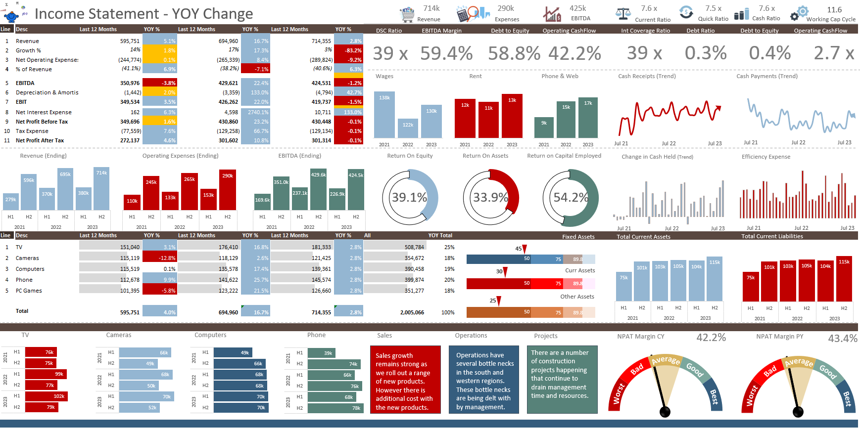
Dashboard Upgrade
This is a new Excel Dashboard from an older dashboard I have upgraded. The transformation is complete.
Read More
Infographics in Excel
Infographics in Excel is not a new concept but these sort of graphical representations are very powerful and convey a striking message. Infographics are usually not as dynamic as a dashboard, they tell a striking story. This is not to say that the source data which populates the infographic can't be dynamic in nature.
My website is about to explode with Infographics as I publish a swath of interactive Excel Infographics for people to plug and play with.
Read More
Showing Trends with a Chart
Adding a bit of pizazz to charts can be difficult at times. I tend to stick to what I know works when comparing say budget to actual. What is nice is to add some trending data to the conversation. I think it adds value from a visual perspective. It is nothing the user cannot see when actual is against budget or forecast. It just adds an extra element to the chart. I prefer to add trend data as a Line chart rather than use Excel’s inbuilt trending tool. There is more flexibility in the formatting of a Line chart.
Read More
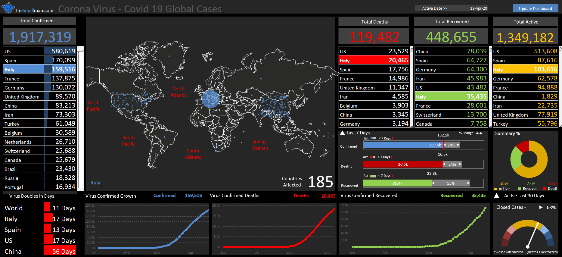
Road Traffic Statistics in Excel
While going through some road traffic information on the Department of Transport's website it occurred to me that the data was perfect to create a dashboard. It was information rich and there were very little gaps in the data. I decided to use quite a few pictures in conjunction with the charts to try and spice them up. I have used actual data but had to ‘normalise’ some of the data as there were a few gaps.
Read MoreFeatured Posts
Recent Posts

Inflation Over Multiple Years in a Single Cell January 10, 2025
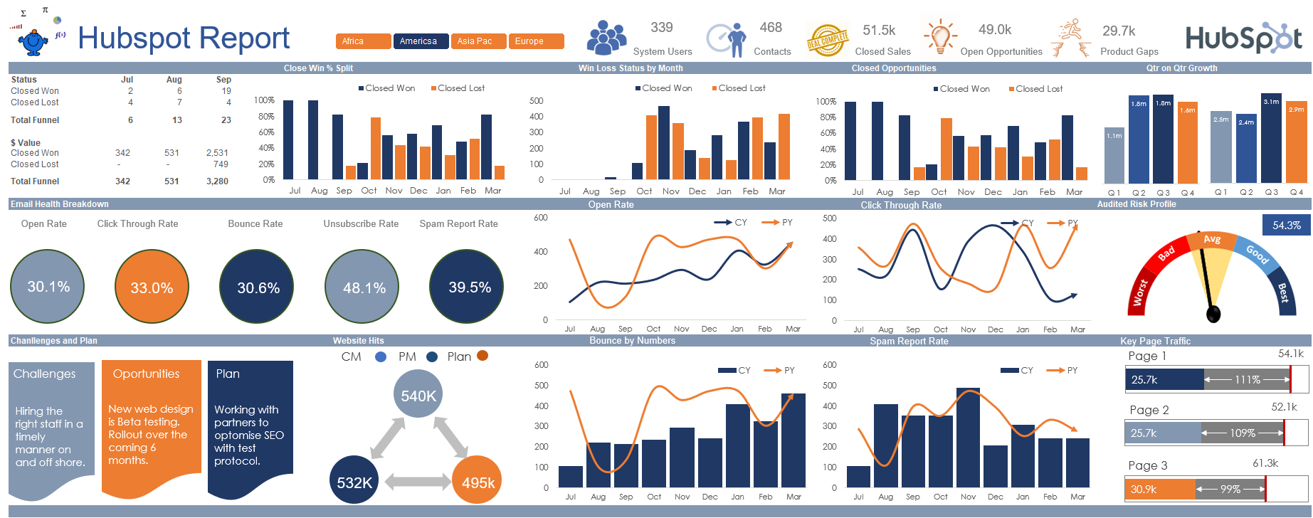
Hubspot Dashboard October 3, 2024

Monthly Dashboard With Supporting Metrics September 25, 2024
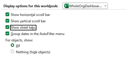
Excel Show Missing Sheet Tabs July 29, 2024

Run Macro Overnight Automatically June 24, 2024

Split File into Parts and Save to Directory April 20, 2024
Most Popular Author December 14, 2023
Creating an Excel Dashboard - A Guide with Templates December 8, 2023
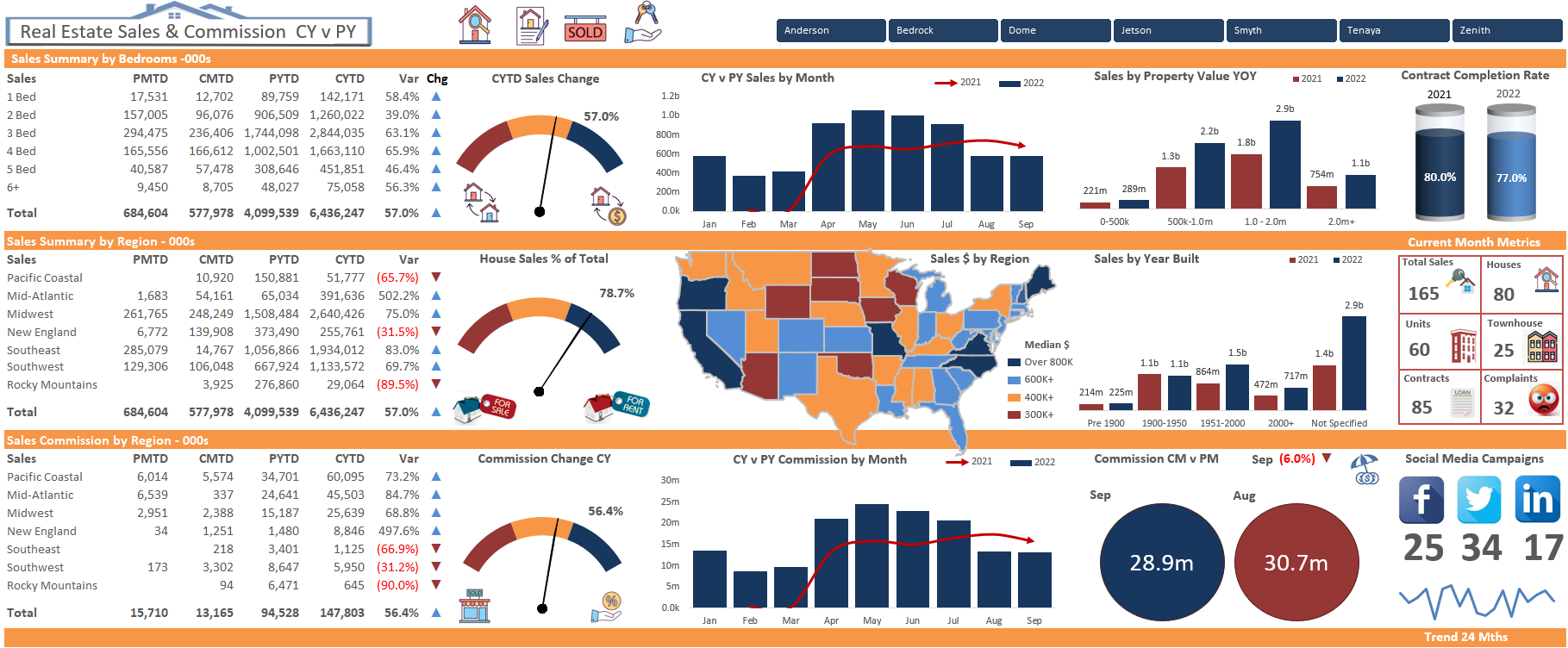
Real Estate Excel Dashboard October 11, 2023

Updating Excel Dashboards September 29, 2023