

A Dynamic Pareto Chart in Excel
A Pareto chart in Excel is a chart which is made up of a column chart and a line chart to show a cumulative position. This is often a good chart to show an 80 20 scenario, where 80 % of the costs are achieved by 20% of the cost drivers. The chart can be created by segmenting the the data into cost drivers or buckets. If your business expenses were allocated into the following buckets:
Staff
Building
Legal
Accounting
Rates
Entertainment
Marketing

Infographics in Excel
Infographics in Excel is not a new concept but these sort of graphical representations are very powerful and convey a striking message. Infographics are usually not as dynamic as a dashboard, they tell a striking story. This is not to say that the source data which populates the infographic can't be dynamic in nature.
My website is about to explode with Infographics as I publish a swath of interactive Excel Infographics for people to plug and play with.
Read More

Format Chart Numbers as Thousands or Millions
Recently I have been creating some comparison charts (prior year agains projections) and usually the numbers in my tables have been in a format which would suit. In this recent project though the data was in large whole numbers and I wanted to format this into a chart so it appeared as millions. In order to get from whole numbers to millions I had to work with the number format in what was a slightly unintuitive way and I hope by sharing this that I save you some time in the process.
Read MoreFeatured Posts
Recent Posts

Inflation Over Multiple Years in a Single Cell January 10, 2025
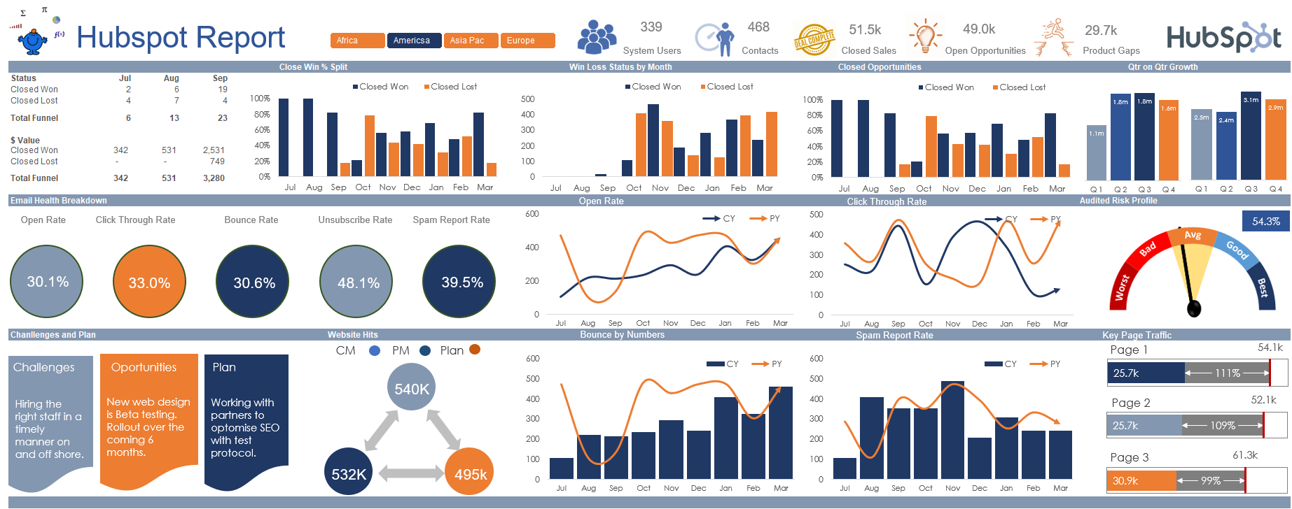
Hubspot Dashboard October 3, 2024

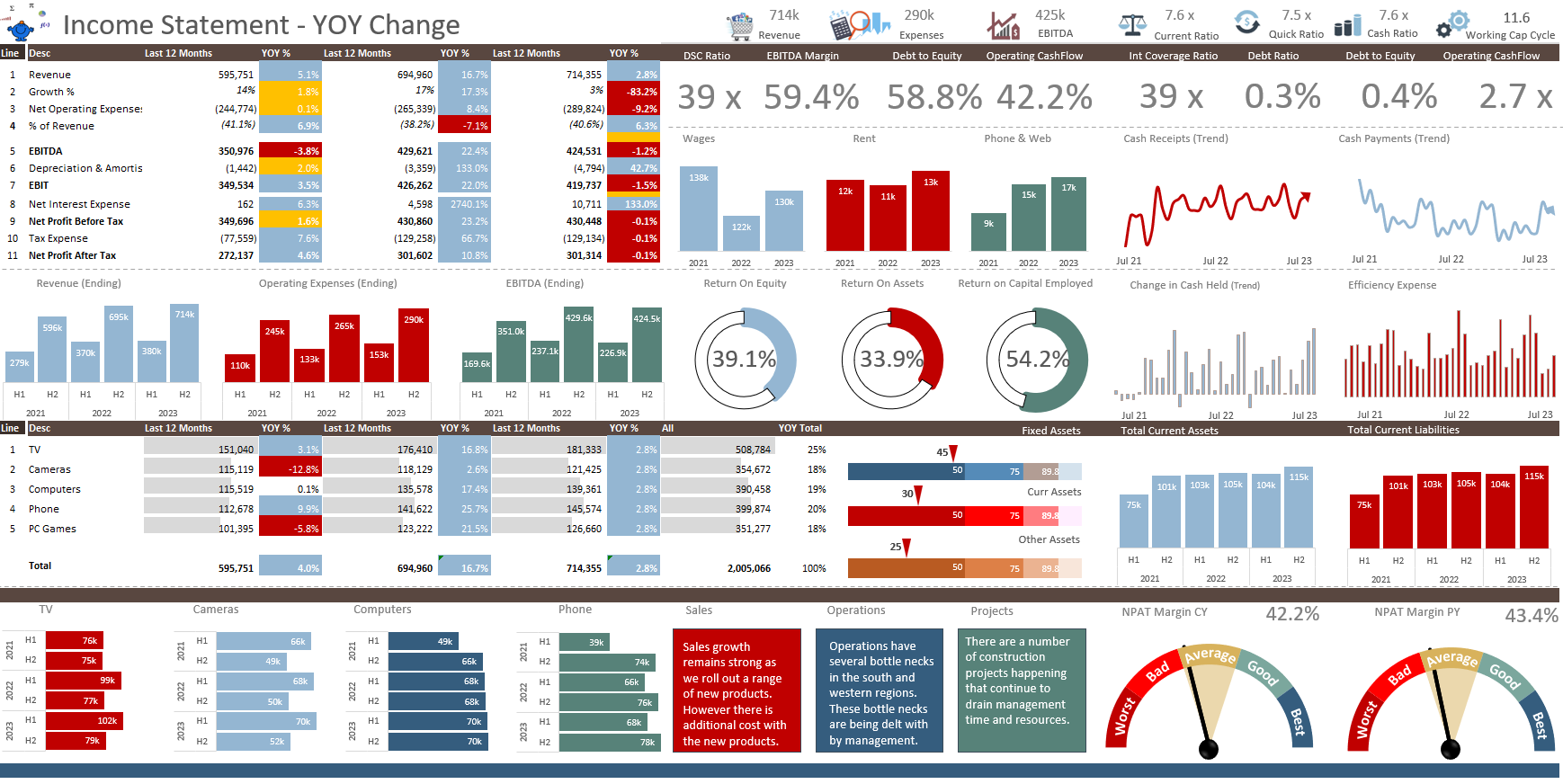
Monthly Dashboard With Supporting Metrics September 25, 2024
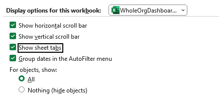
Excel Show Missing Sheet Tabs July 29, 2024

Run Macro Overnight Automatically June 24, 2024

Split File into Parts and Save to Directory April 20, 2024
Most Popular Author December 14, 2023
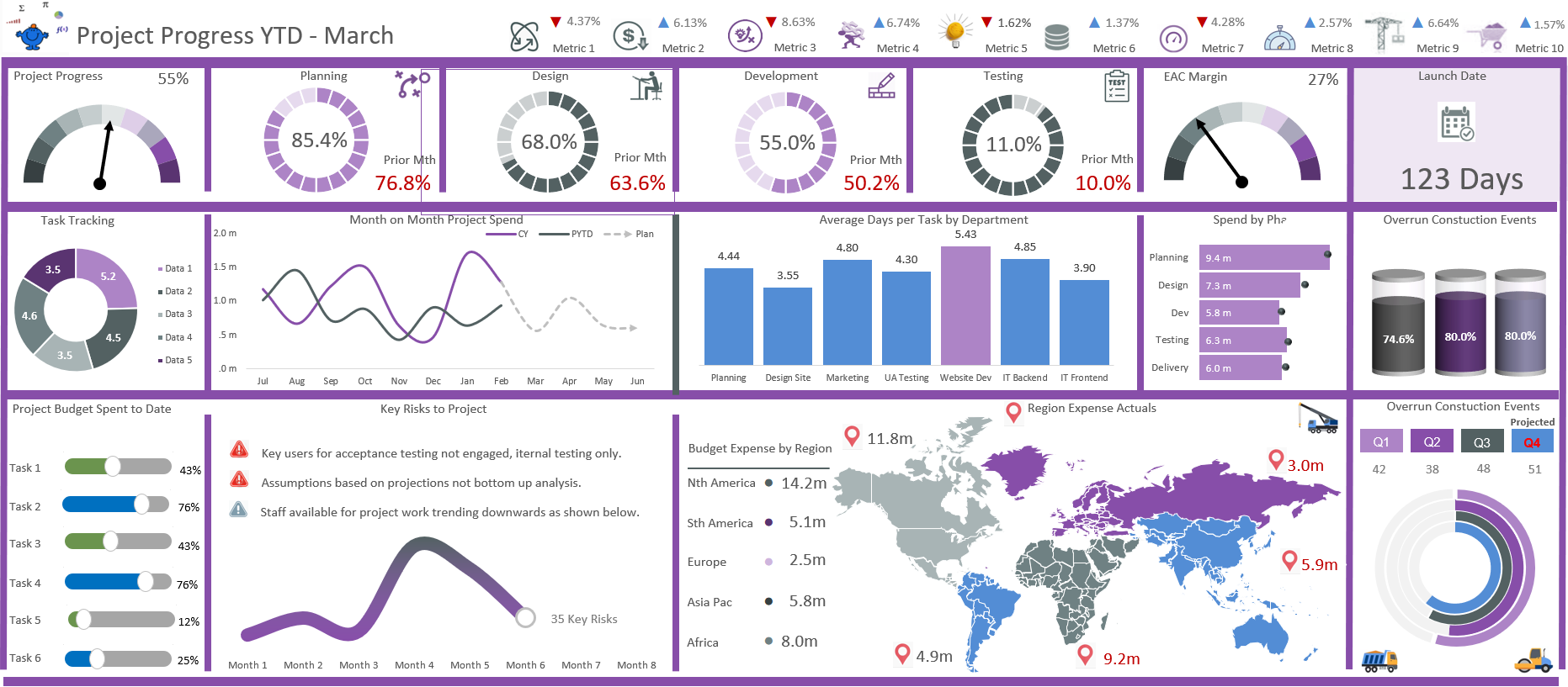
Creating an Excel Dashboard - A Guide with Templates December 8, 2023
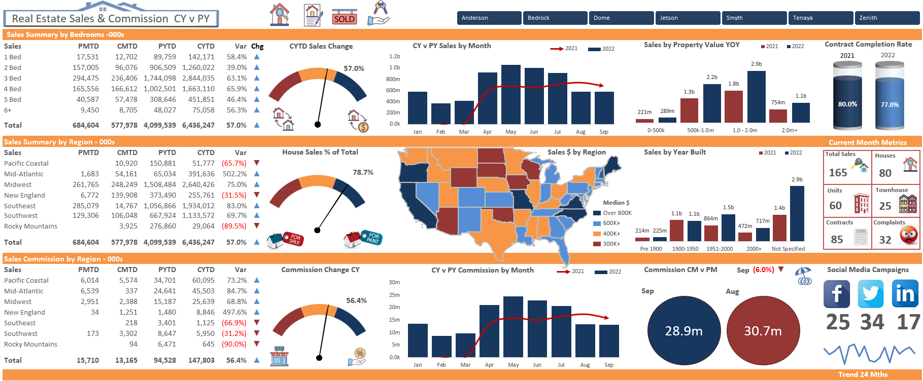
Real Estate Excel Dashboard October 11, 2023

Updating Excel Dashboards September 29, 2023