Water Statistics Infographic in Excel
The above infographic is a look at how we use water and what is expected to happen if there is a 2 degrees increase in global temperatures . Governments are good for changing long term policy for change in our world but if you want to enact real change you have to make it yourself. If everyone collectively agrees to change - change happens in our world. Our world will continue to grow in population. If 7 billion people agreed to enact change as a collective - climate change, world poverty etc, would end very quickly in my opinion.
Read MoreExcel Climate Change Infographic
This is an infographic based on our changing climate with statistics from the web showing the current state of affairs, all things climate change.
Read MoreMale Female Customer Infographic
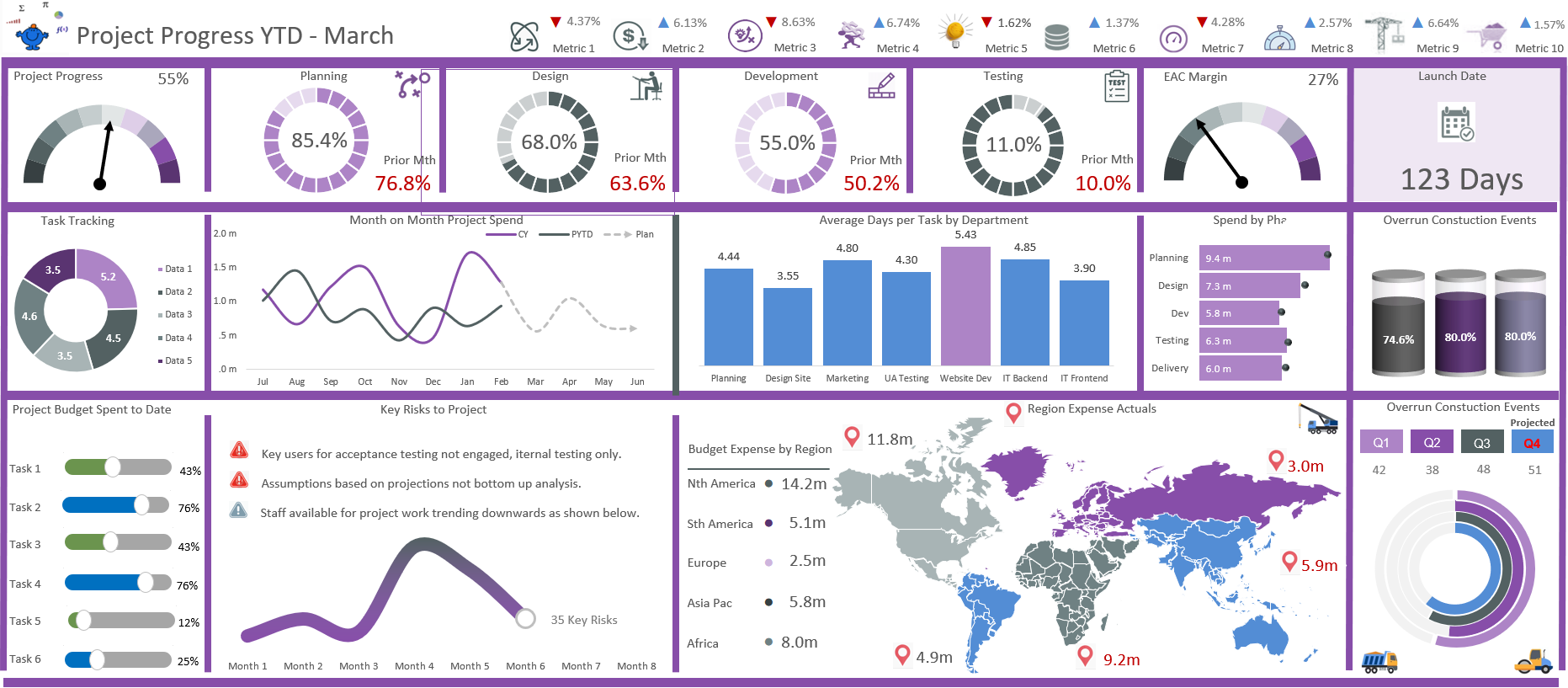
So I am on the infographic trail again. I have been doing a 3 part series for CPA Australia and have decided to make a few additional Excel infographics just for a bit of fun on the side. With all of the inforgarphics on the site I have not built complex calculation engines. I simply put a visual display together which is driven by the contents of Excel cells. The result is an easy to maintain and update visual report. With any luck some people might find the results useful in the work they do.
Read MoreScandinavian Infograpic in Excel
The above infographic is one of my favourites of the Nordic region. It is very simple and yet tells a story about 4 countries in Scandinavia. The Excel infographic has the top 5 companies for each country (Iceland is excluded due to its small size - sorry). It has data on career and staffing data. There is some population metrics, GDP and GDP Growth which is low all around the world as a result of the global downturn after 2008. Let's hope that ends soon.
Read MoreFeatured Posts
Recent Posts
Inflation Over Multiple Years in a Single Cell January 10, 2025
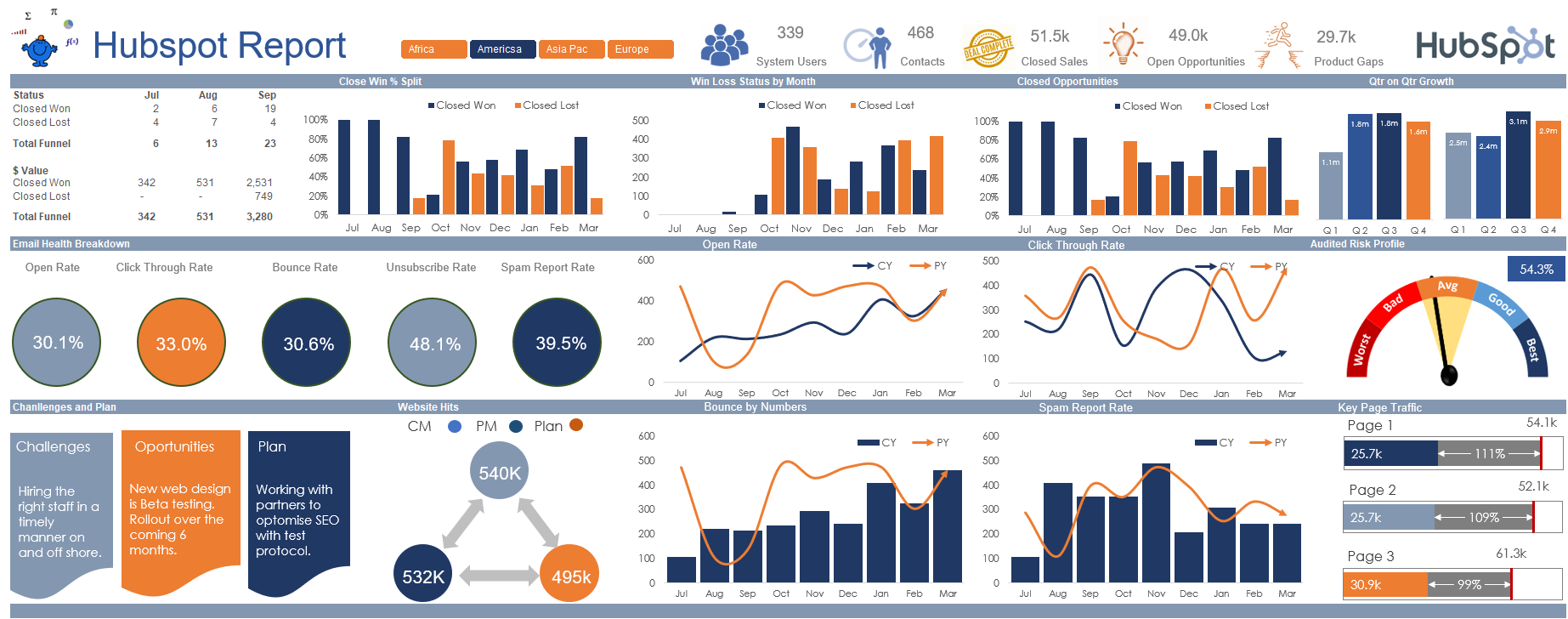
Hubspot Dashboard October 3, 2024
Monthly Dashboard With Supporting Metrics September 25, 2024
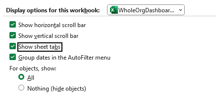
Excel Show Missing Sheet Tabs July 29, 2024
Run Macro Overnight Automatically June 24, 2024
Split File into Parts and Save to Directory April 20, 2024
Most Popular Author December 14, 2023
Creating an Excel Dashboard - A Guide with Templates December 8, 2023
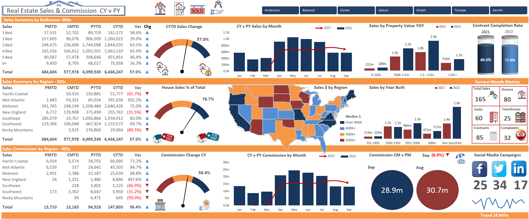
Real Estate Excel Dashboard October 11, 2023
Updating Excel Dashboards September 29, 2023


