
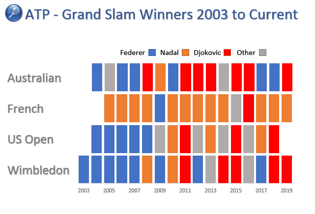
The Tennis Chart
I happened across this article on the Brisbane Times website which outlined the dominance of Federer, Nadal and Djokovic in recent memory. This article outlines how the interesting chart is created in Excel.
Read More
Copy and Paste an Excel Chart into PowerPoint with VBA
Creating Powerpoint presentations automatically is handy if you want the power to control another office application. In this post I will copy a chart in Excel and paste it into a fresh instance of Power Point. I will show two examples, once where the data will be pasted into a presentation with a title and one without. This is a building blocks approach, creating a procedure which pastes one chart might seem like time better spent done manually but if there were 20 charts it would be faster for VBA to do the work for you.
Read More
Bubble Chart in Excel
Creating Bubble charts in Excel is reasonably straight forward. They are very similar to a line chart without the line and with a bit more pizazas. You will find quite a few Bubble Charts onthesmallman.com particularly in the dashboard section.
The following article will take you through how to make one.
Read MoreFeatured Posts
Recent Posts

Inflation Over Multiple Years in a Single Cell January 10, 2025
Hubspot Dashboard October 3, 2024

Monthly Dashboard With Supporting Metrics September 25, 2024
Excel Show Missing Sheet Tabs July 29, 2024

Run Macro Overnight Automatically June 24, 2024

Split File into Parts and Save to Directory April 20, 2024
Most Popular Author December 14, 2023
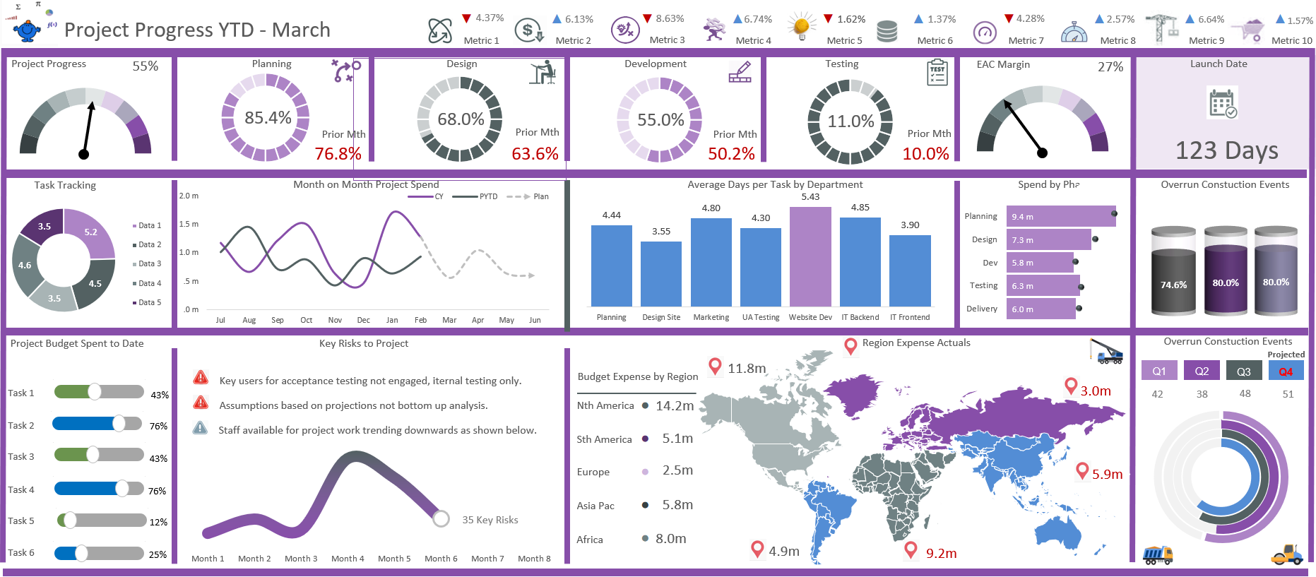
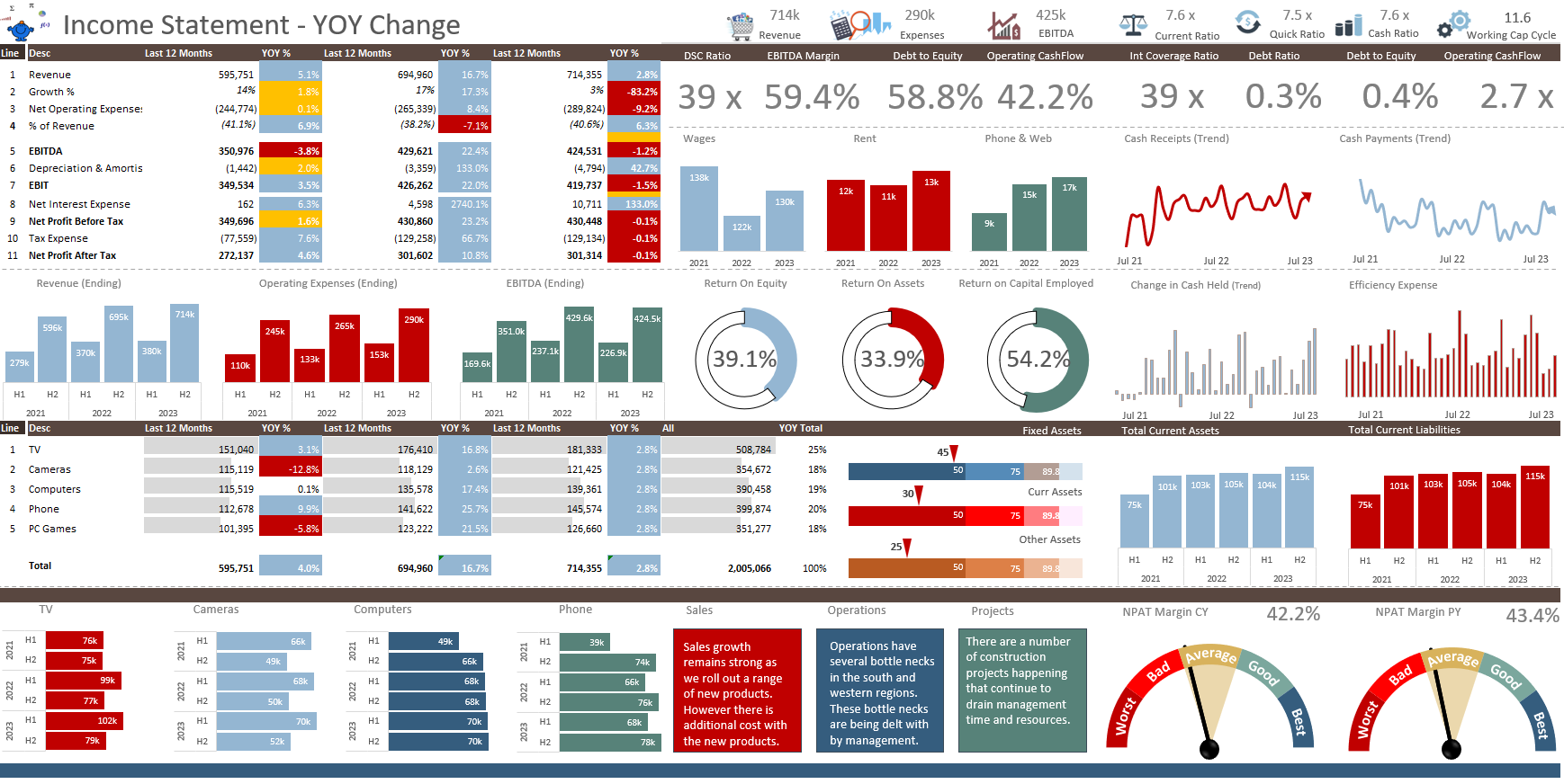
Creating an Excel Dashboard - A Guide with Templates December 8, 2023
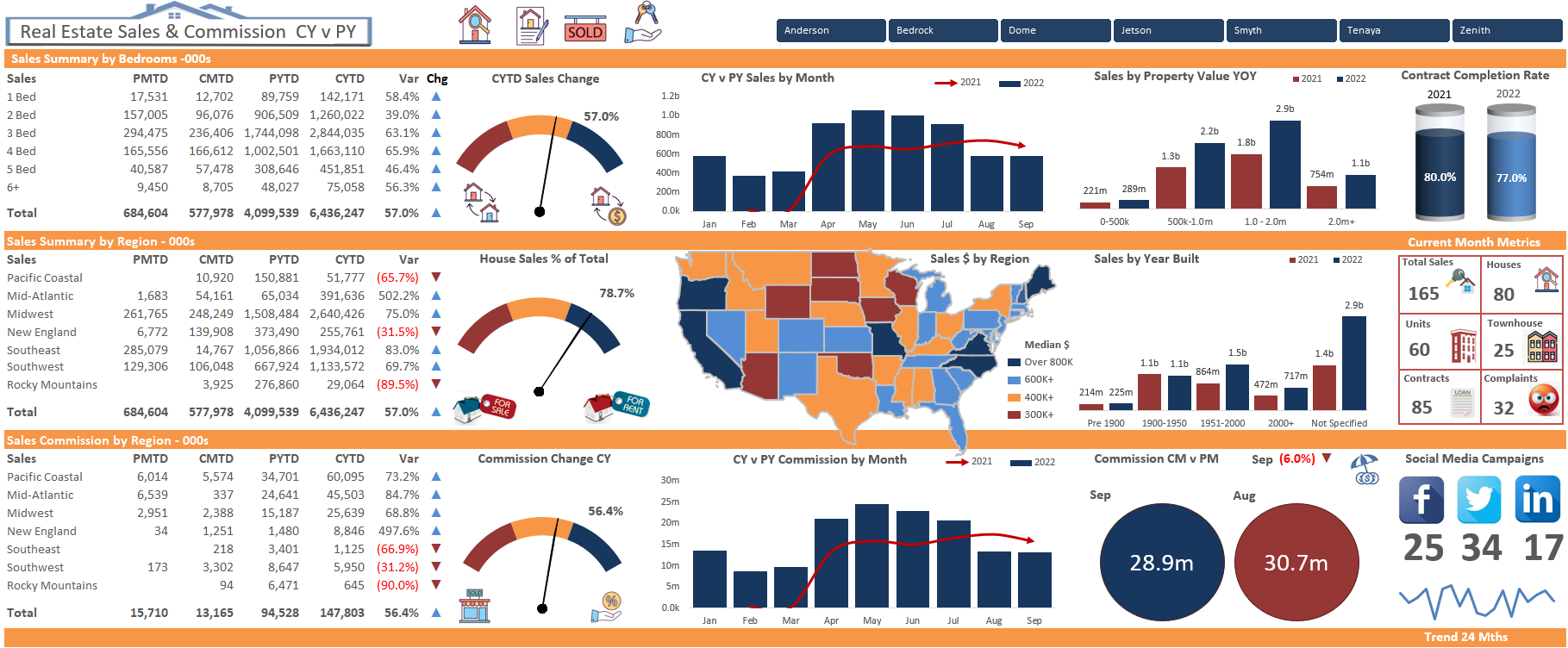
Real Estate Excel Dashboard October 11, 2023

Updating Excel Dashboards September 29, 2023