
Heat Map in Excel
The following article has is a bit of fun with Excel shapes that work like charts. I learnt this technique from reading Robert Mundig's blog at Clearly and Simply blog and Jordan Goldmeier's blog at Option Explicit. All learning comes from somewhere and these guys are cutting edge, I can not recommend their sites strongly enough.
The heat map as the process is known has become a very colourful addition to the data visualisation world. It is the process of changing the colours of shapes and the procedure is relatively straight forward. Iin the following example the map of Australia is used. I will use three colours to change the appearance of the map of Australia. From the drop down you can choose blue, red or green. These are just example colours.

Each of the parts of the map have a segment or a State. These States need a name which can be drawn upon at a later point. The following is an example of the State of Queensland.

I have named the above shape QLD. The data table besides the map has the exact name of each of the state shapes.

So VIC has the RGB number (50, 0, 0) assigned to it. The State names on the left match the names given to each state in the map. The colours, red, green and blue are the colour codes which will be added to the series colour of the chart. The above table draws on another table to lookup the colour codes.
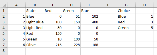
In the above table on the first two items (row 2 and 3) on the left hand table are for the colour Blue. The second two items are for red and the final two items are for green. The choice in column G is the criteria for the combo box on the main page. While Column H is for a lookup formula based on the numbers in column A.
Finally there is some vba coding which runs every time there is a change to the combo box.
Sub Map() 'Excel VBA to colour shapes.
Dim var As Variant
Dim i As Integer
var=Range("B12", Range("E65536").End(xlUp))
For i=1 To UBound(ar) 'Start Excel VBA loop.
shp.Fill.ForeColor.RGB = RGB(var(i, 2), var(i, 3), var(i, 4))
The code puts the data in the first table into an array called var. Then the names of each of the States are put into an array called ar.
So each State has the following names.
- VIC
- NSW
- QLD
- NT
- SA
- WA
- ACT
- TAS
Now a loop will cycle through each of the items in the array (ar) and assign the colour from each of the values in the array var.
As the combo box changes the colour in the map will change as well. Here is an example of when the combo box selection is blue.

The method has great implications as you can assign a colour based on criteria. There is an example of this method in the following dashboard Heat Map Dashboard. The following file outlines the heat map procedure in Excel
